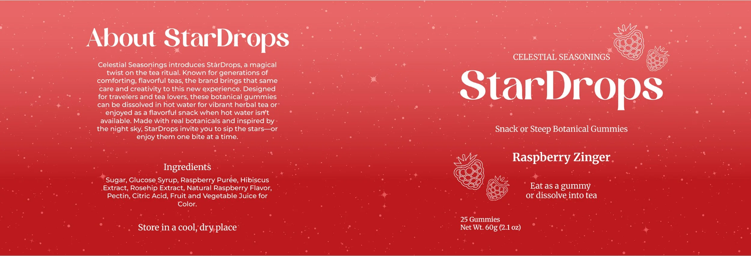
StarDrops
Packaging Design
Overview
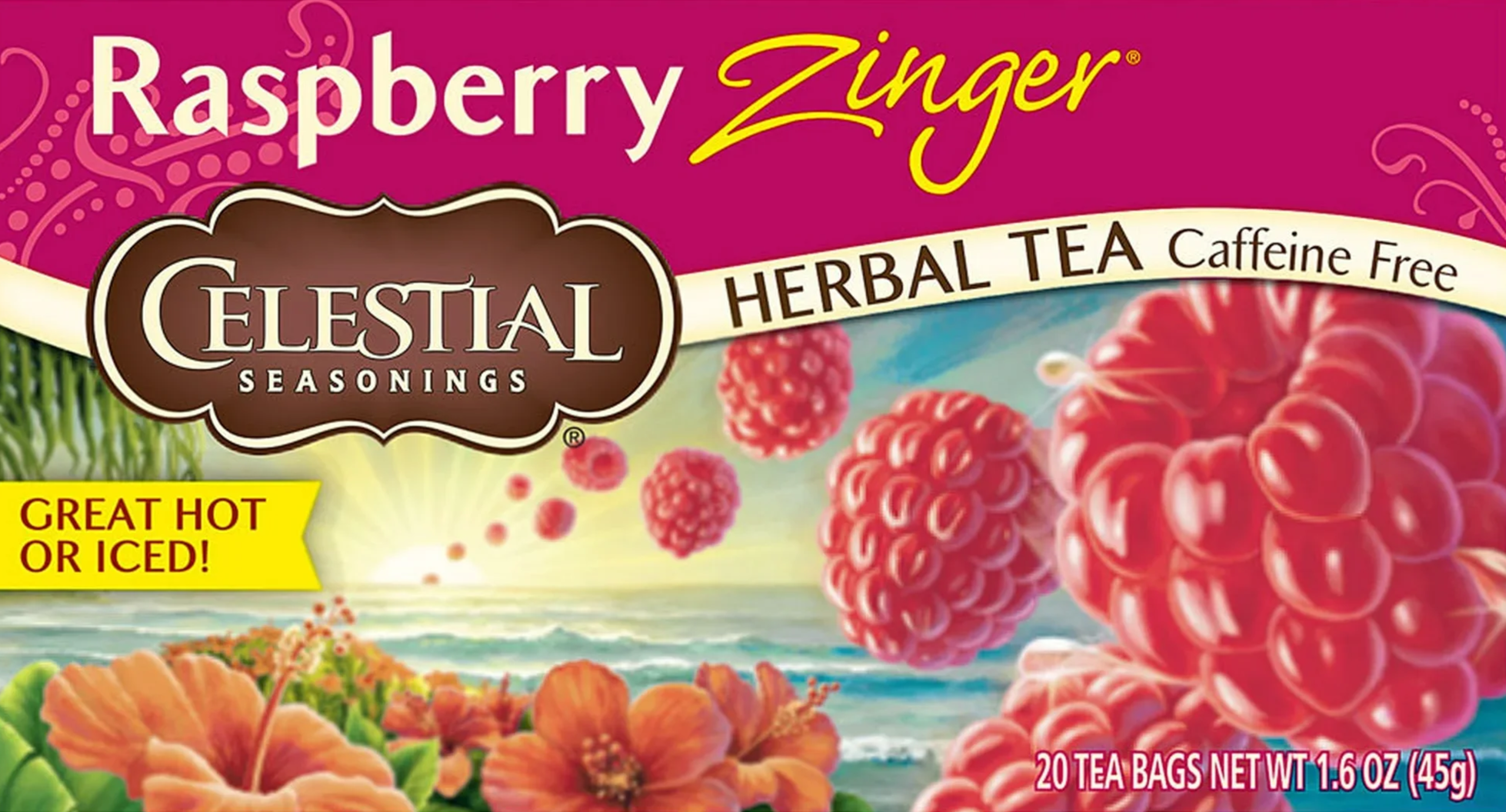
This project began as a packaging redesign for Celestial Seasonings, aiming to modernize the brand while preserving its playful, nostalgic identity. Early concepts explored bold typography and a space meets nature aesthetic, but the strength of the existing brand shifted the focus from redesign to expansion.
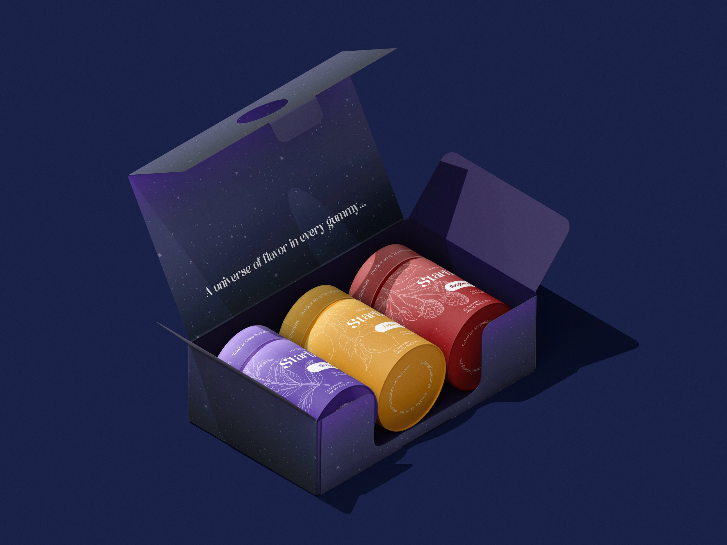
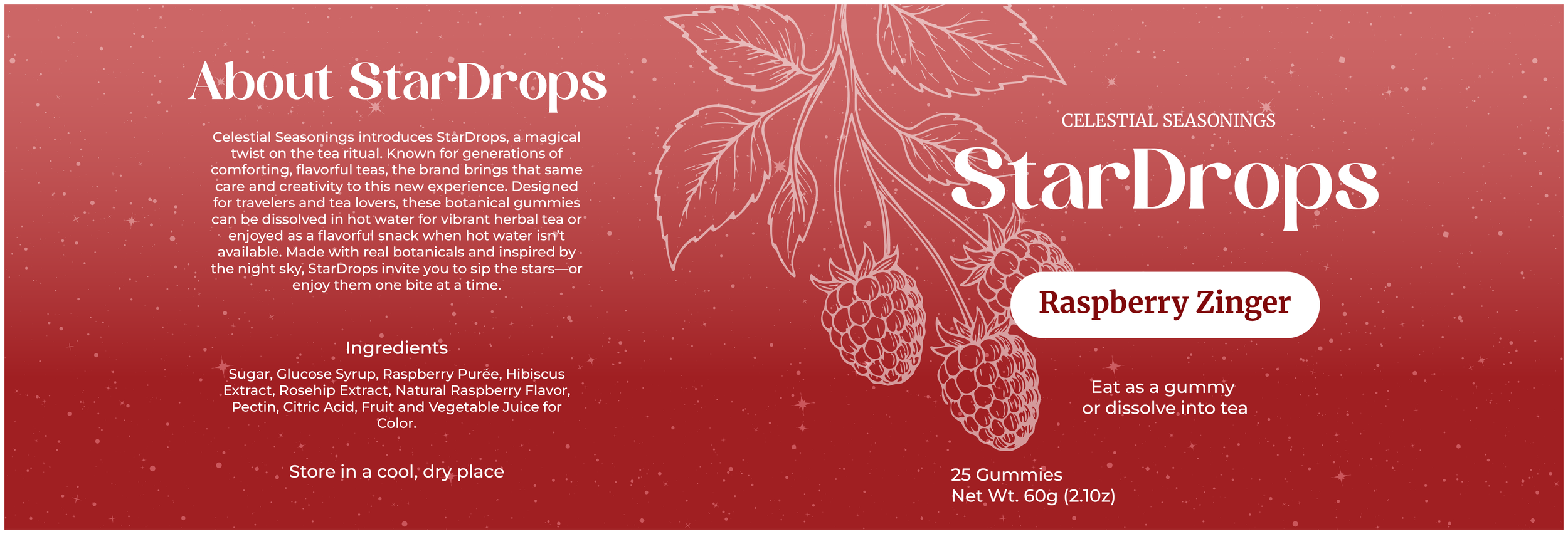
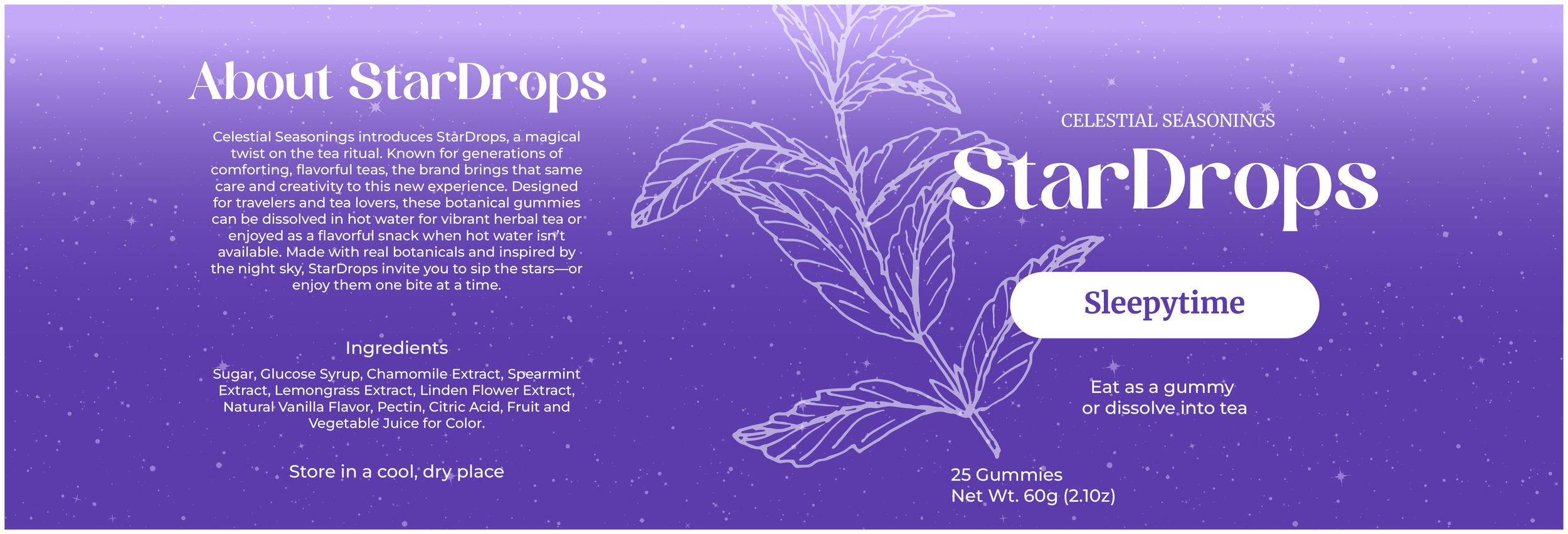
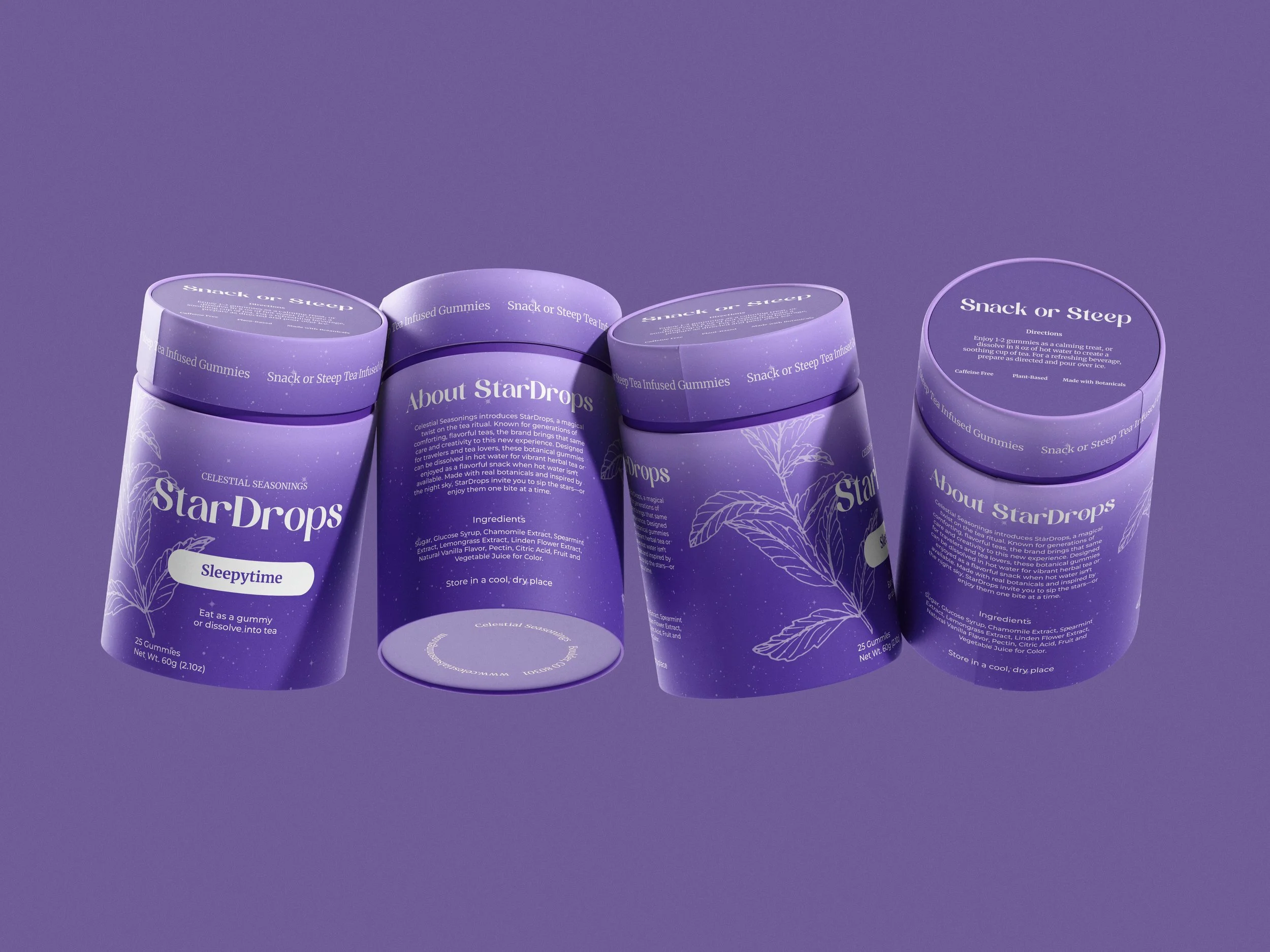
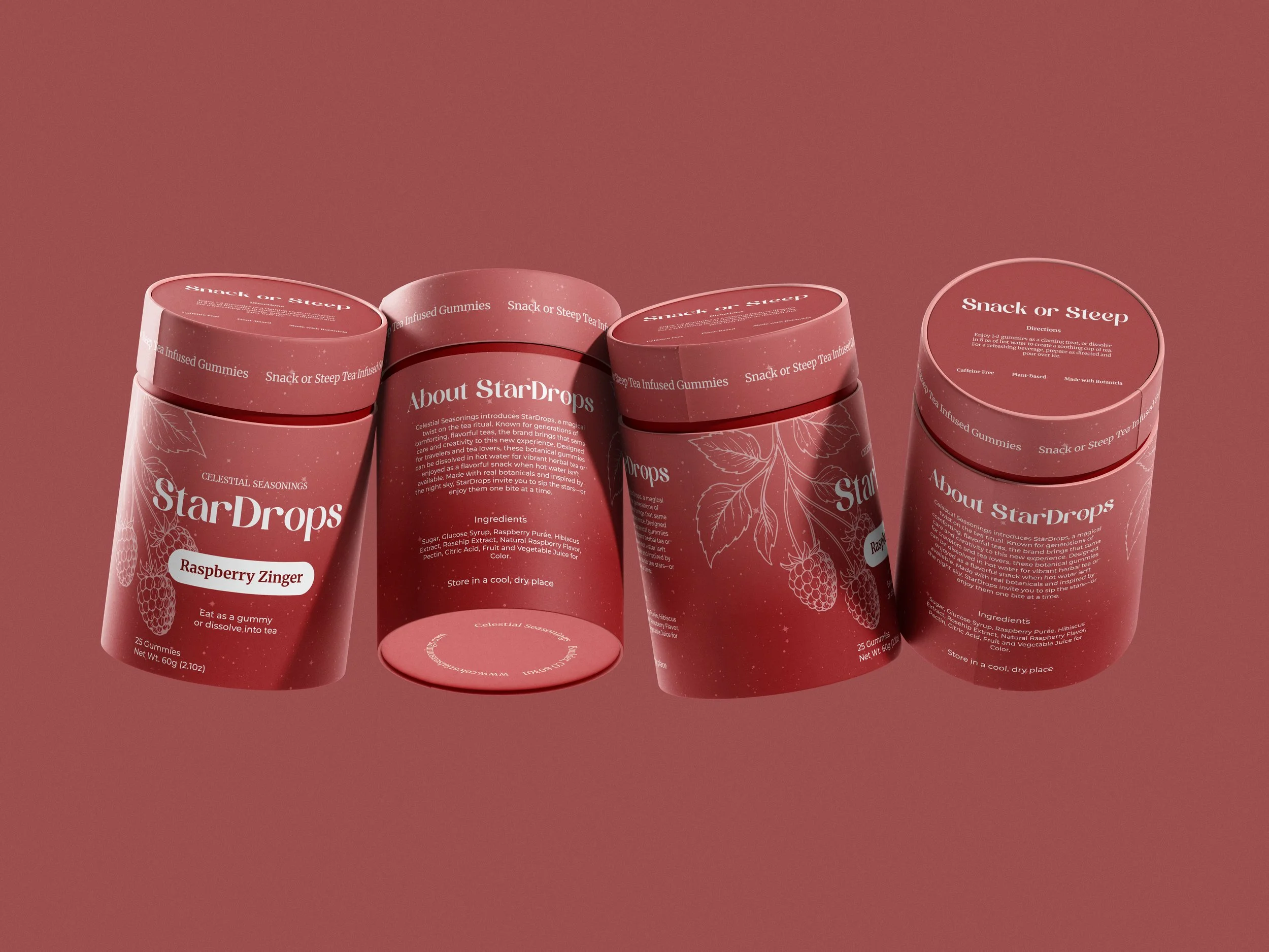
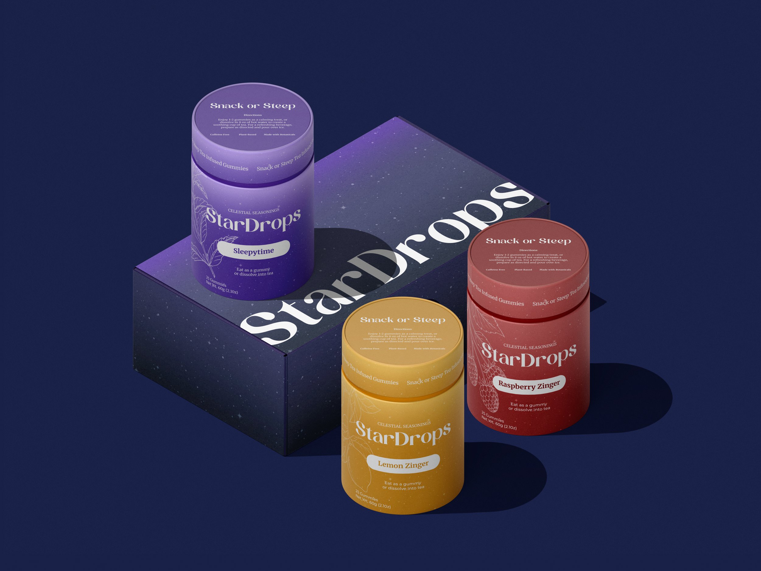
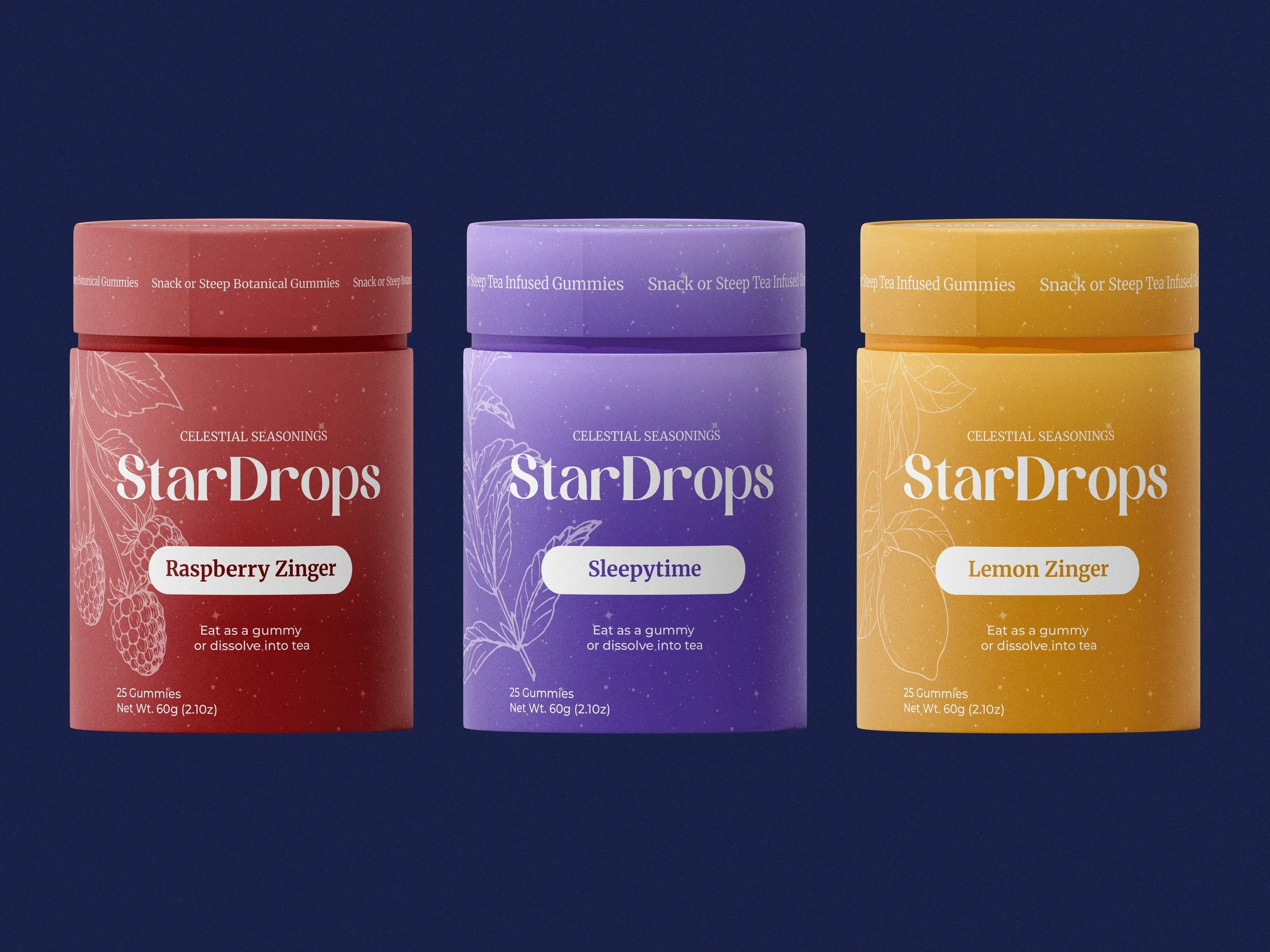
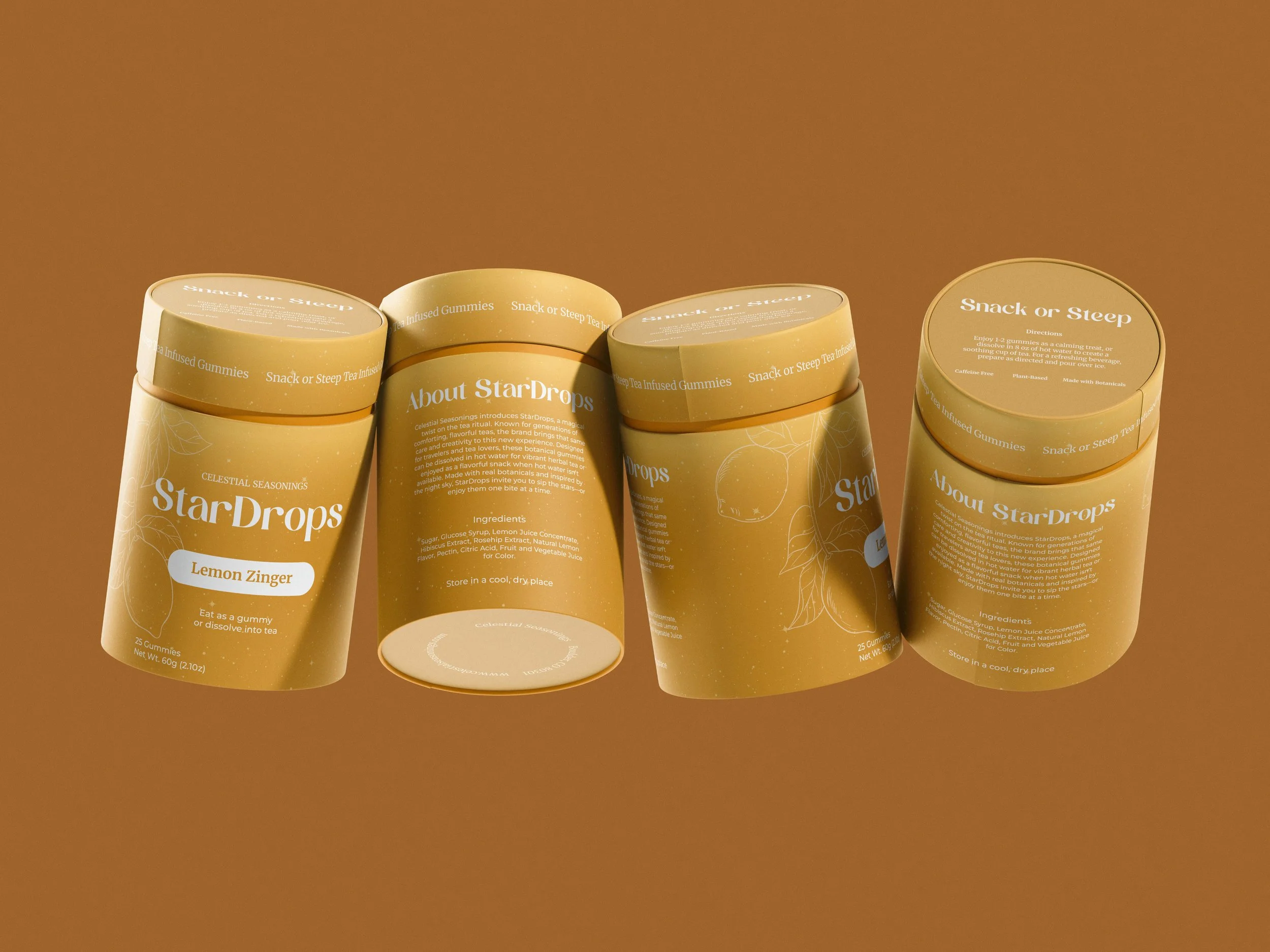
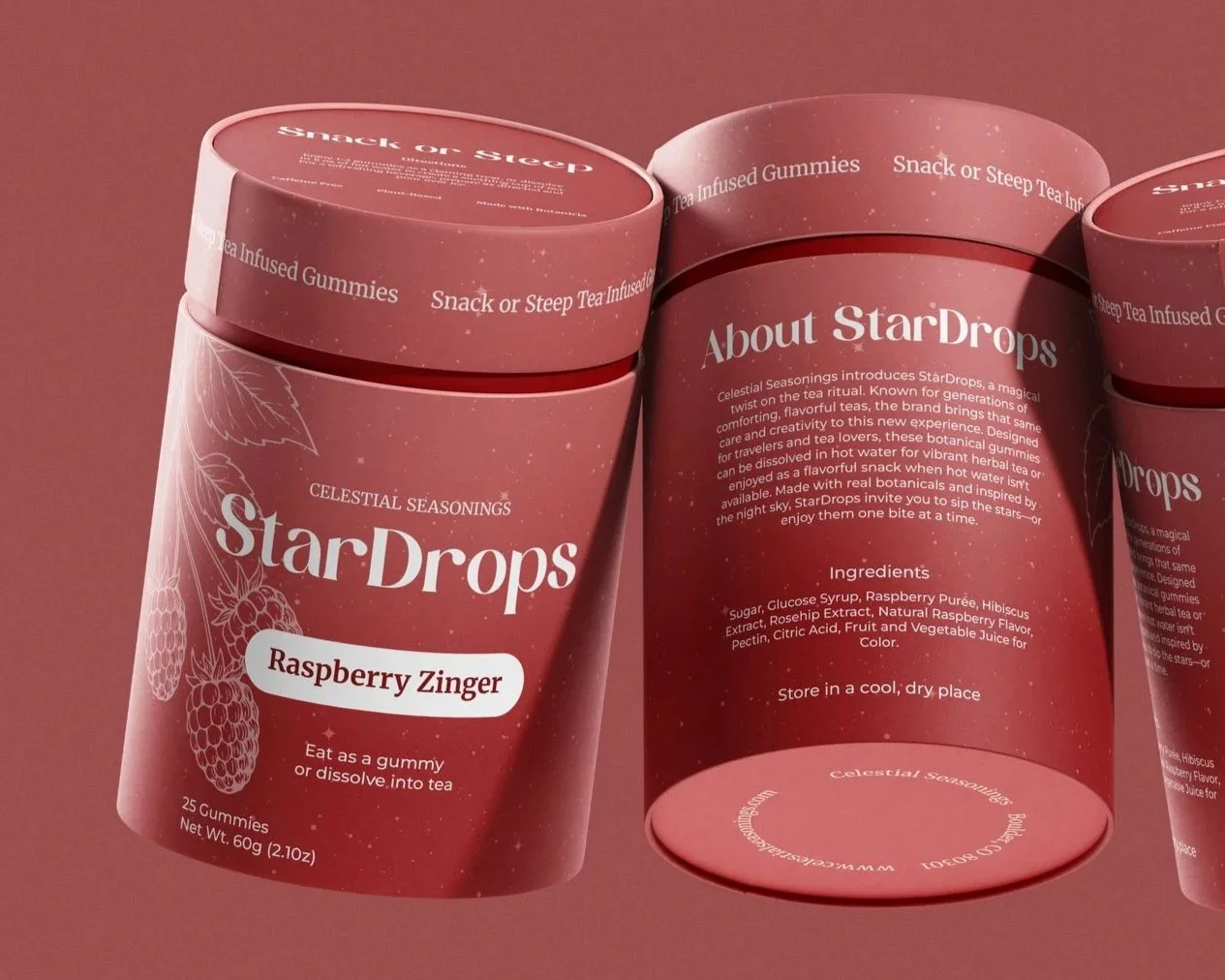
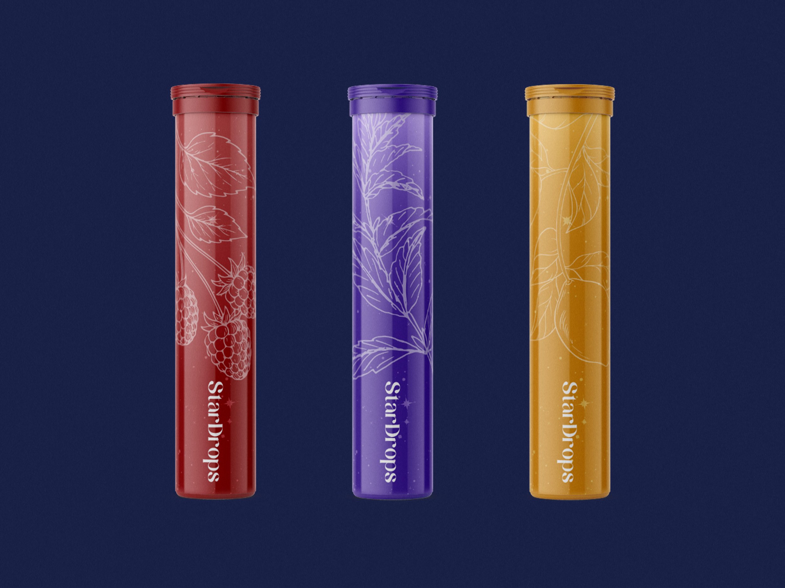
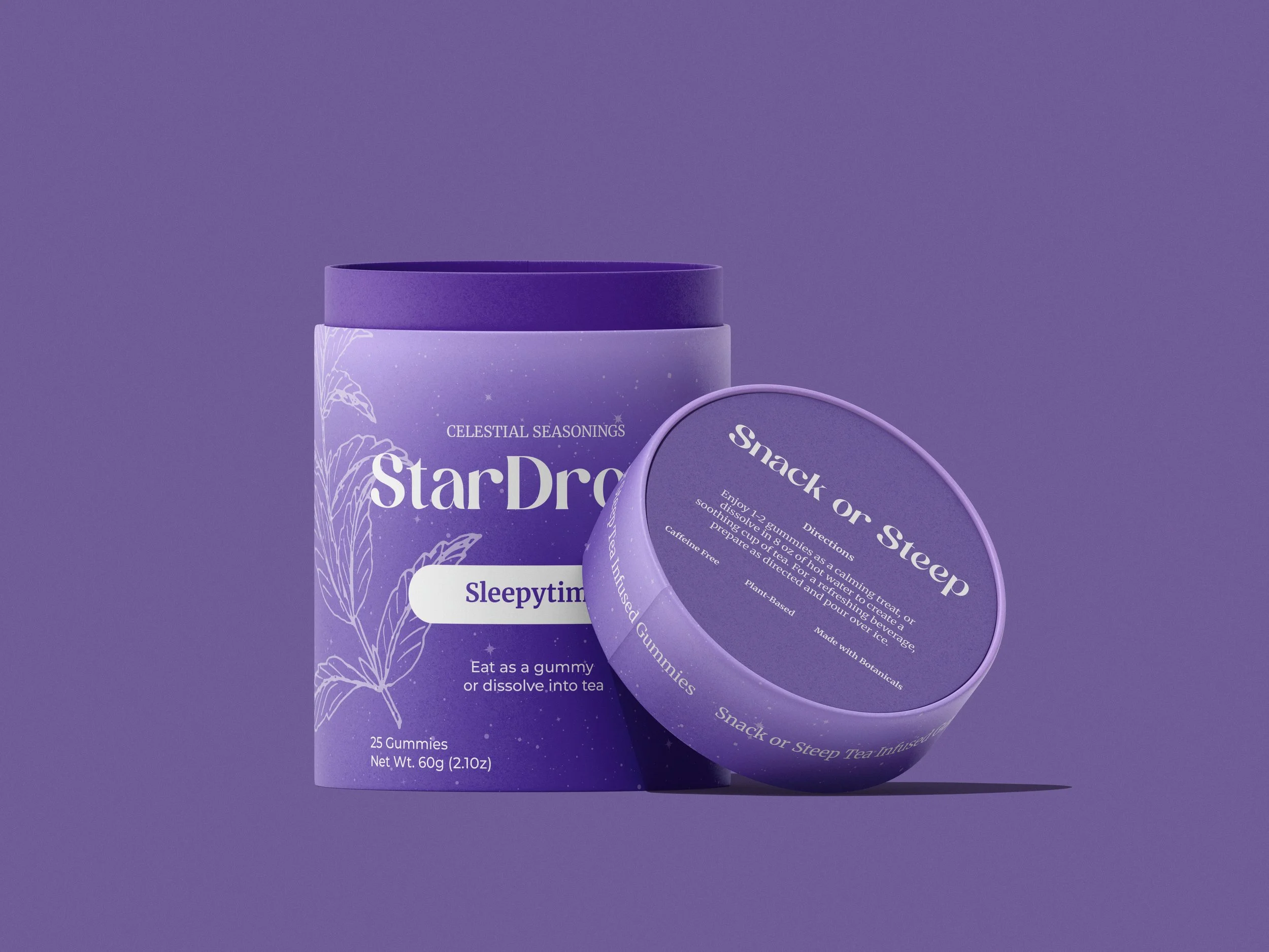
The final outcome is StarDrops, a sister brand of botanical gummies that can be eaten or dissolved in hot water to create herbal tea. Designed for portability, the system includes travel tubes and a subscription box with rotating and seasonal flavors.
StarDrops targets younger tea drinkers, travelers, and active individuals seeking a more convenient tea experience. Its playful, visually engaging design appeals to design conscious consumers, blending vibrant color and eye catching illustrations to create a fresh yet familiar extension of the Celestial Seasonings brand.
Research & Discovery
Research focused on Celestial Seasonings’ established identity, packaging, and storytelling approach, providing a foundation for the project.
A review of competitors revealed a trend toward minimal, wellness driven aesthetics, highlighting an opportunity to take a more expressive and playful direction. Observations of retail environments further emphasized the importance of strong shelf presence and clear flavor differentiation, which directly informed later design decisions.
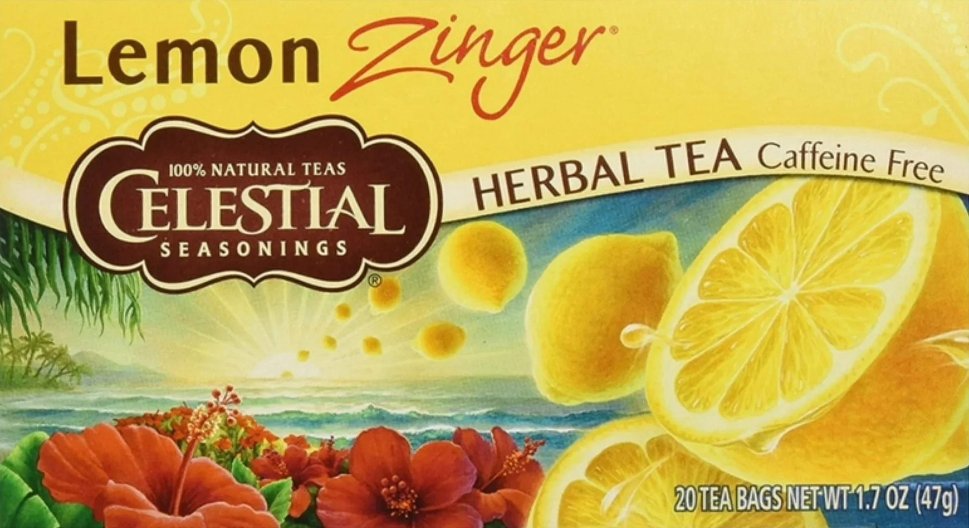
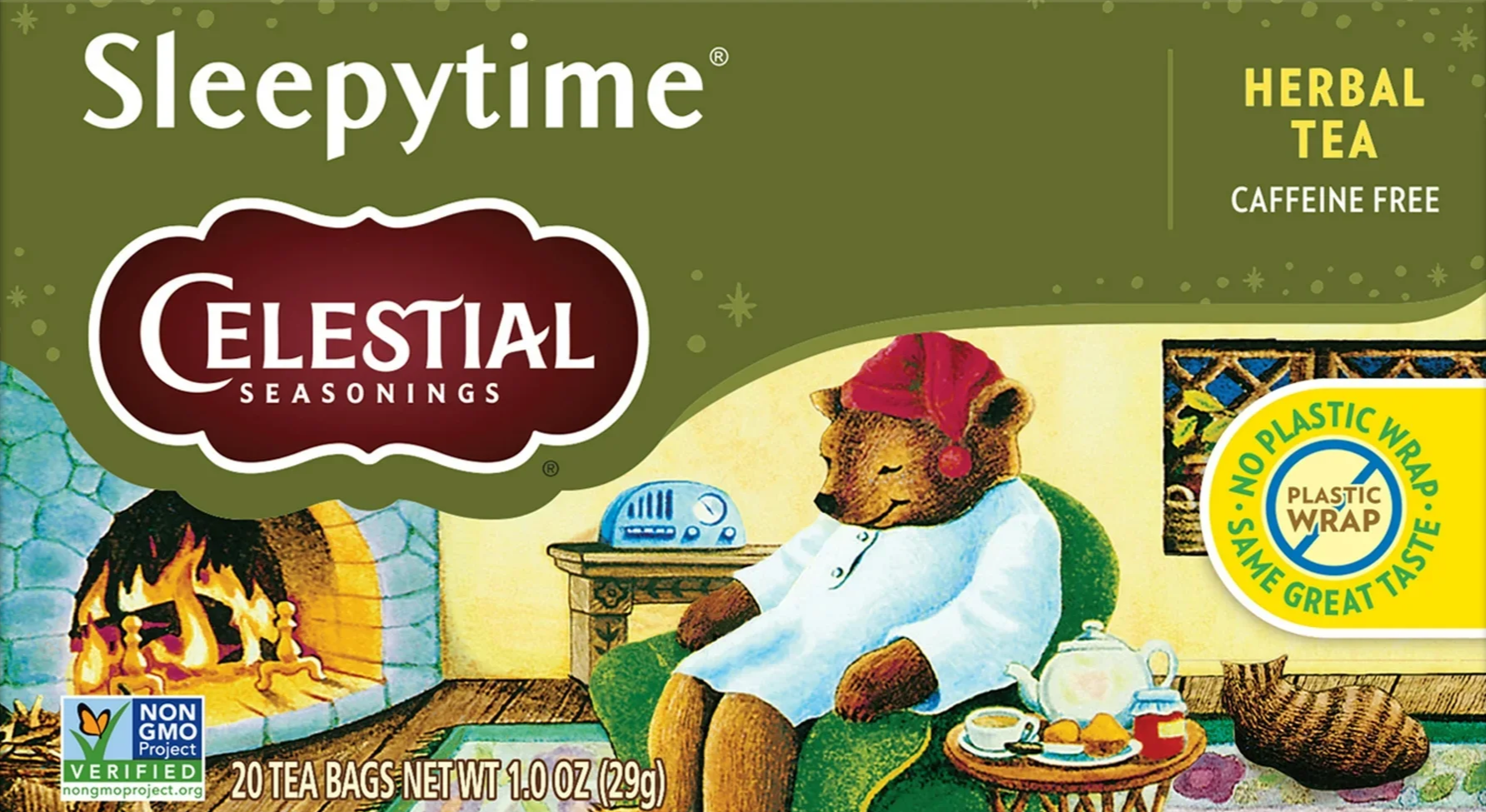
Original Packaging
Inspiration & Ideation
Mood Board
This mood board explores a playful, modern visual direction through bold color, soft gradients, and clean typography. It brings together bright tones and softer pastels to show how color can feel energetic without becoming overwhelming. Subtle shifts in tone and texture add depth while keeping the overall look light and approachable.
Space-inspired imagery and minimal layouts are used as references to suggest a balance between dreamy and structured. The compositions highlight clear hierarchy and simple organization, helping define a direction that feels creative and expressive.
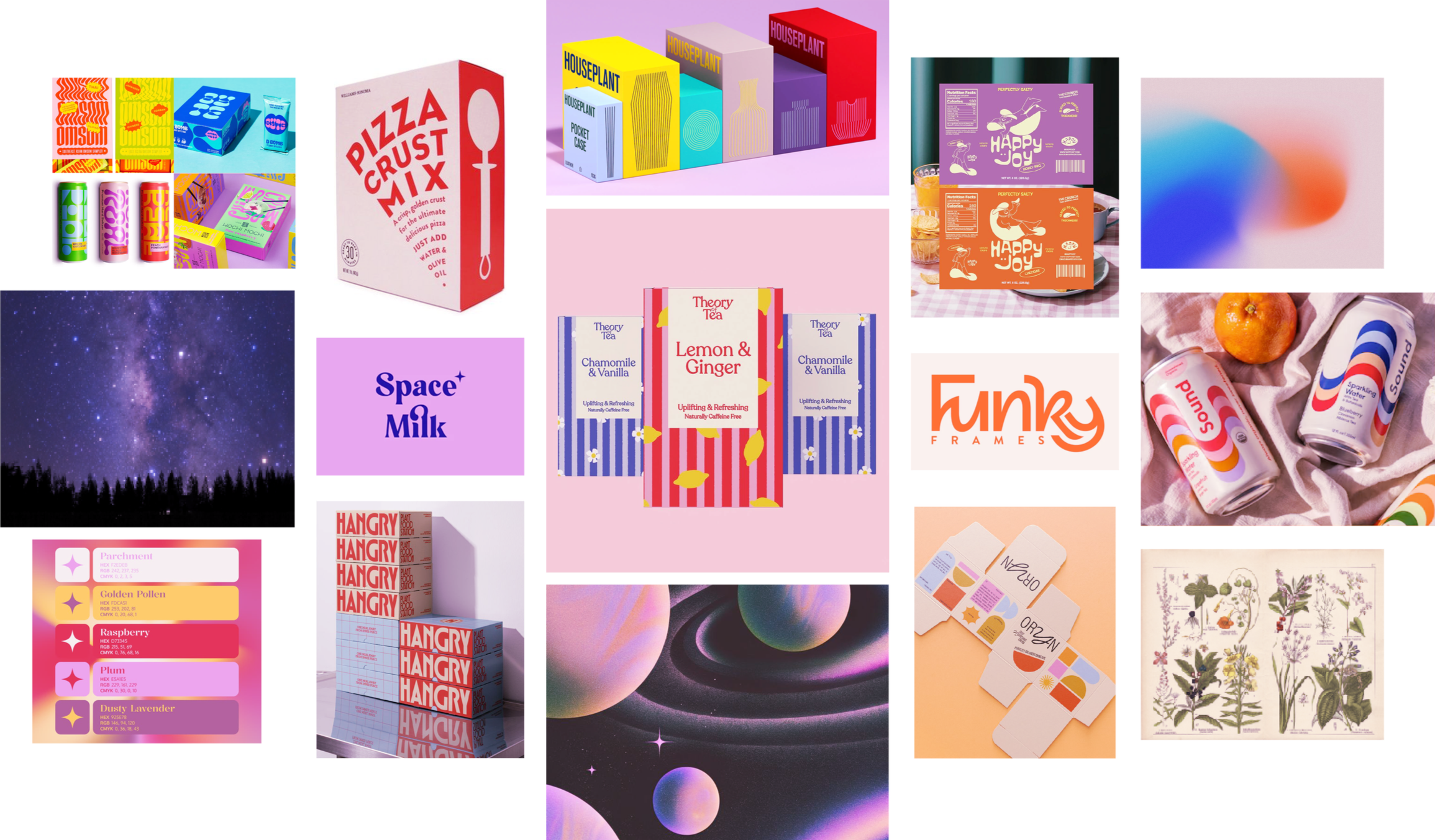
Click image to expand
Sketches
At this stage, the focus remained on redesigning Celestial Seasonings, before the concept evolved into StarDrops.
Initial sketches translated the concept into typography driven layouts and packaging designed for strong shelf presence. Explorations emphasized bold type, dynamic composition, and a blend of celestial and botanical themes, with iterations refining a cohesive and recognizable direction before moving into digital development.
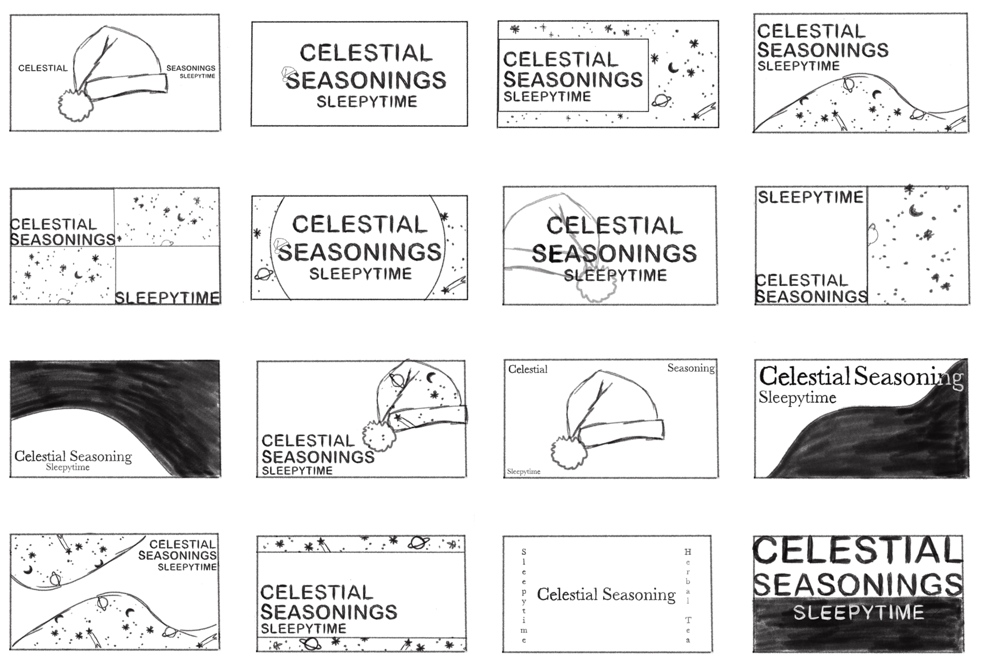
Click image to expand
Digital Drafts
Round One
Digital drafts focused on refining layout, typography, and overall system structure for Celestial Seasonings. While the direction explored ways to modernize the existing brand, it often felt constrained. There was a consistent sense of hitting a wall, as each iteration struggled to balance originality with the brand’s already well established identity.
Round 02
As the project shifted into StarDrops, the work started to feel easier and more natural. Moving away from redesigning the original brand gave more creative freedom, and the system became more clear and cohesive.
The layout still felt weak and needed more structure. The star constellation graphics also felt too literal and a bit gimmicky, which didn’t match the direction.
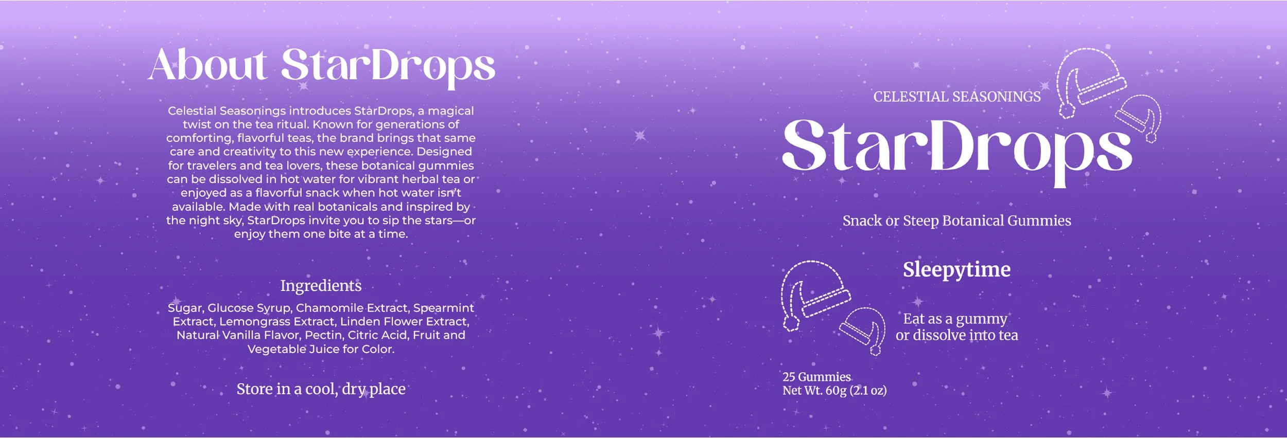
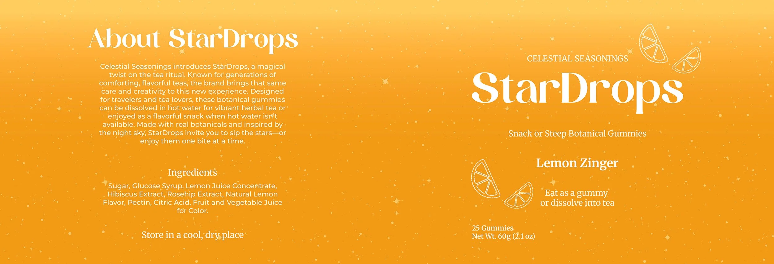
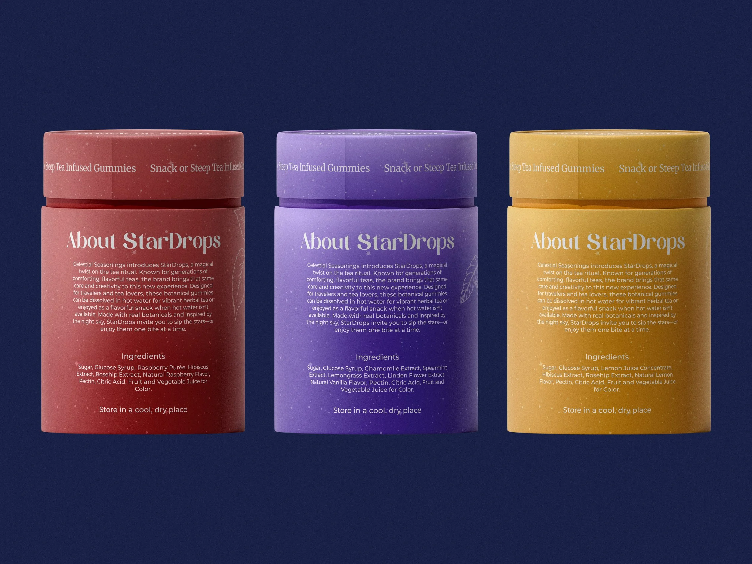
Final Design
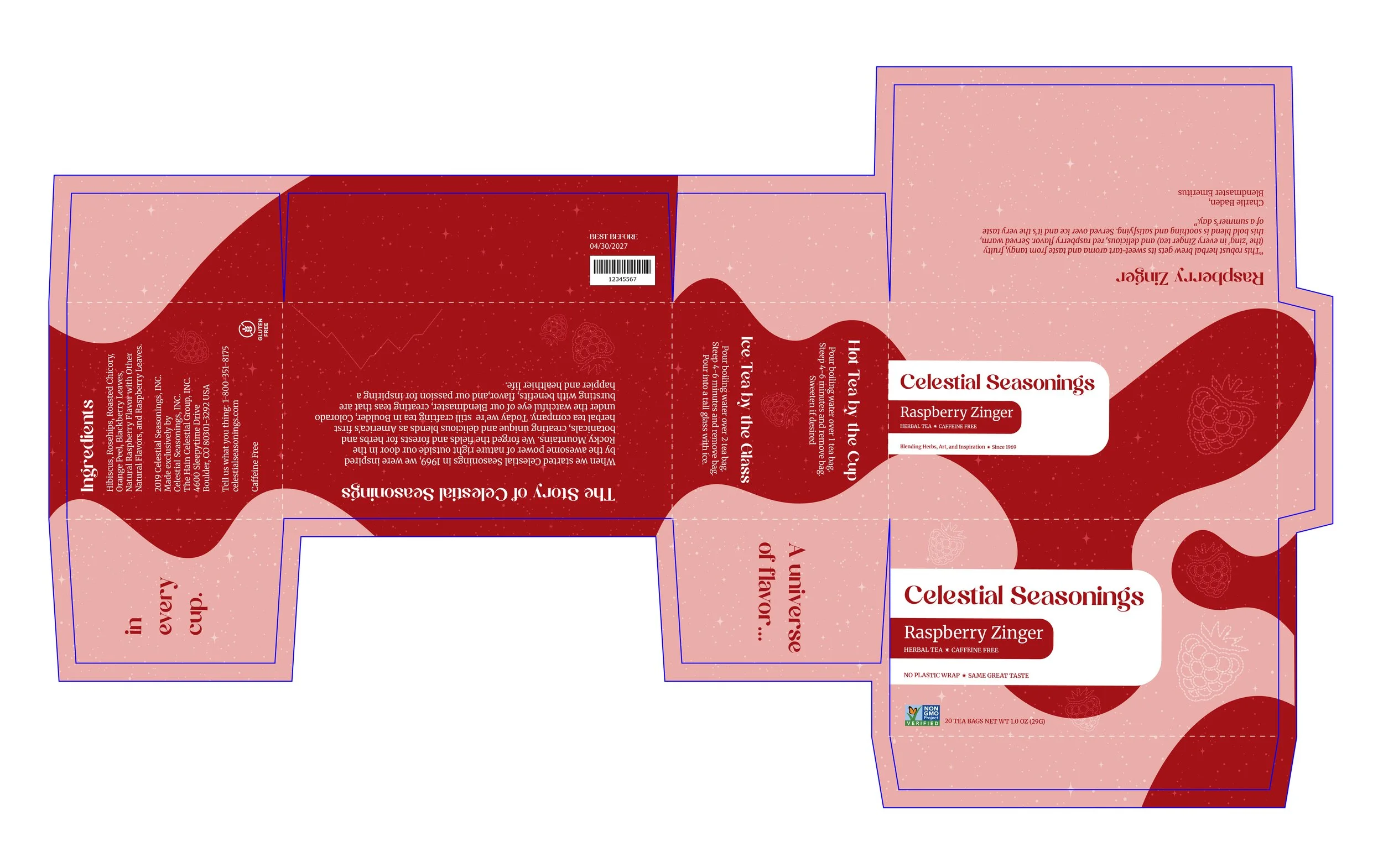
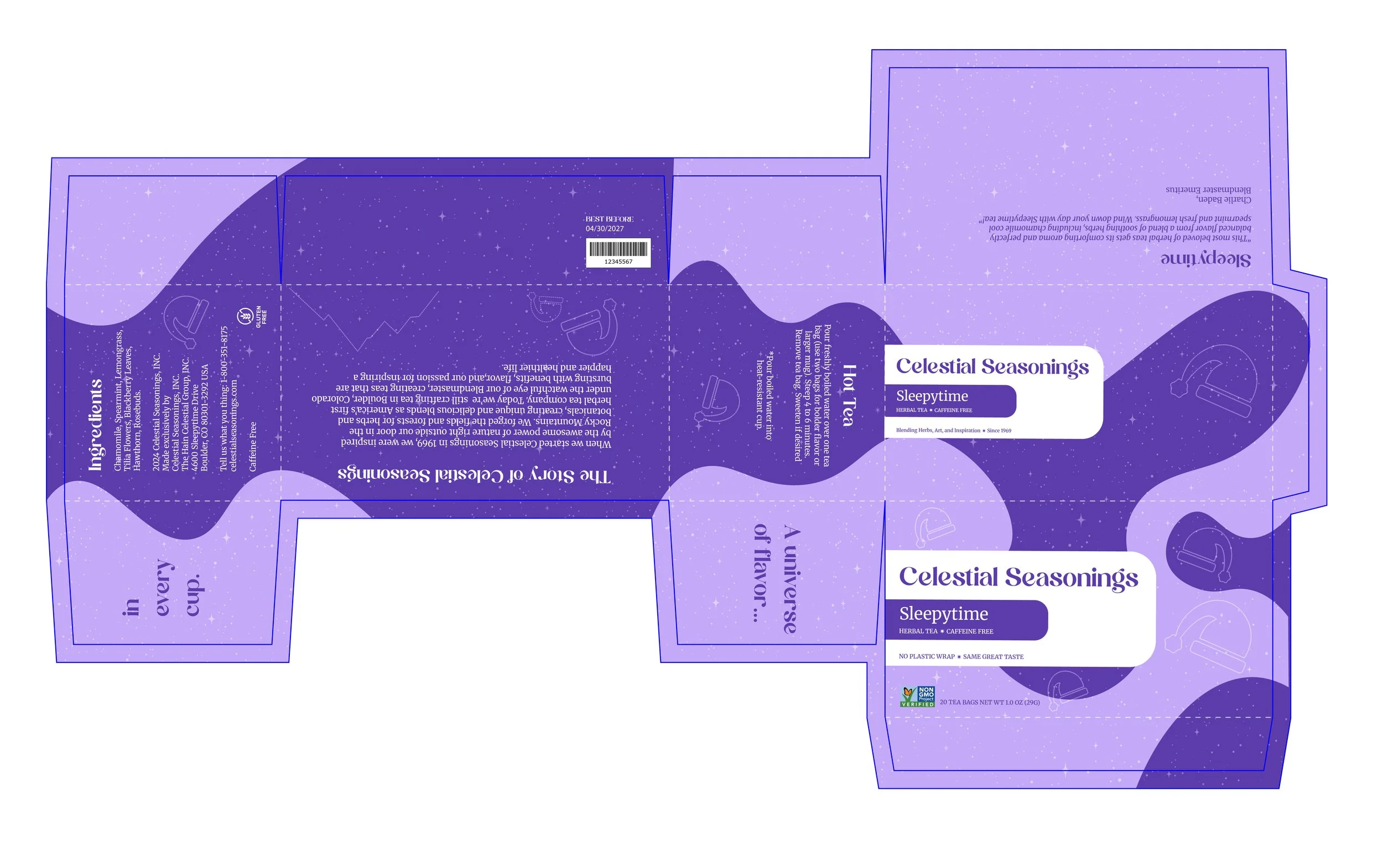
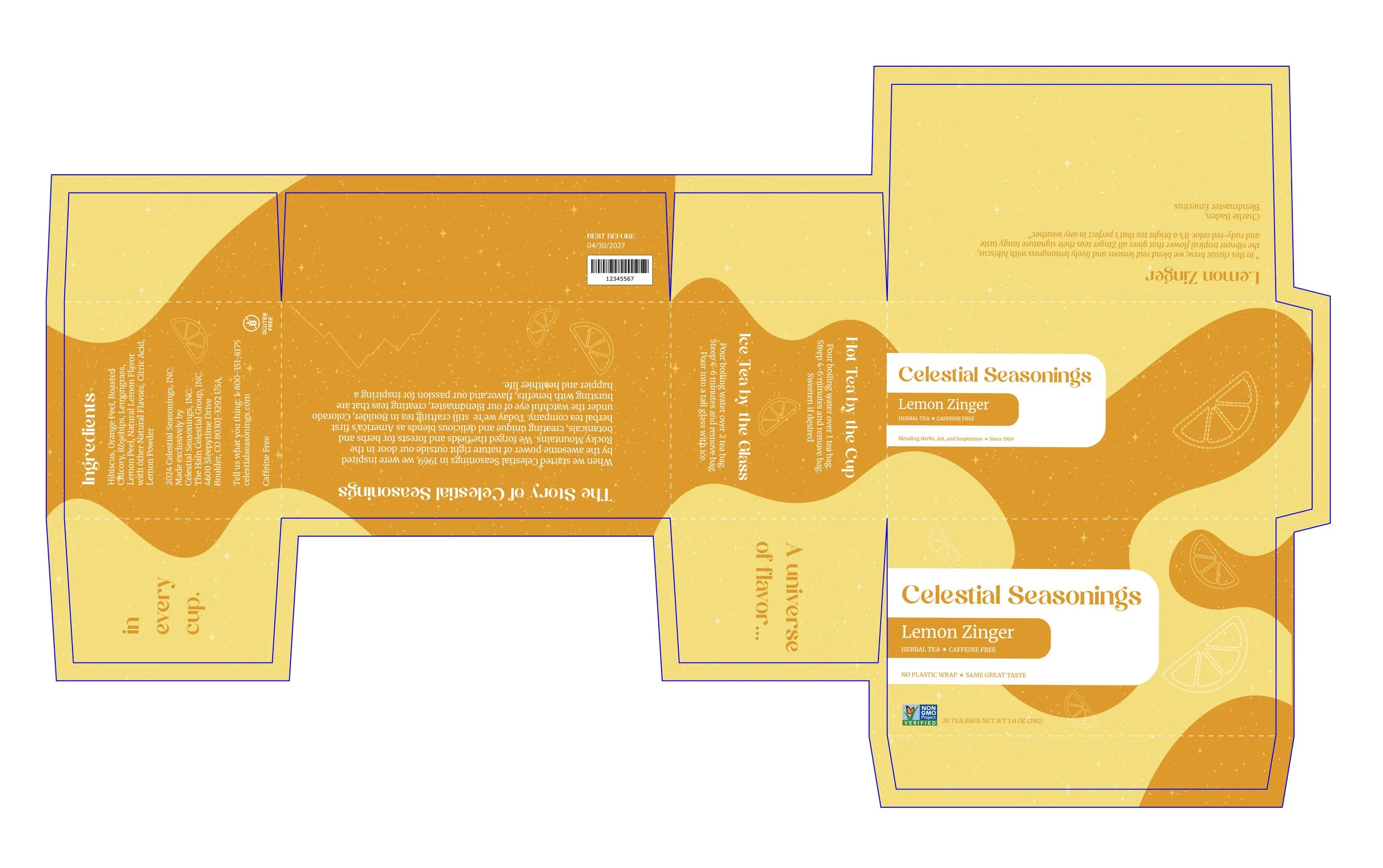
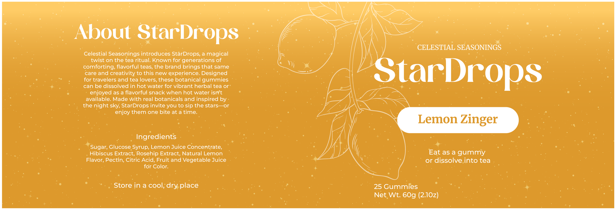
The system positions StarDrops as a playful, imaginative sister brand, using rich, vibrant hues—reds, purples, and yellows—to reference natural ingredients while creating strong shelf presence. Each flavor is distinguished by its own color system, allowing for clear differentiation within a cohesive lineup.
Typography plays a key role in shaping the brand’s personality. Calgary, Merriweather, and Montserrat work together to balance expression and readability, reinforcing a tone that feels both playful and modern. The product line features familiar blends like Raspberry Zinger, Sleepytime, and Lemon Zinger, while the packaging system expands into travel tubes and a subscription box designed for convenience and discovery.
Bold typography, vibrant color, and cohesive storytelling come together to create a brand experience that feels engaging, memorable, and easy to navigate.
Reflection
This project balanced honoring an established brand with introducing innovation, evolving from a redesign into a strategic sister brand through research driven decisions. It strengthened my skills in brand strategy, packaging, and product innovation, and reinforced how typography, color, and storytelling work together to create a cohesive system.