City Rebrand
Warsaw, Poland
Overview
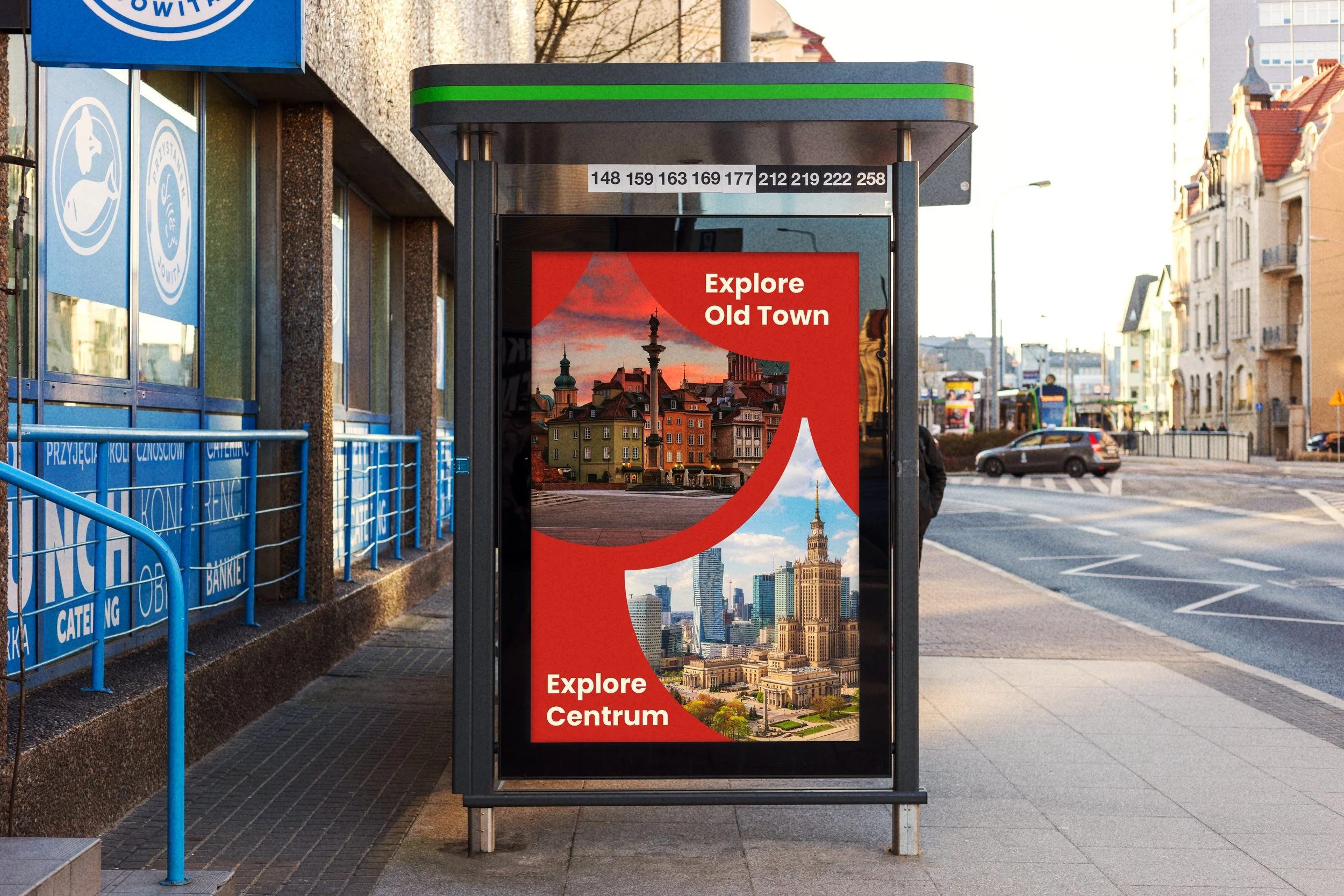
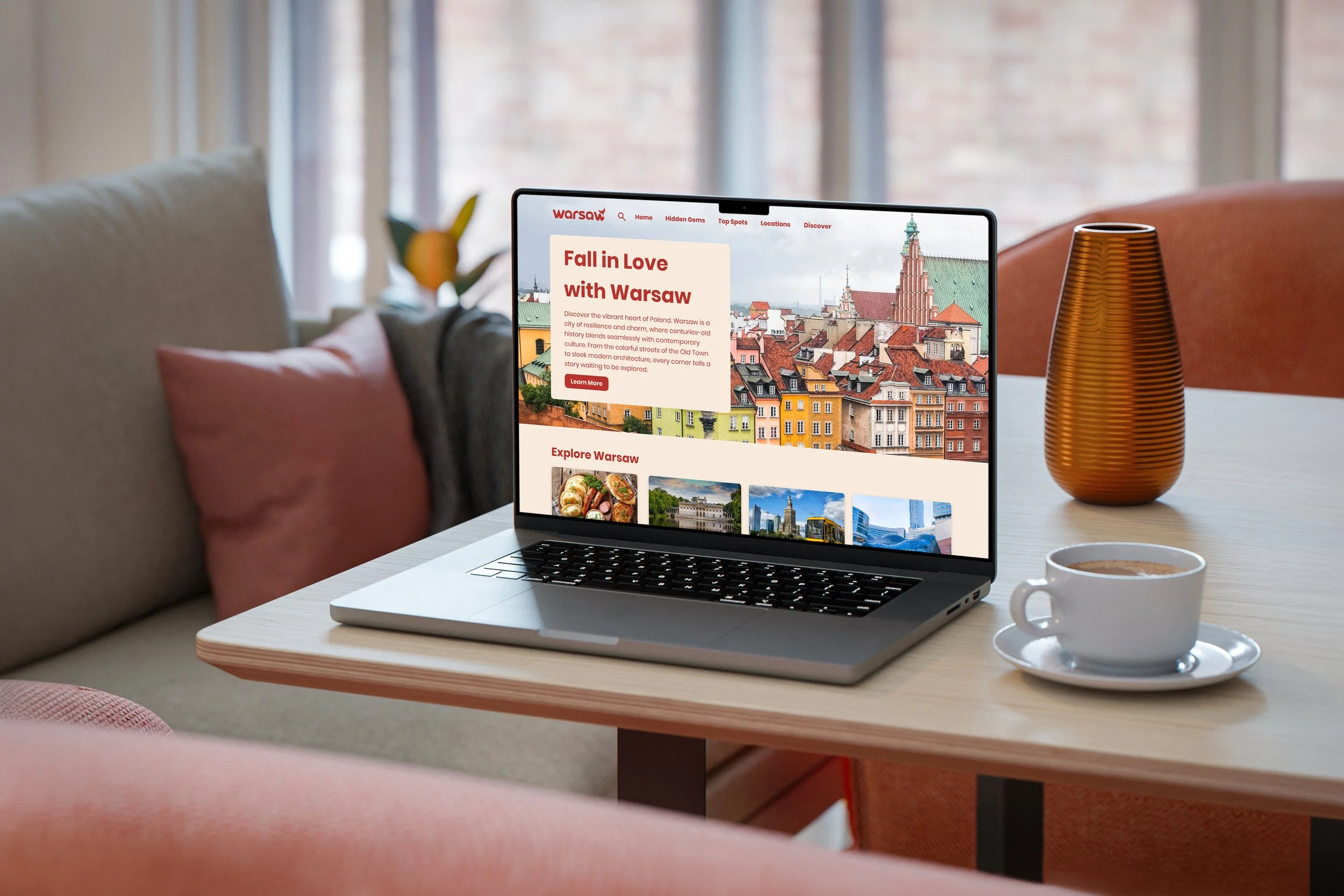
Warsaw is a city shaped by its comeback. This project creates a multichannel brand that presents Poland’s capital as a destination for modern travelers, connecting its complex history with its growth as a tech and cultural hub.
Built around the idea of the “Phoenix City” and a contemporary look, the identity feels both rooted and forward looking. It targets travelers ages 20 to 45 who value authentic experiences, especially those interested in history, art, and modern city life.
Research & Discovery
I began by diving into Warsaw's architectural and social history. The city was 85% destroyed during WWII and meticulously rebuilt using 18th-century landscape paintings as a blueprint. This unique cycle of destruction and rebirth became my central creative anchor. I wanted the brand to honor this resilience without feeling overly historical or static, ensuring the identity felt relevant to a 21st-century audience.
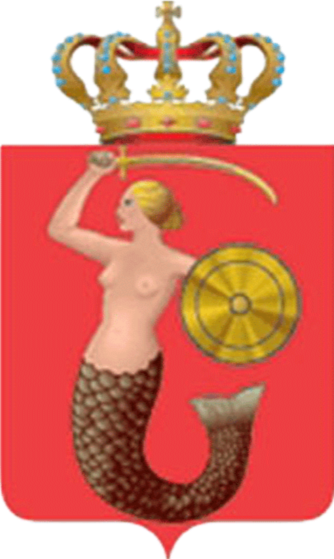
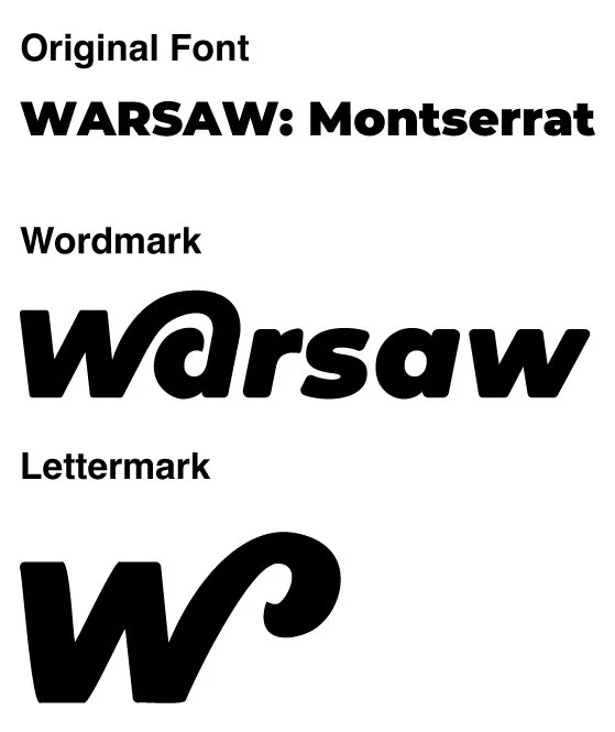
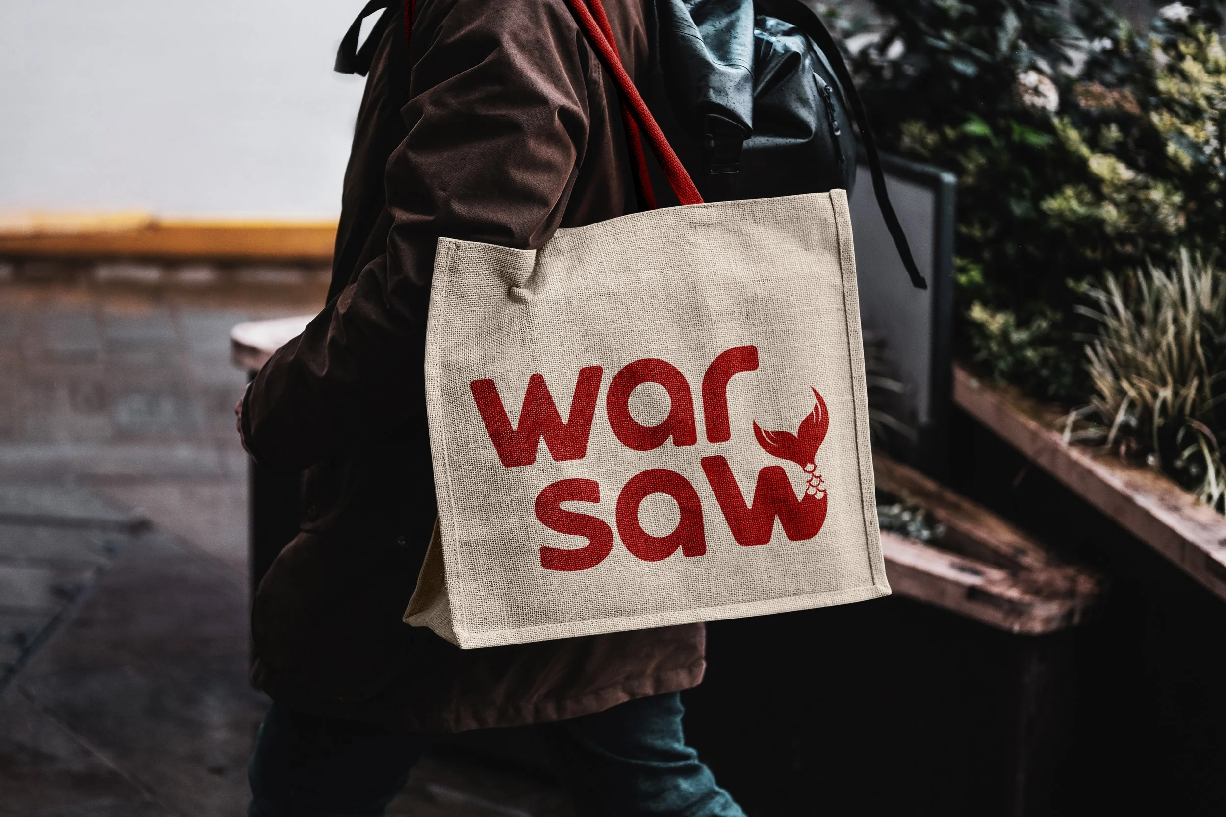
Current Logo
Previous Logos
Inspiration & Ideation
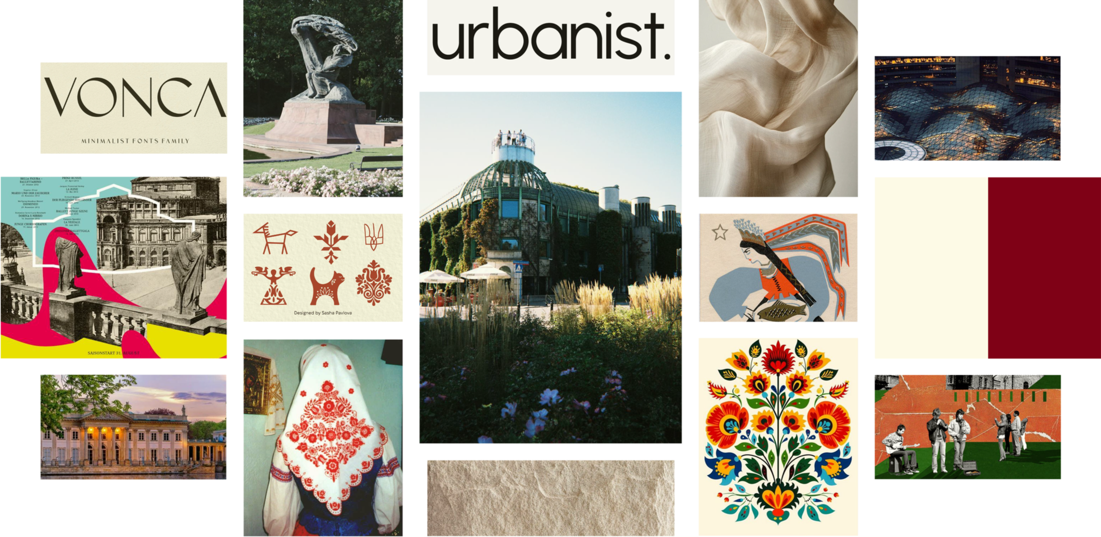
Mood Board
This mood board blends classic European architecture and sculpture with clean, modern design. Neutral tones like cream and deep red create a calm, refined palette, while touches of texture add warmth and depth. Traditional patterns and folk-style illustrations bring in detail and character without overwhelming the composition.
Minimal typography and structured layouts keep everything clear and balanced. The mix of historic visuals and modern elements creates a look that feels thoughtful, elevated, and quietly expressive.
Click image to expand
Sketches
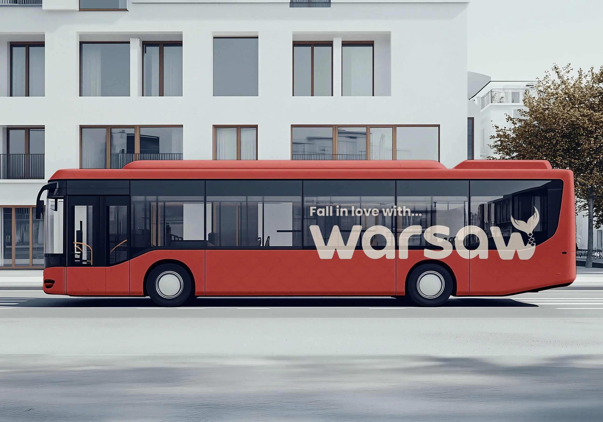
Early concepts explored building Warsaw’s identity into its name. Elements like the Vistula River, Frédéric Chopin, and the Syrenka (Warsaw’s mermaid) were tested. The strongest direction came from integrating the mermaid’s tail into the typography, connecting the city’s legend with a modern word mark.

Click image to expand
Digital Drafts
Round One
This phase explored three different directions. One version used a wave form to reference the Vistula River, another focused on a mermaid tail, and a third experimented with a heart shape inspired by Wielka Orkiestra Świątecznej Pomocy, a well known Polish campaign symbolized by red hearts. While each concept connected to Warsaw’s culture, the forms felt inconsistent and sometimes unclear. The tail in particular had proportion issues and did not always read as a mermaid.
Round 02
The second round refined the direction by focusing on a clearer, simplified mermaid tail. Adjusting the proportions and reducing complexity improved readability and balance. This created a more cohesive and flexible mark that feels approachable while still reflecting Warsaw’s identity. However, the form still needed refinement, as it continued to read more like a whale than a mermaid tail.
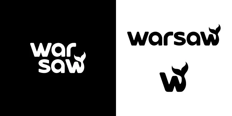
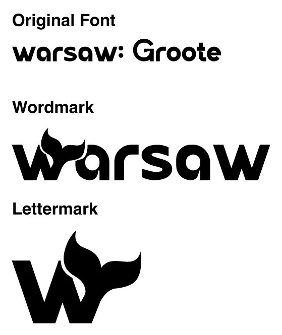
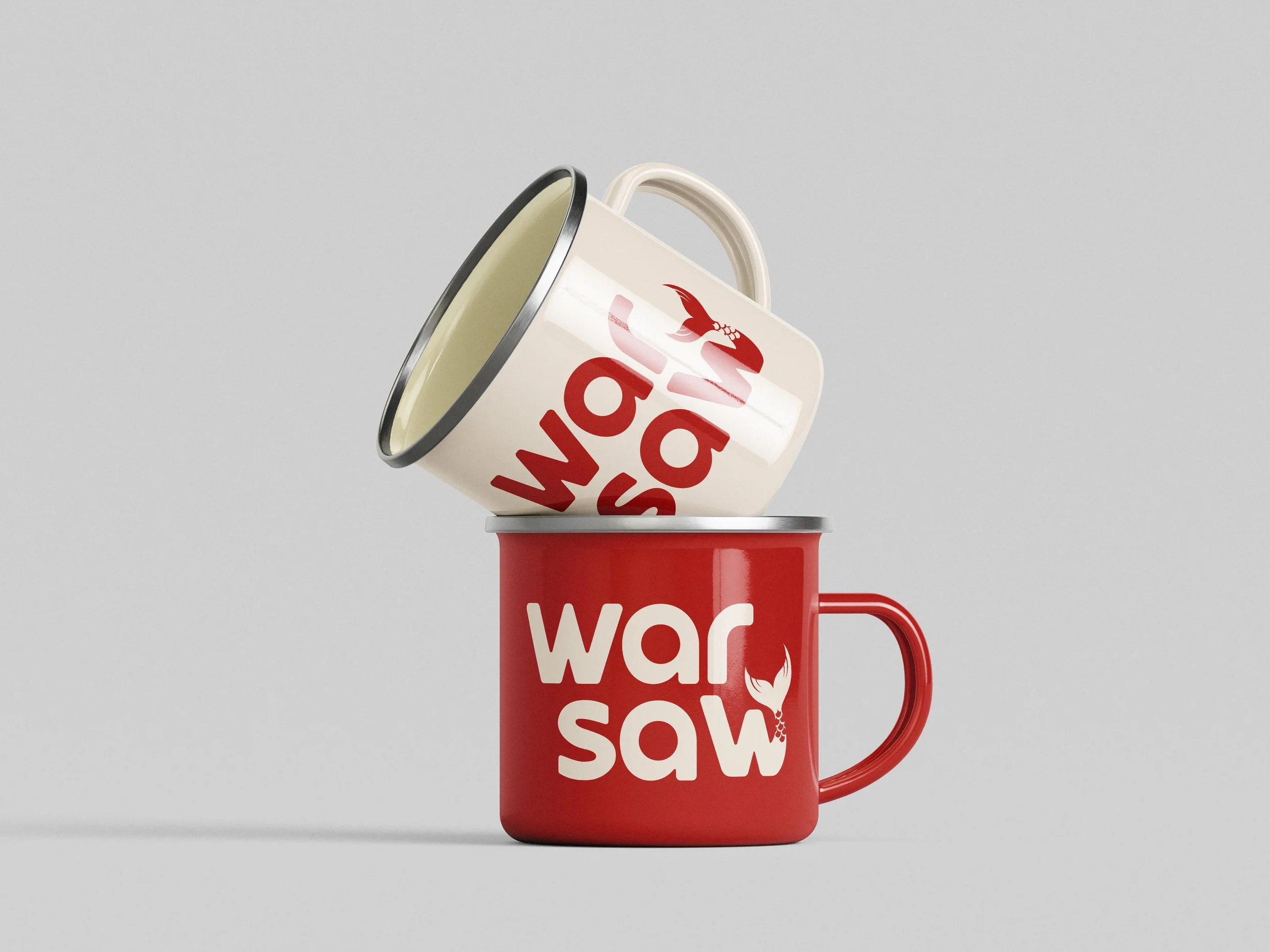
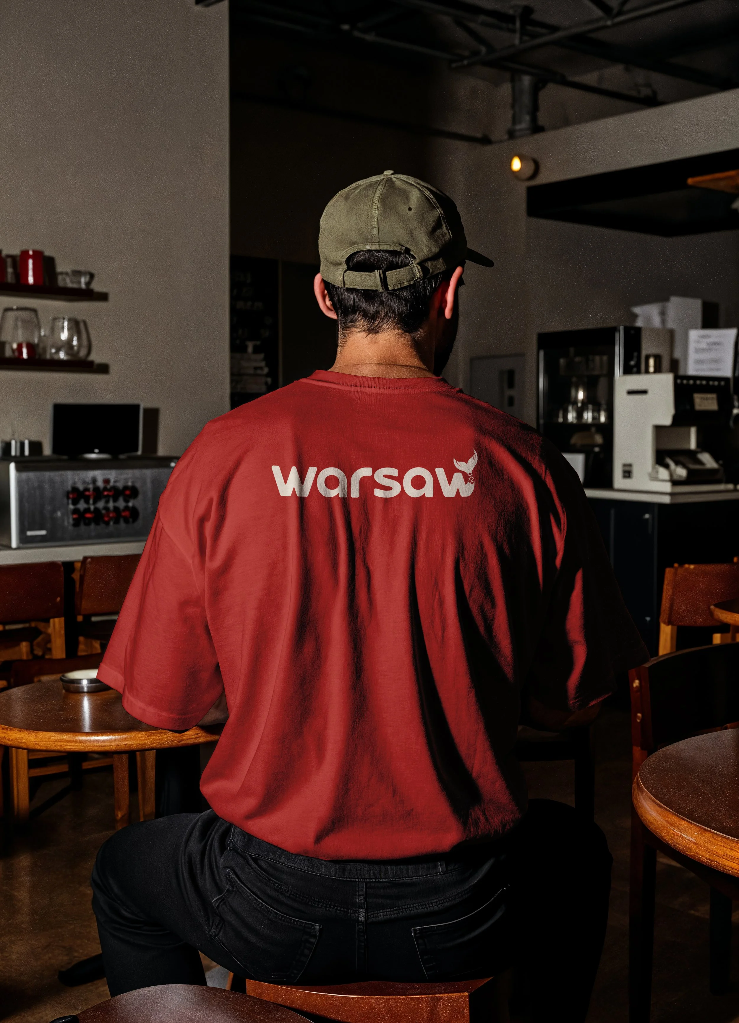
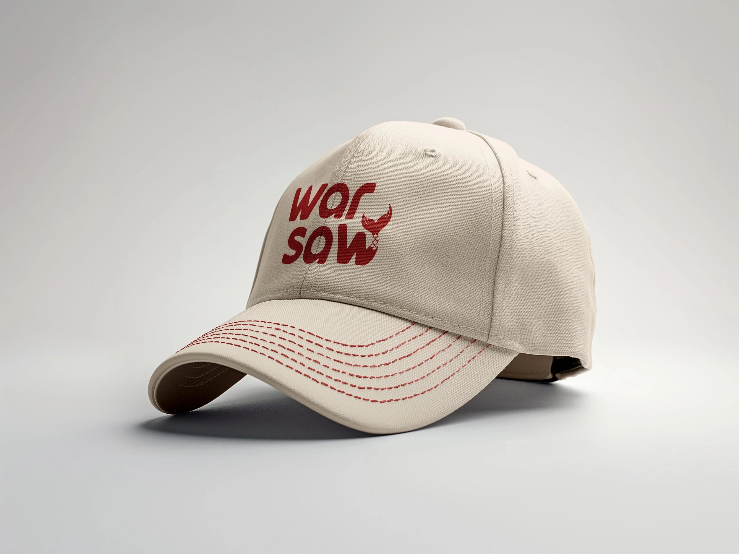
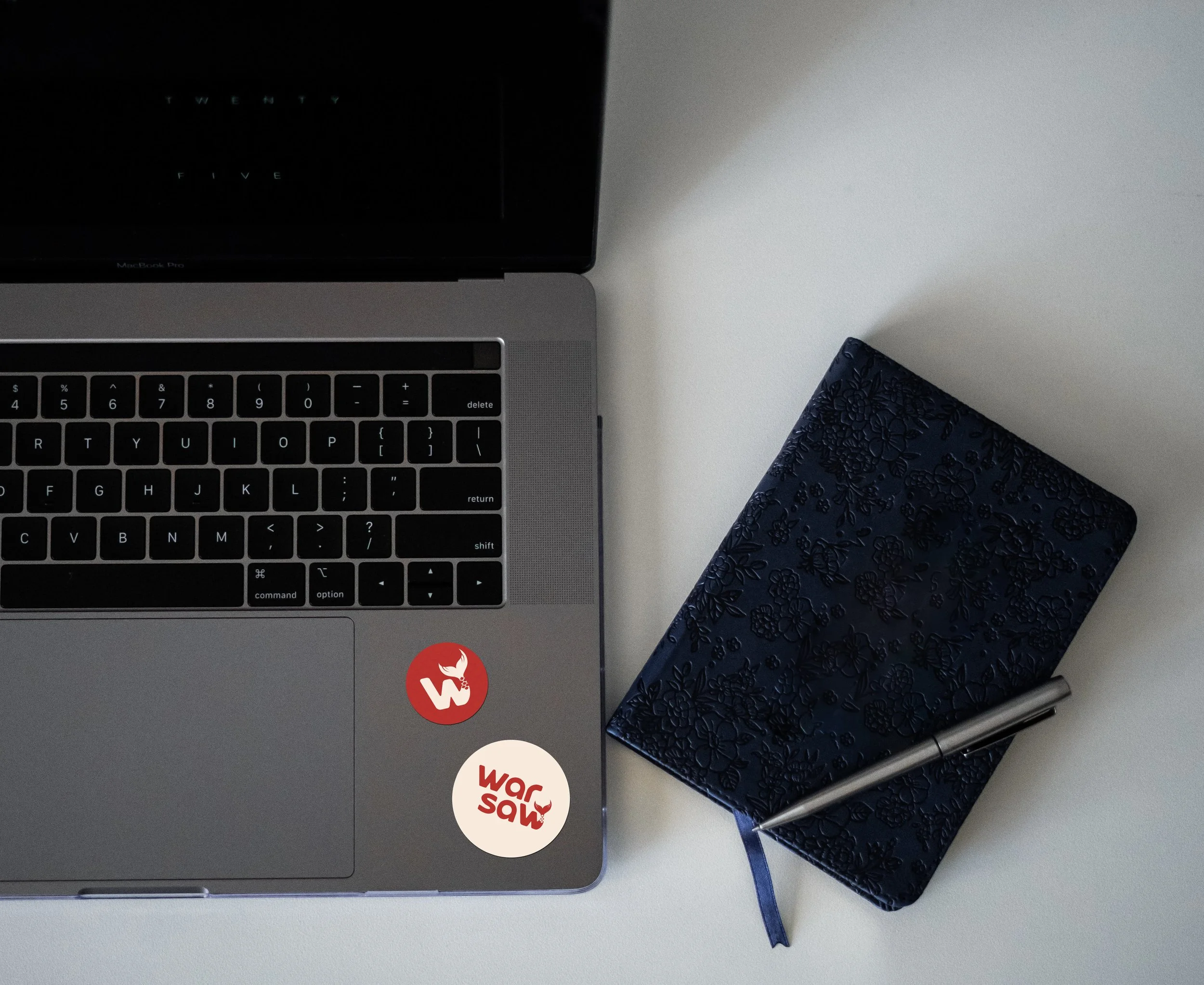
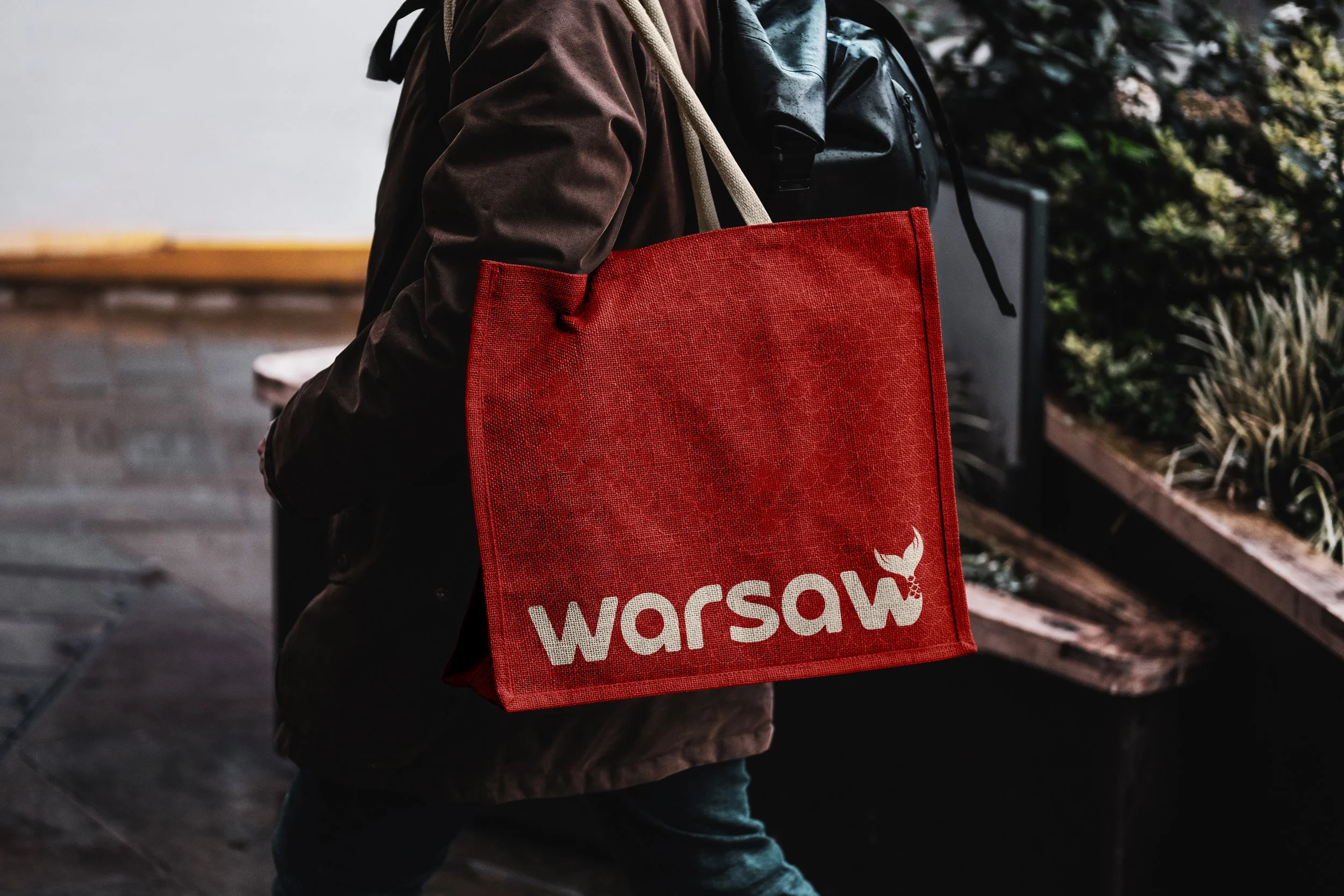
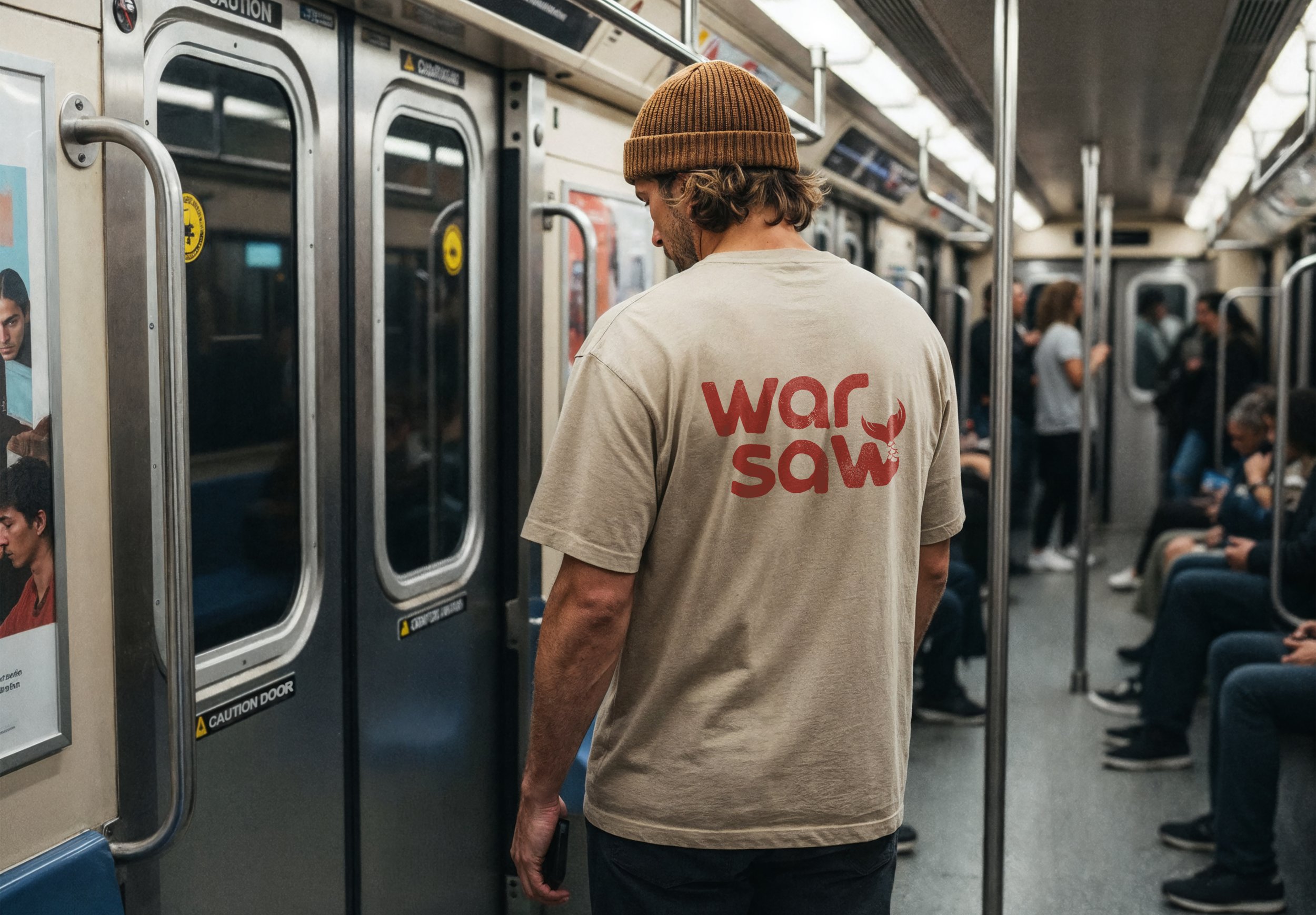
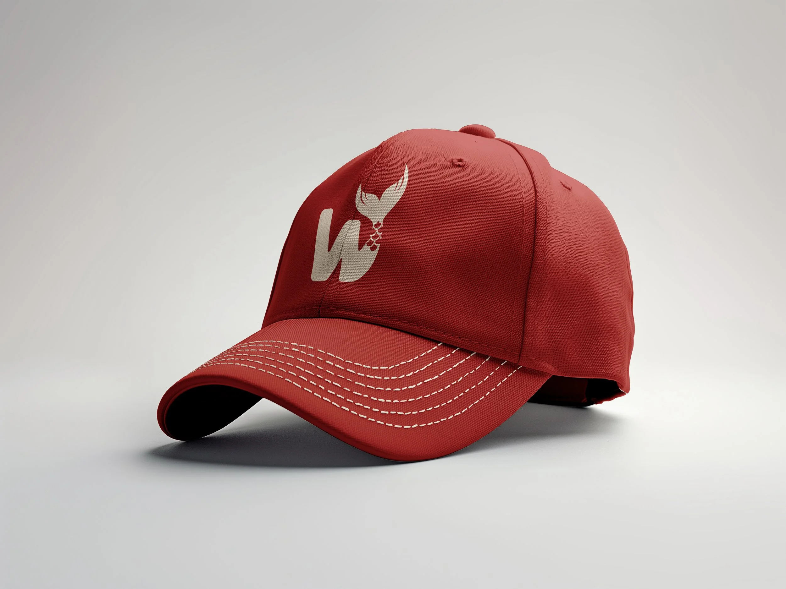
Final Design
Digital development focused on scalability and flexibility across applications. Early iterations revealed proportion issues, with the tail reading more like a whale than a mermaid; refining the silhouette improved both clarity and symbolism while maintaining an approachable feel without the rigidity often seen in municipal branding.
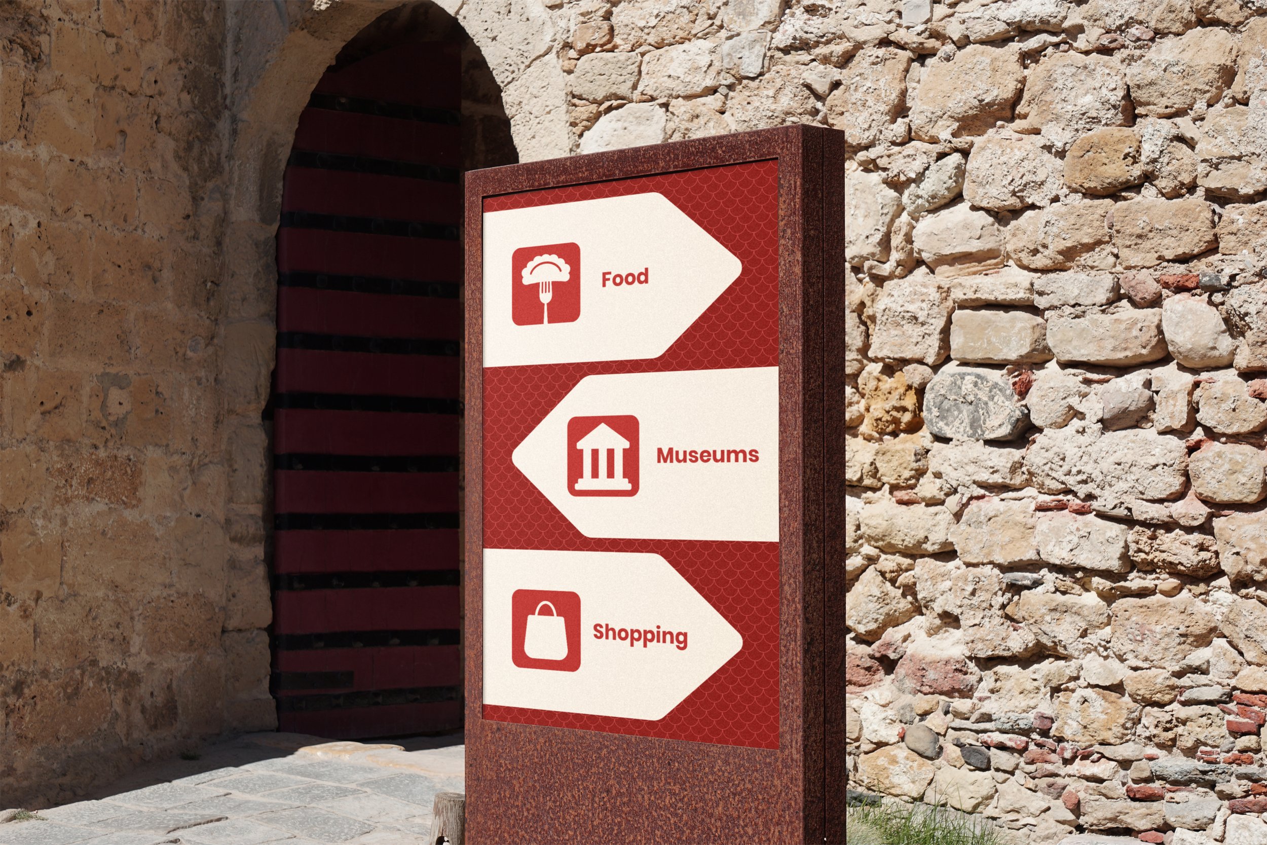
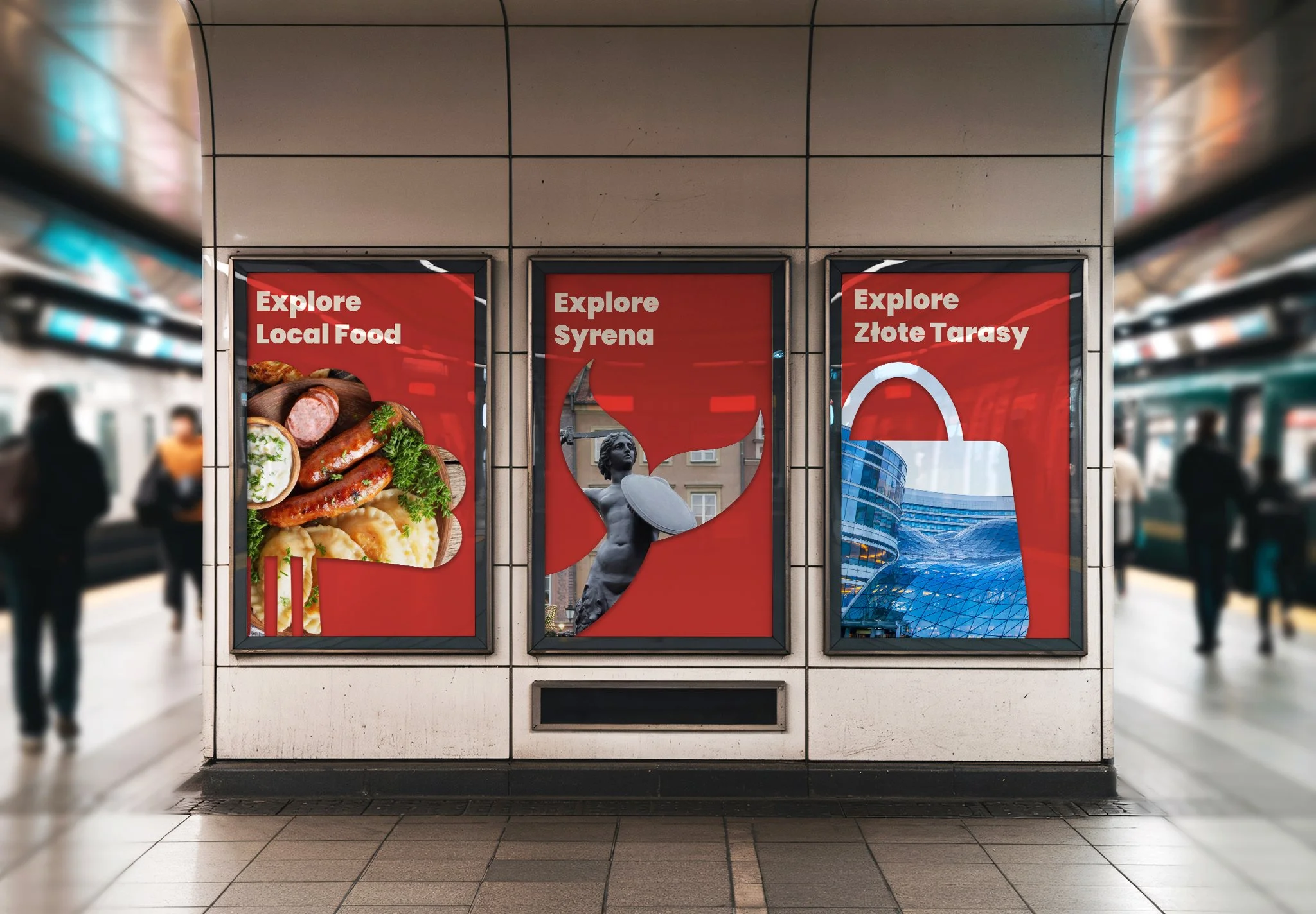
The palette references national identity through a bold red, conveying energy and strength, balanced by a soft neutral that adds warmth and historical depth. Together, they create a high-contrast system that is bold, functional, and easy to navigate.
Typography establishes a clear, modern voice. Groote is used for display, offering strong structure with subtle curves, while Poppins supports body copy with clarity across digital and print. The pairing creates a clean hierarchy that feels both refined and accessible.


Reflection
This project focused on translating a complex history into a clear, modern identity. Using the mermaid as a subtle detail rather than a literal symbol became a key decision. Iterating on elements like the tail helped improve both clarity and meaning.
Designing across multiple applications strengthened my understanding of how to keep an identity cohesive and flexible. The result is a brand that feels strong, intentional, and rooted in story.