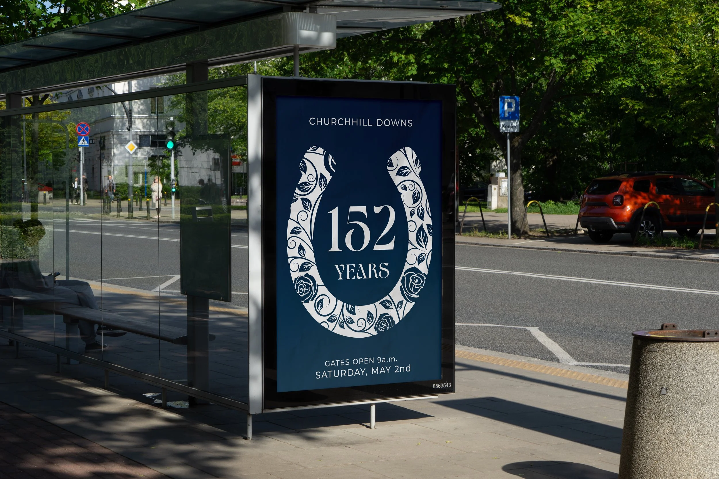
Event Branding
Kentucky Derby
Overview
This project reimagines the visual identity of the Kentucky Derby, a sporting and cultural event defined by tradition and spectacle. The project began with a poster design, which was then expanded into a broader identity system.
The redesign balances boldness and elegance, capturing both the energy of the race and its refined Southern character. Emphasizing movement, style, and prestige, the approach positions the Derby as a cultural event that extends beyond sport into fashion and social ritual.
It targets an adult audience, primarily ages 30 to 65, with younger attendees drawn to its social and stylistic appeal. The audience is largely middle to high income, seeking an experience that blends excitement, tradition, and social appeal. Some engage through racing and betting, while others are drawn to fashion, culture, and celebration, united by an appreciation for elegance and spectacle.
Research & Discovery
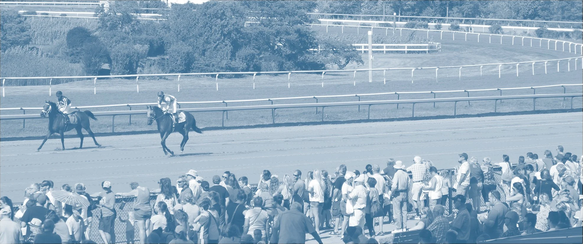
Research focused on the history, traditions, and identity of the Kentucky Derby. As the longest running sporting event in the United States, its legacy helped guide the direction while showing the need to balance tradition with a more modern look.
Looking at fashion, typography, color, and promotional materials showed how the event is presented. Statement hats and bright seasonal colors highlighted a strong connection between movement, style, and atmosphere.
Observing the audience showed the Derby is both a race and a social event, where fashion and celebration matter just as much as the sport. The key insight was to capture a sense of motion and elegance while keeping the excitement of the event.
Inspiration & Ideation
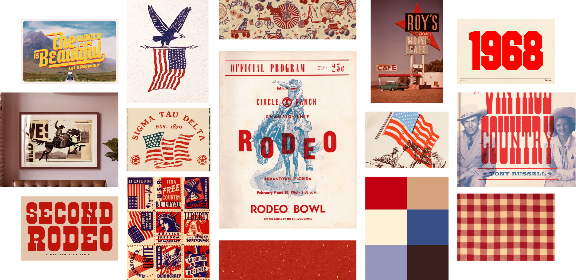
Mood Board
The visual style is inspired by vintage Americana, combining a nostalgic feel with energy and Southern charm. It pulls from mid-century design, equestrian imagery, expressive typography, gingham patterns, and worn poster textures. Collegiate-style emblems and subtle patriotic details help give it structure and a sense of history.
The color palette uses red, blue, cream, and deep neutrals for a timeless look. Bold typography and layered layouts add movement, while the mix of texture and clean design keeps everything feeling clear, modern, and grounded in tradition.
Click image to expand
Sketches
Sketches explored composition, hierarchy, and storytelling, starting with a poster that later grew into a full identity. Ideas ranged from more formal, centered layouts to dynamic, angled compositions inspired by vintage stamps and printed pieces. Some concepts focused on fashion and social elegance, while others highlighted the energy of racing through horse and jockey silhouettes with bold type. Playing with scale, line, and contrast helped find a balance between movement and refinement.
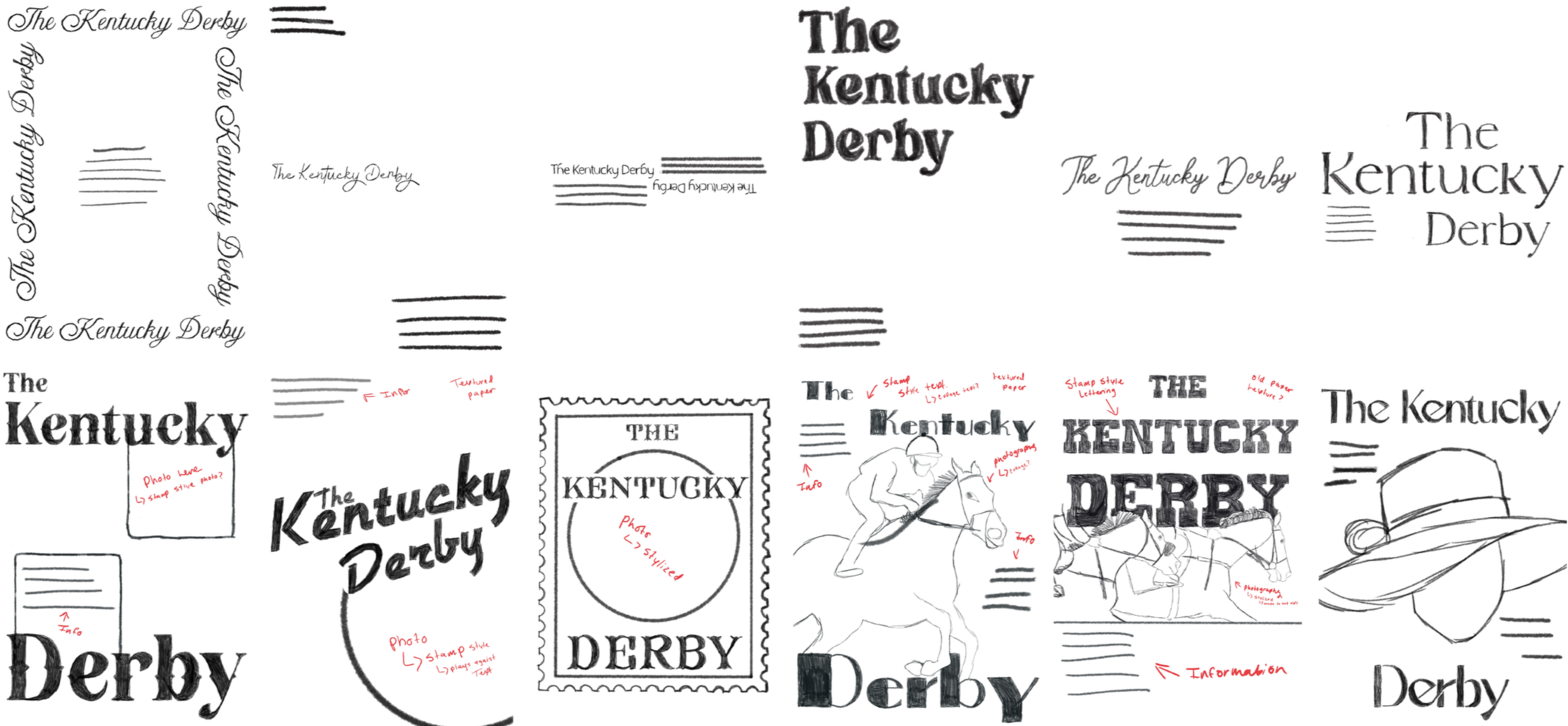
Click image to expand
Digital Drafts
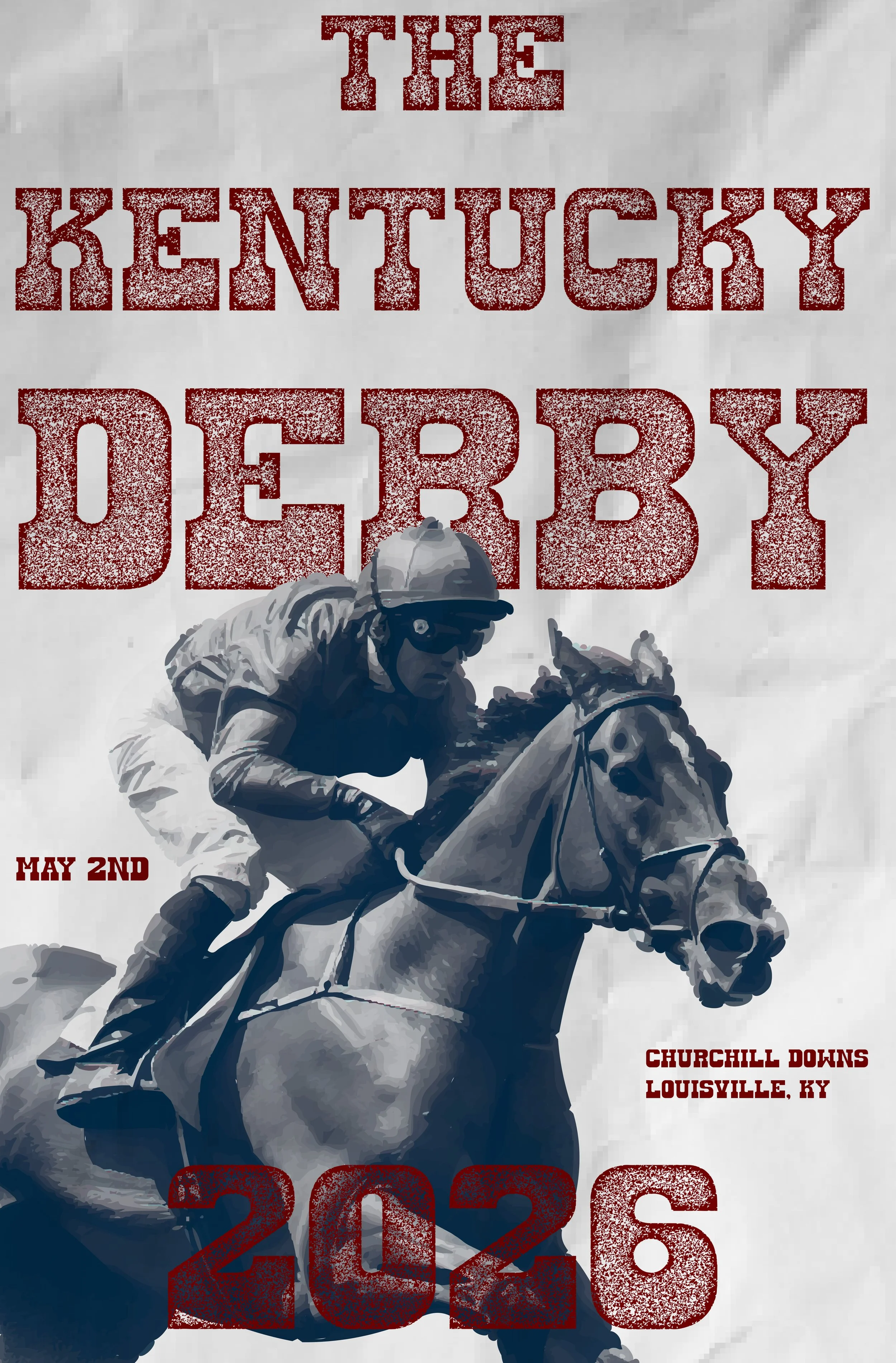
Round One
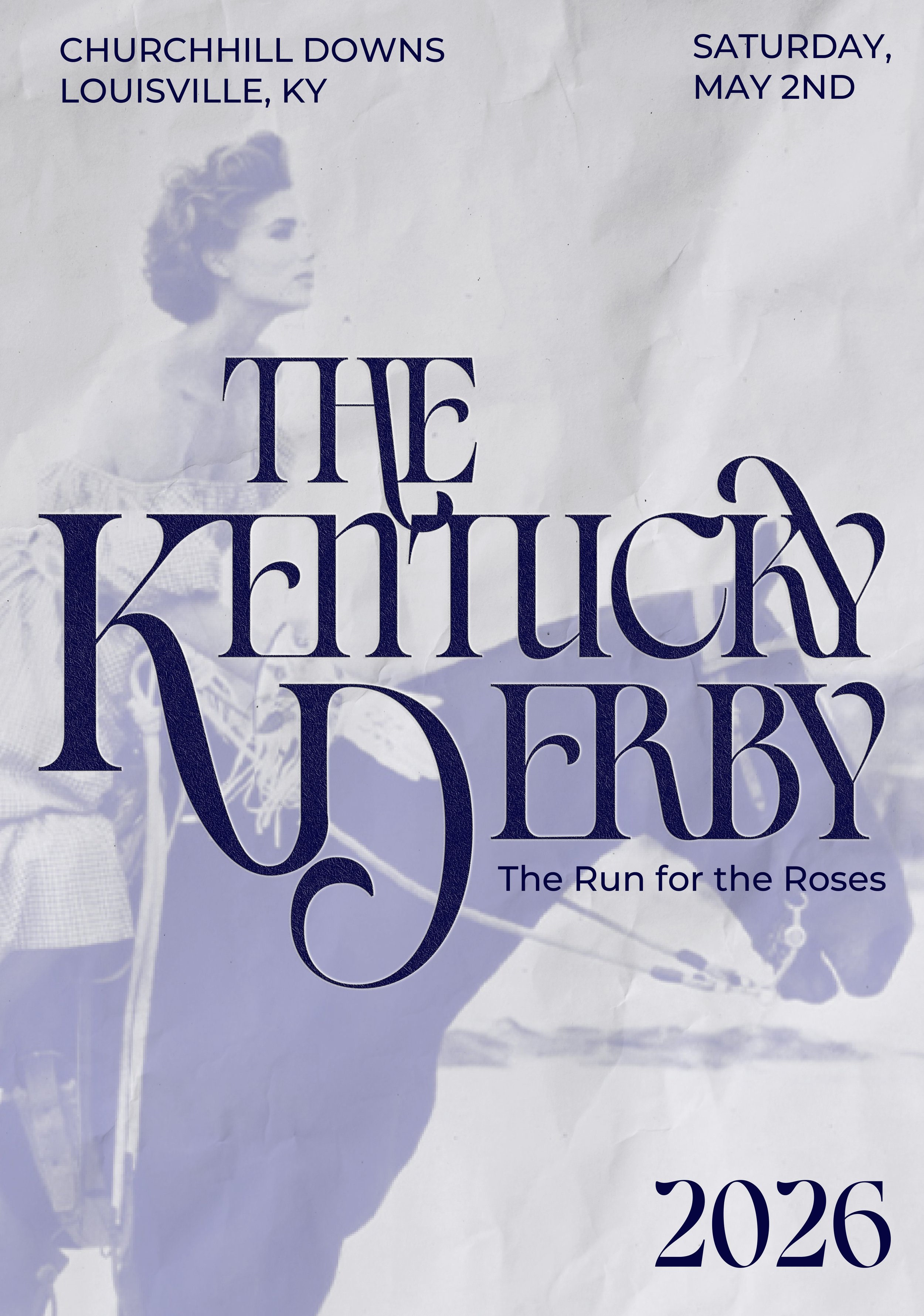
This phase focused on refining layout, typography, and hierarchy across the early poster ideas. I tested different type styles, compositions, and color options to find a strong direction. Some ideas worked well, but overall it felt a bit inconsistent, and I struggled to balance the energy of the race with a more refined look.
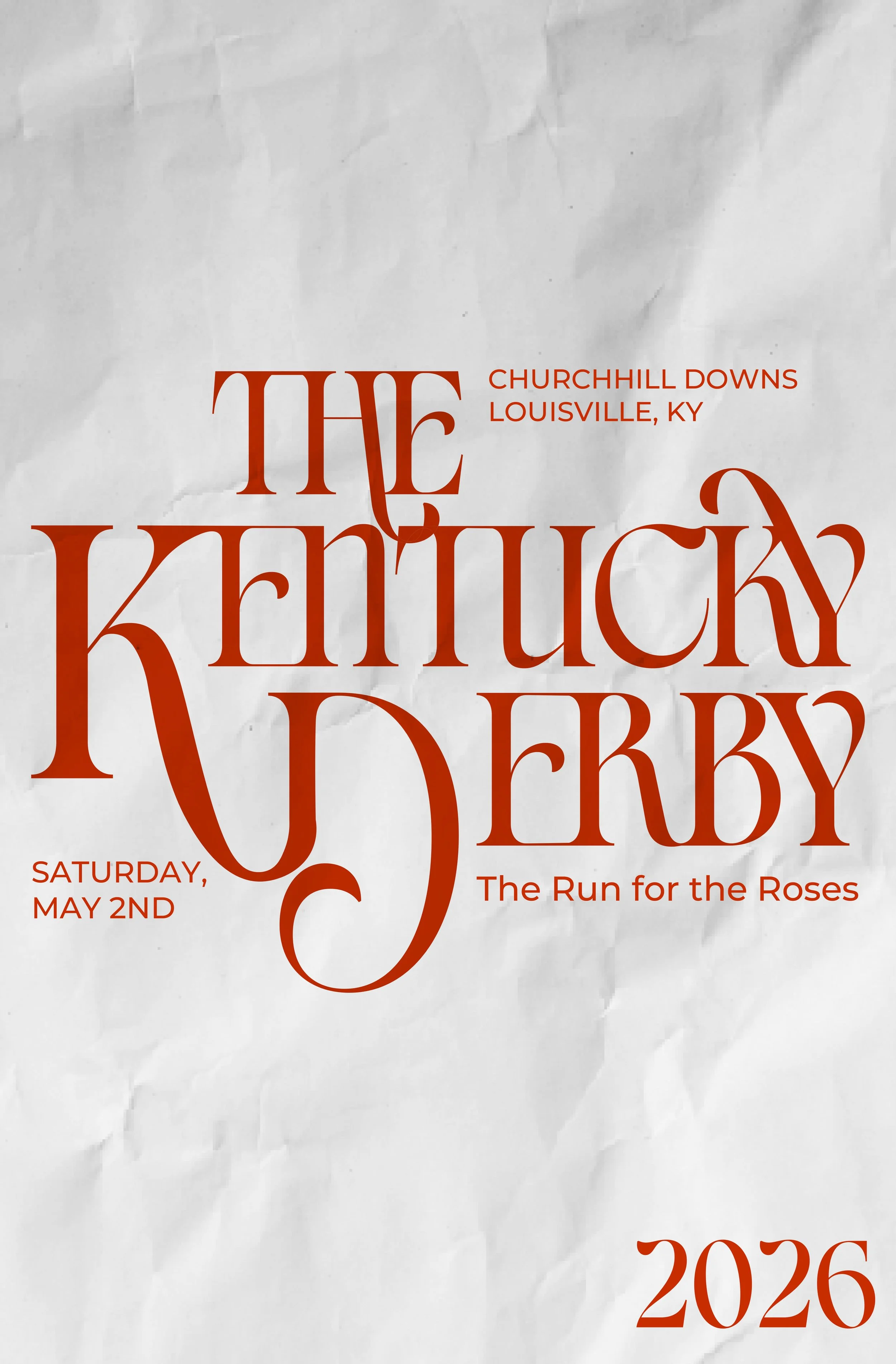
Round 02
In the second round, the direction became much clearer. Simplifying the layout and tightening the color palette improved readability and flow. The typography felt more intentional, and everything started to come together, better capturing both the energy and elegance of the Derby in a more cohesive way.
However, it still needed refinement. The main image didn’t fully support the composition or tone, so I replaced it with a stronger visual that better matched the direction. This final adjustment helped unify the design and create a more balanced, resolved outcome.
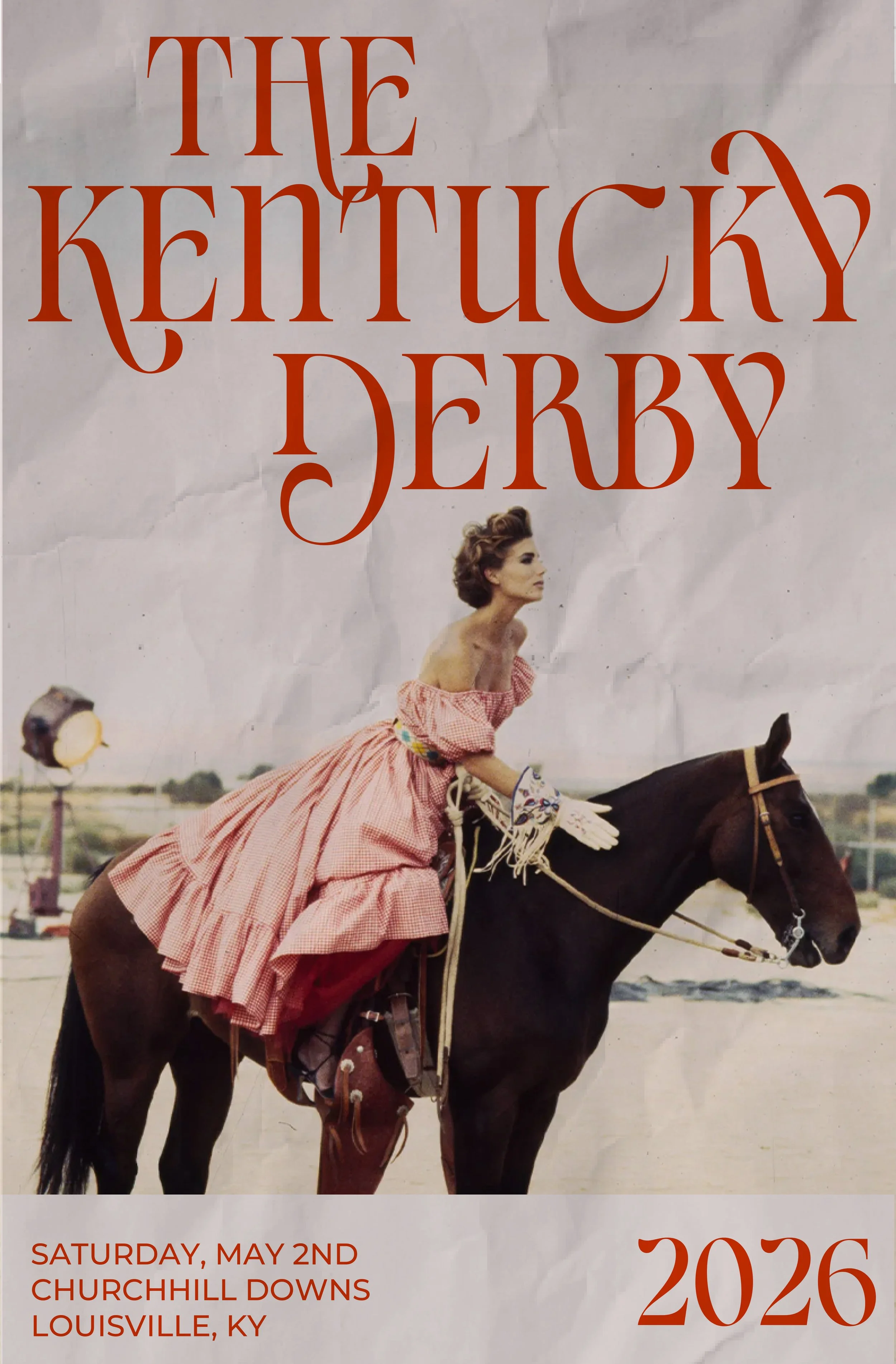
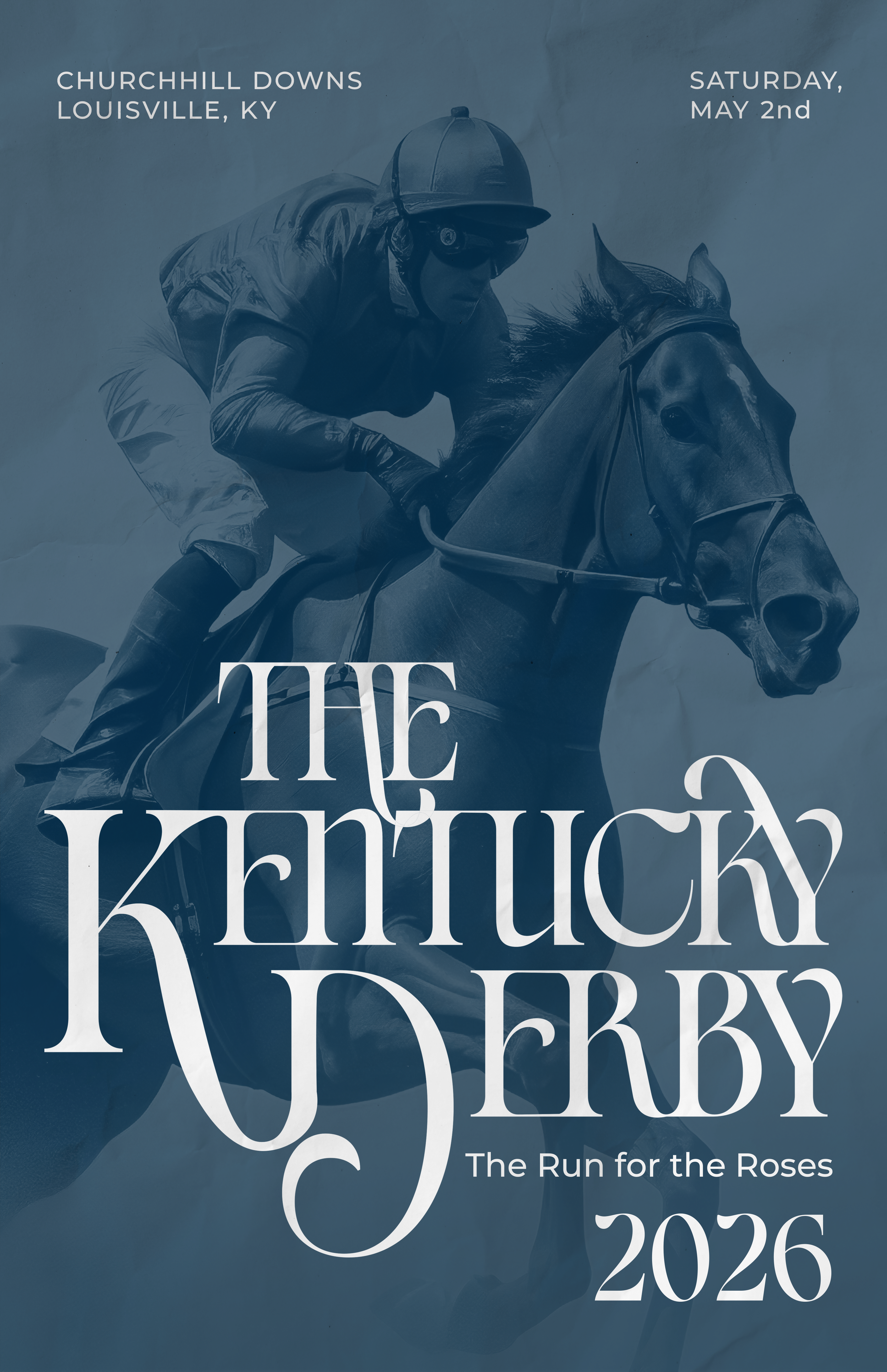
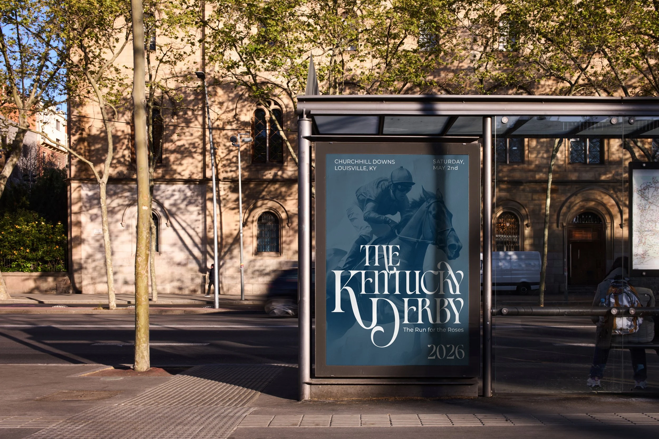
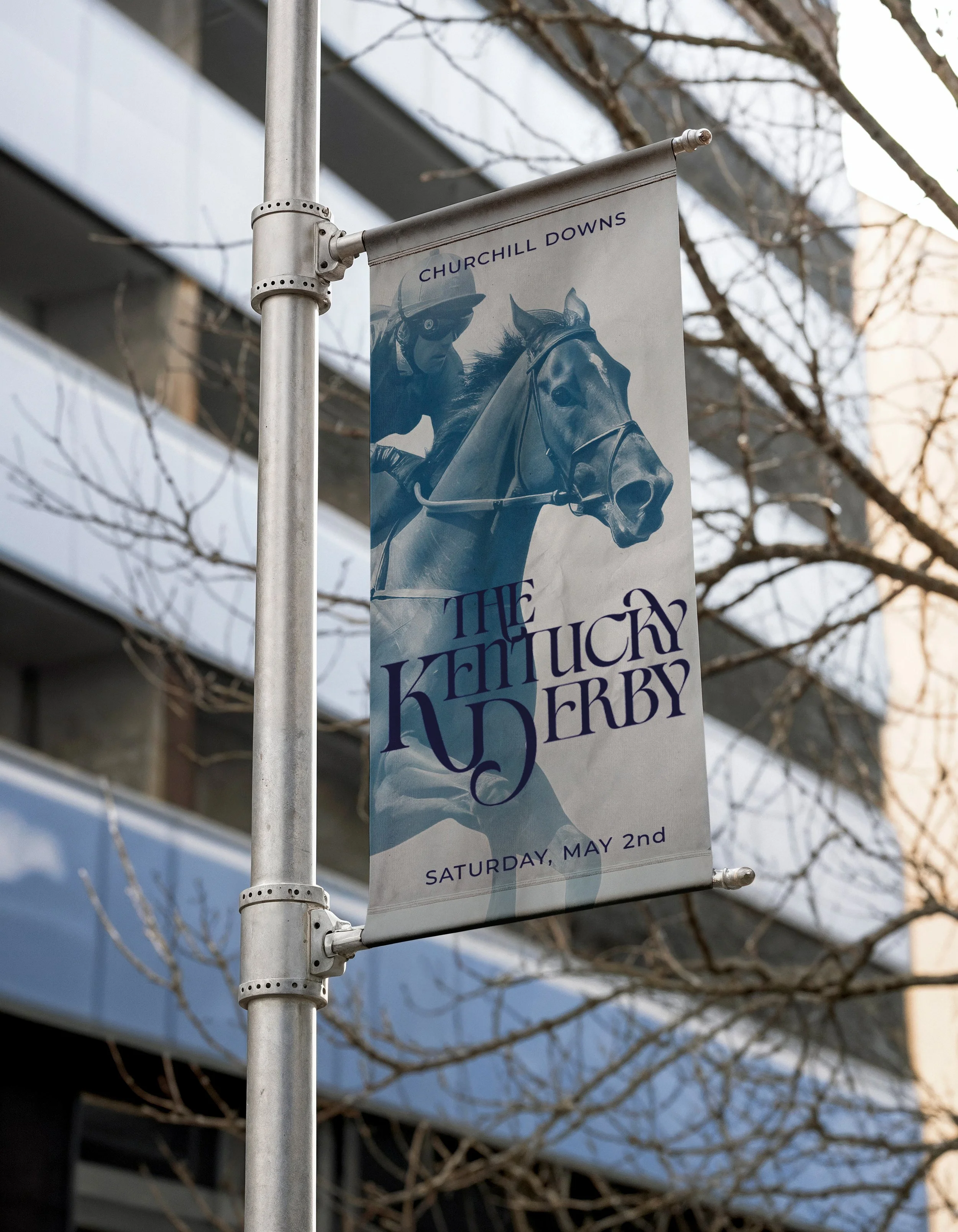
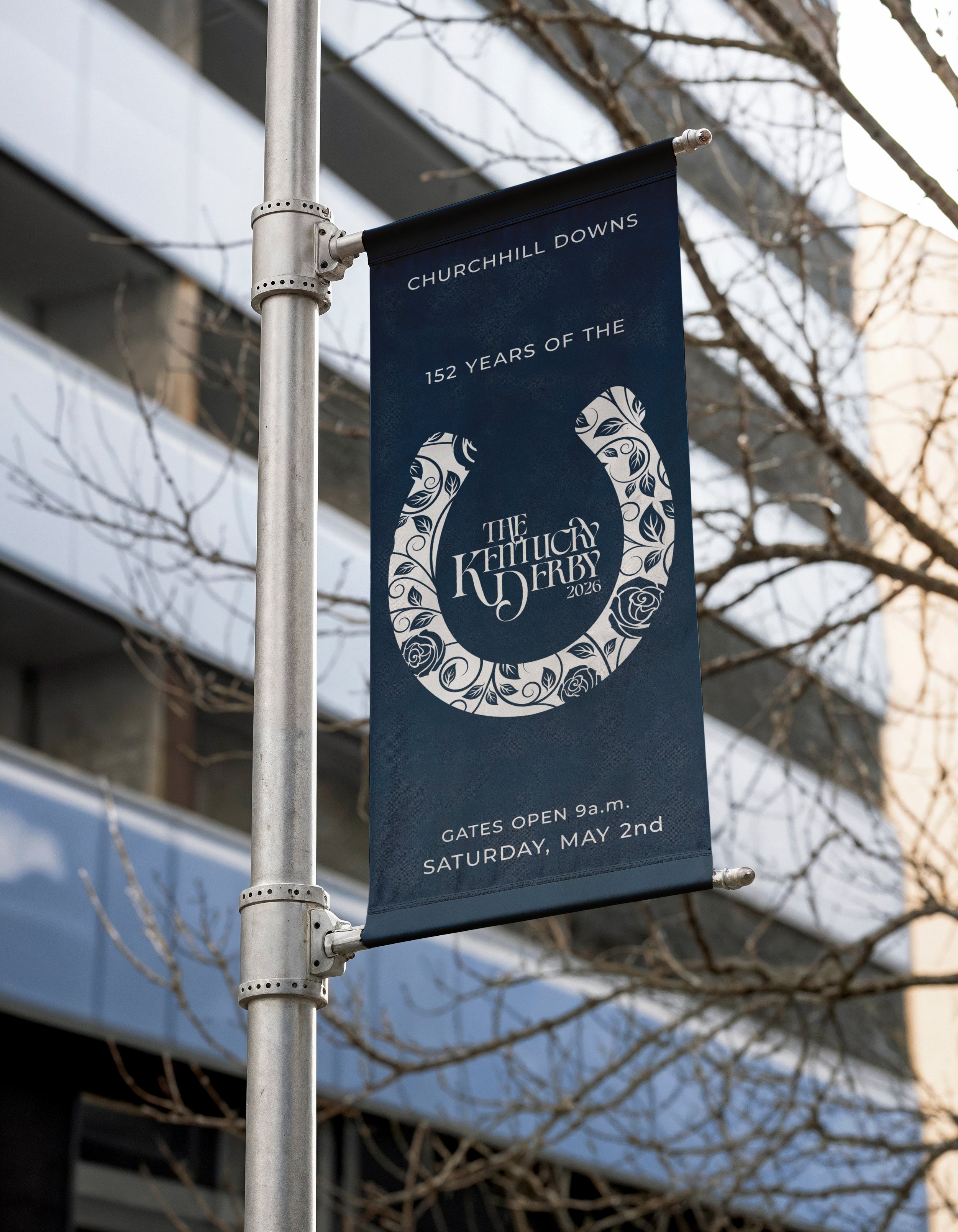
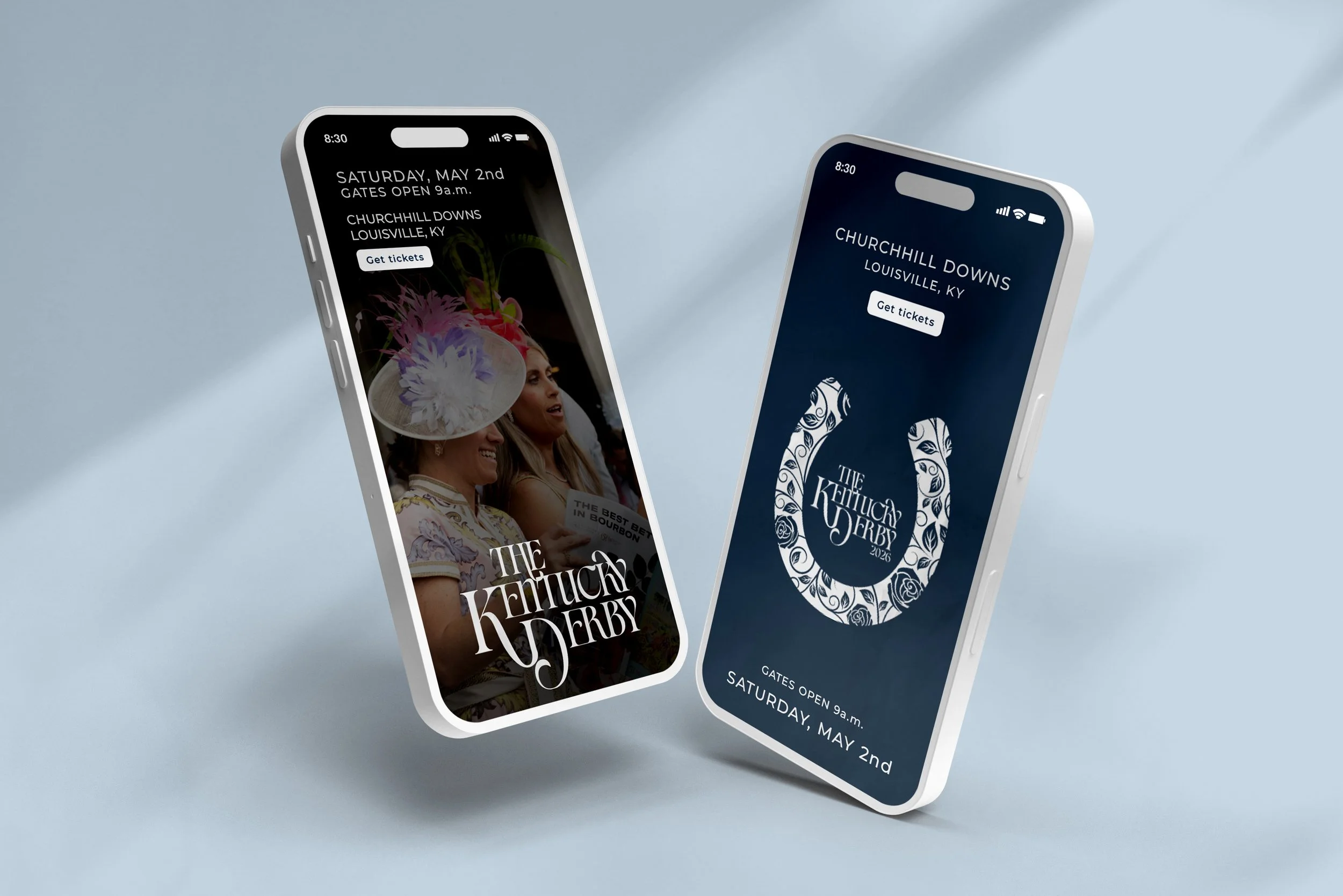
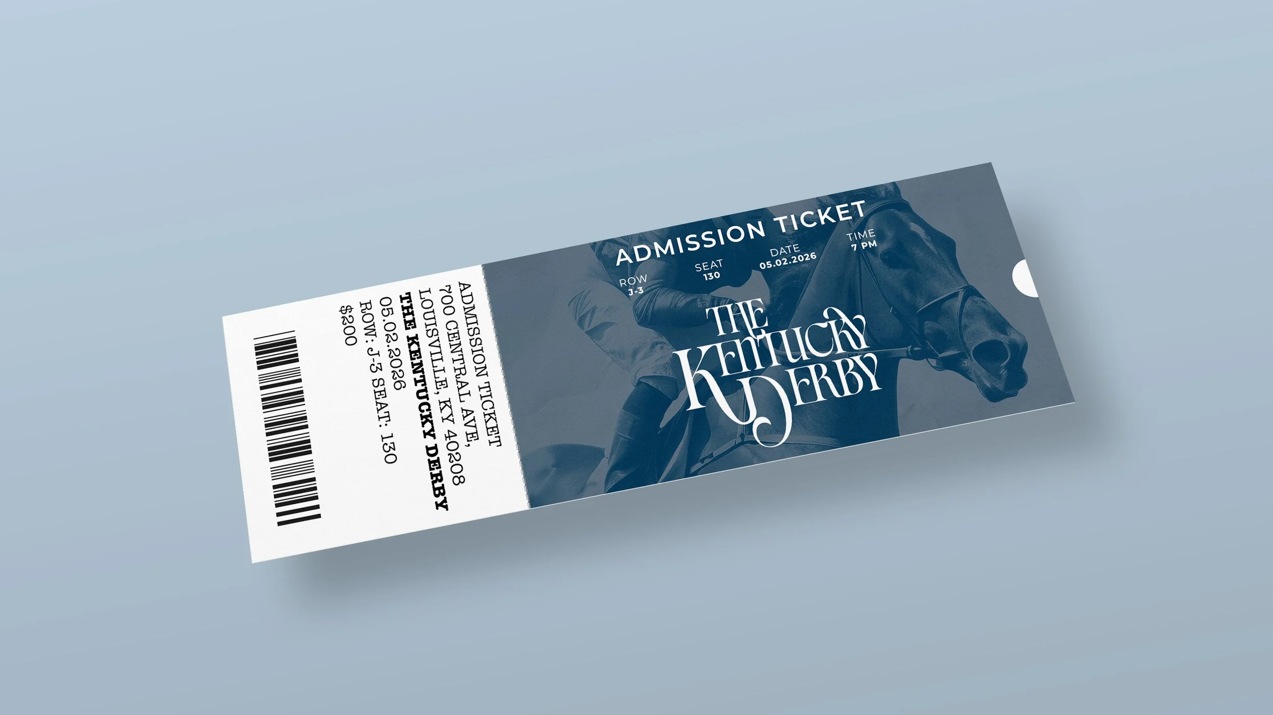
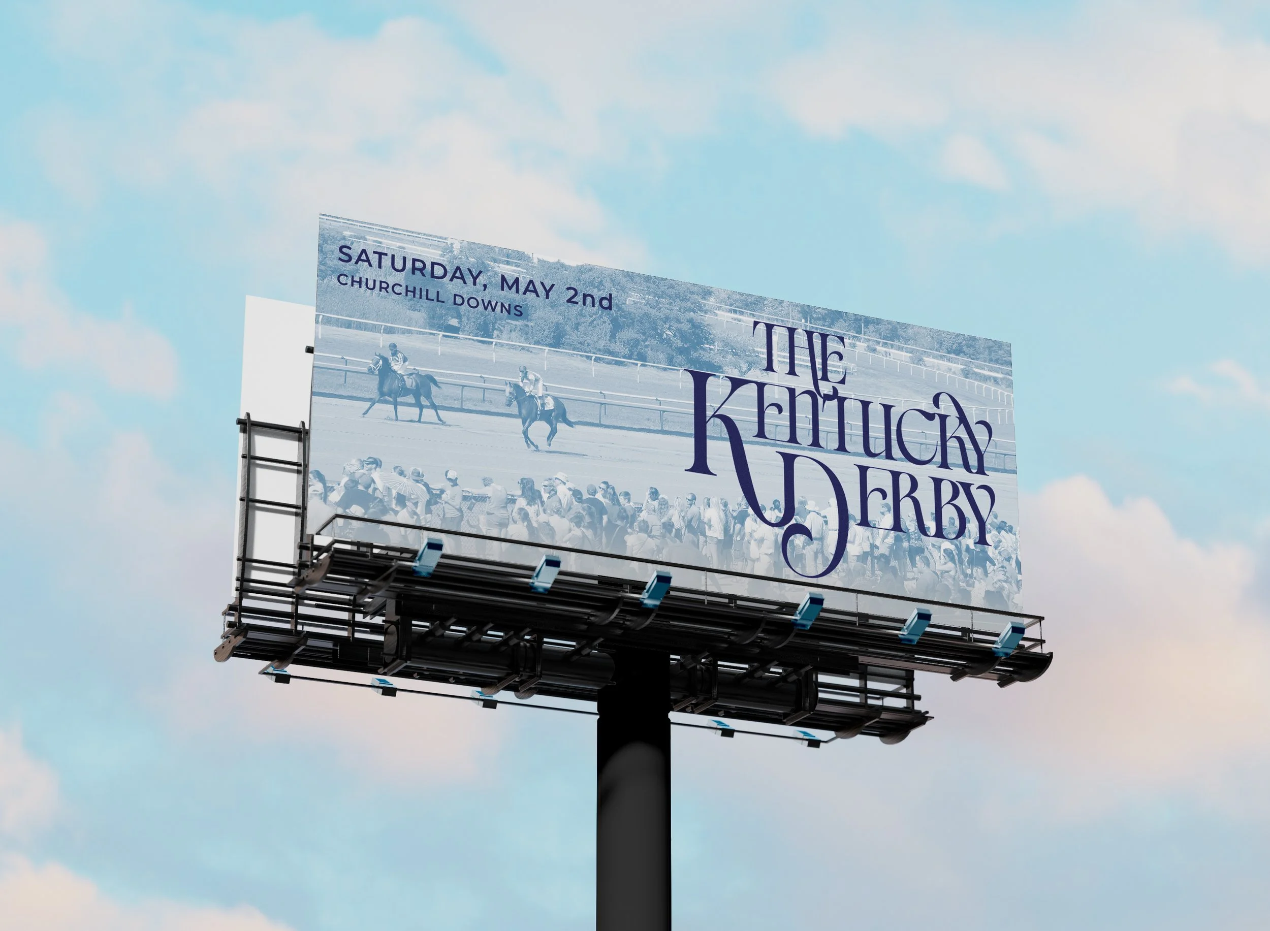
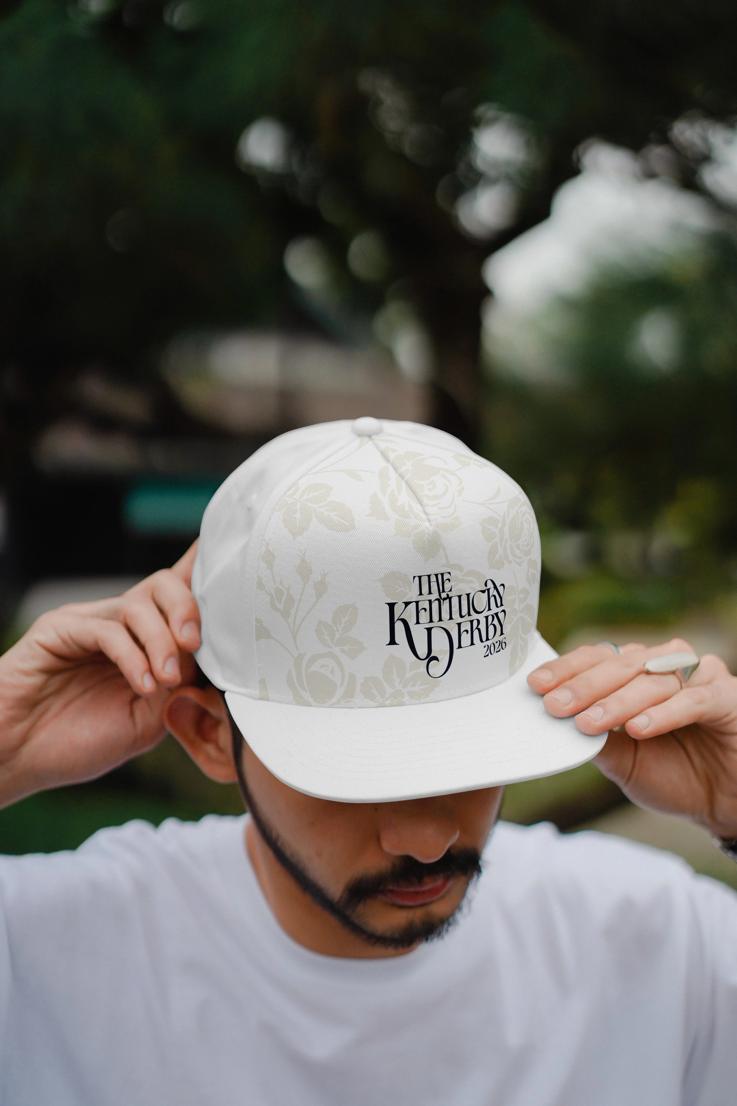
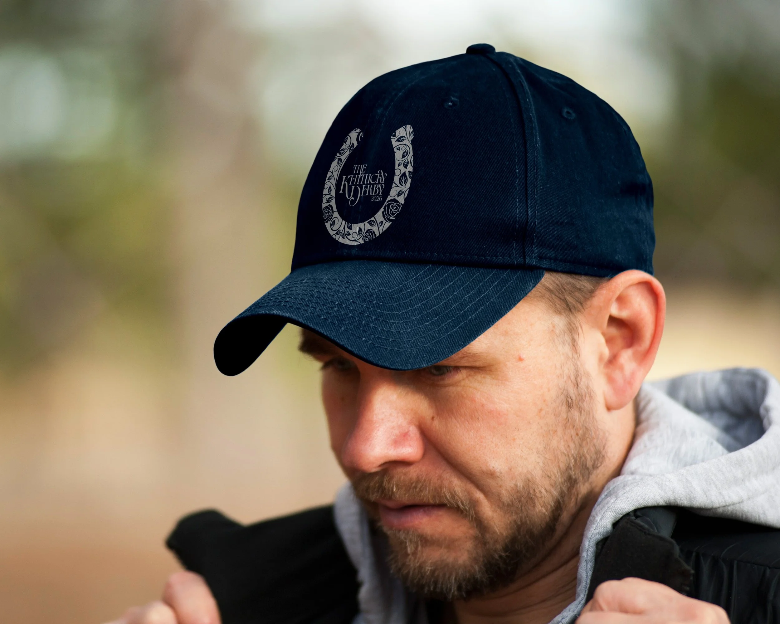
Final Design
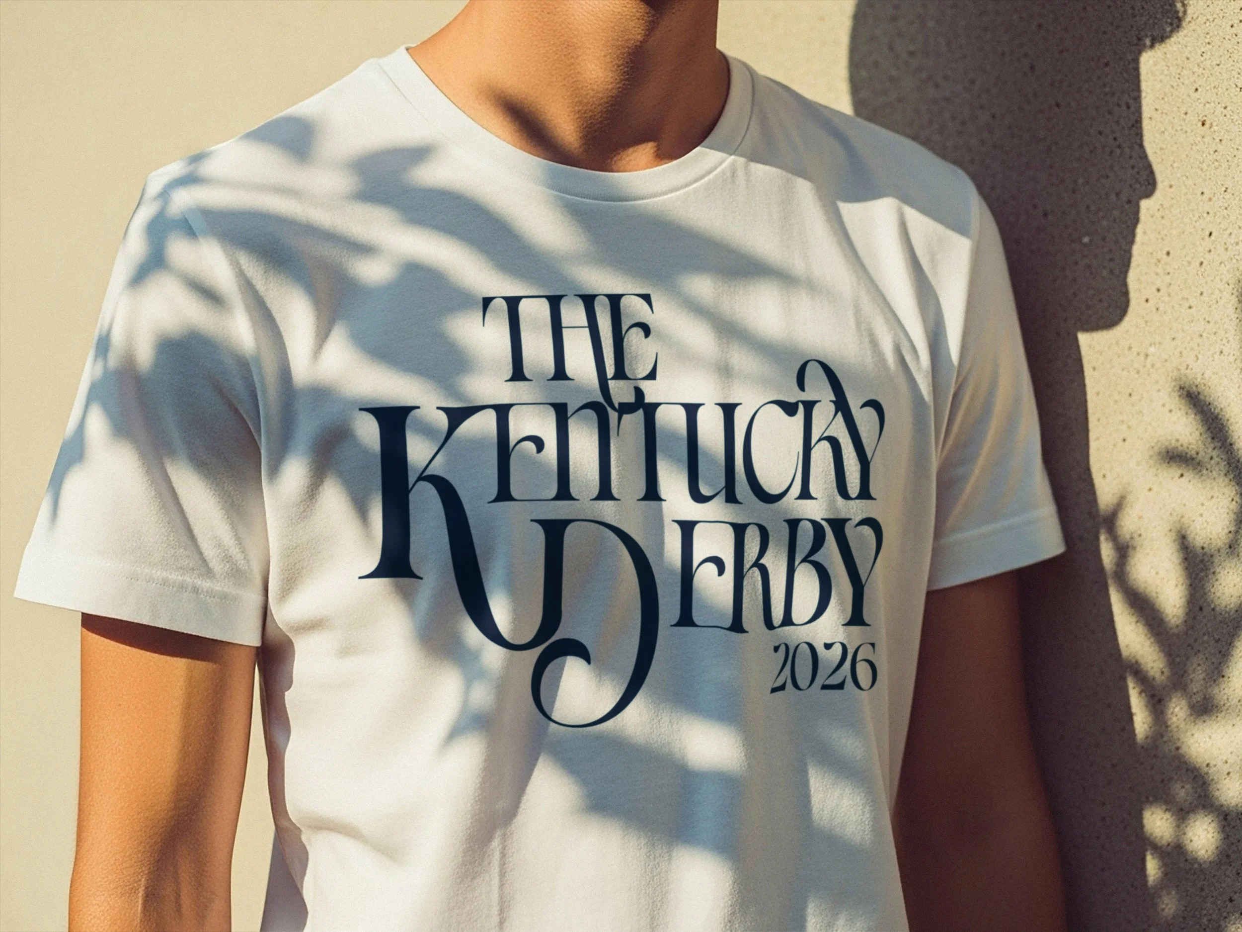
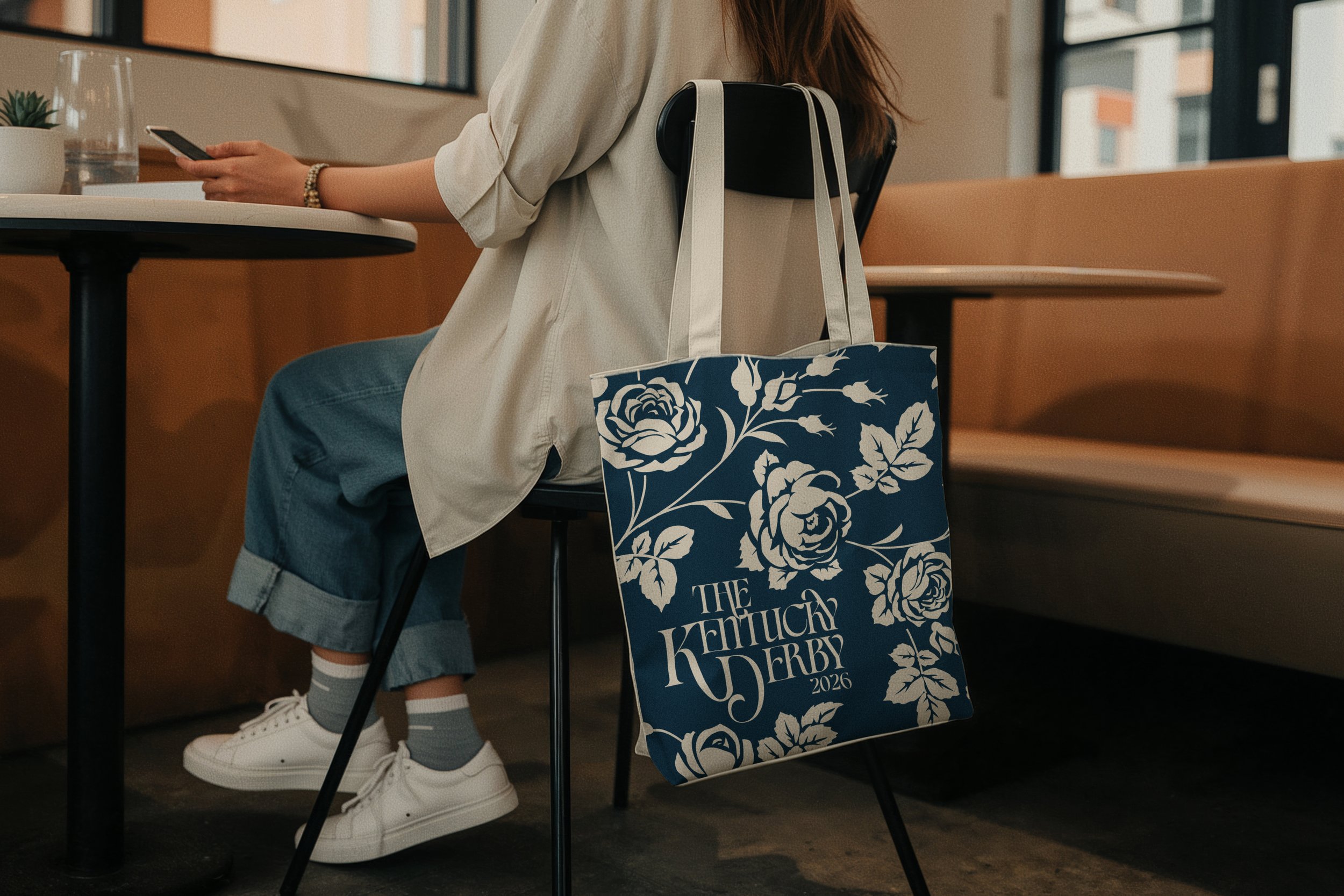
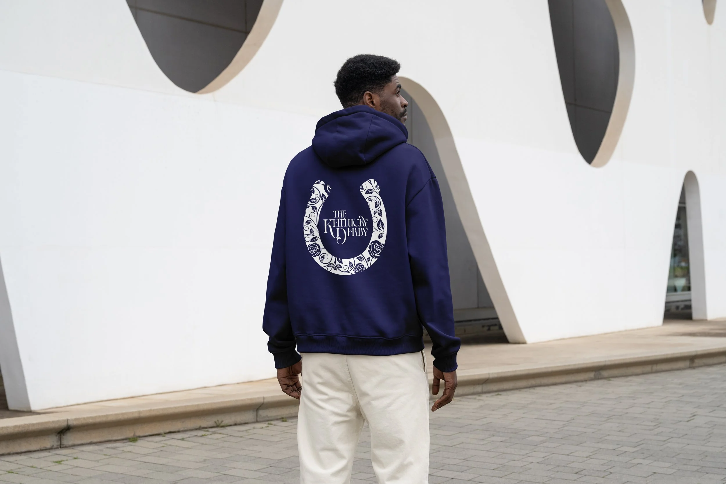
The final design presents the Kentucky Derby through a balance of movement and refinement. A dynamic equestrian image anchors the layout, paired with expressive serif typography, while supporting text remains clean and readable. A simplified layout and focused color palette create a clear, cohesive result.
The palette uses deep navy and slate blue tones to create depth while allowing texture and motion to stand out. Subtle tonal variation keeps the design cohesive.
Typography combines elegance and clarity. A customized version of Civics is used for display type, with dramatic swashes and extended forms, while Montserrat is used for supporting text to maintain readability. Together, they reflect the Derby’s mix of tradition and modern culture.
Reflection
This project focused on balancing tradition with a more contemporary approach. Working within a legacy rich identity required deciding what to keep and what to reinterpret. By translating texture, tone, and the event’s social atmosphere into a unified design, the final outcome communicates both prestige and energy.
The process strengthened my skills in visual storytelling, brand systems, and art direction, and showed how design can respect history while introducing a fresh perspective.