Design Hero Booklet
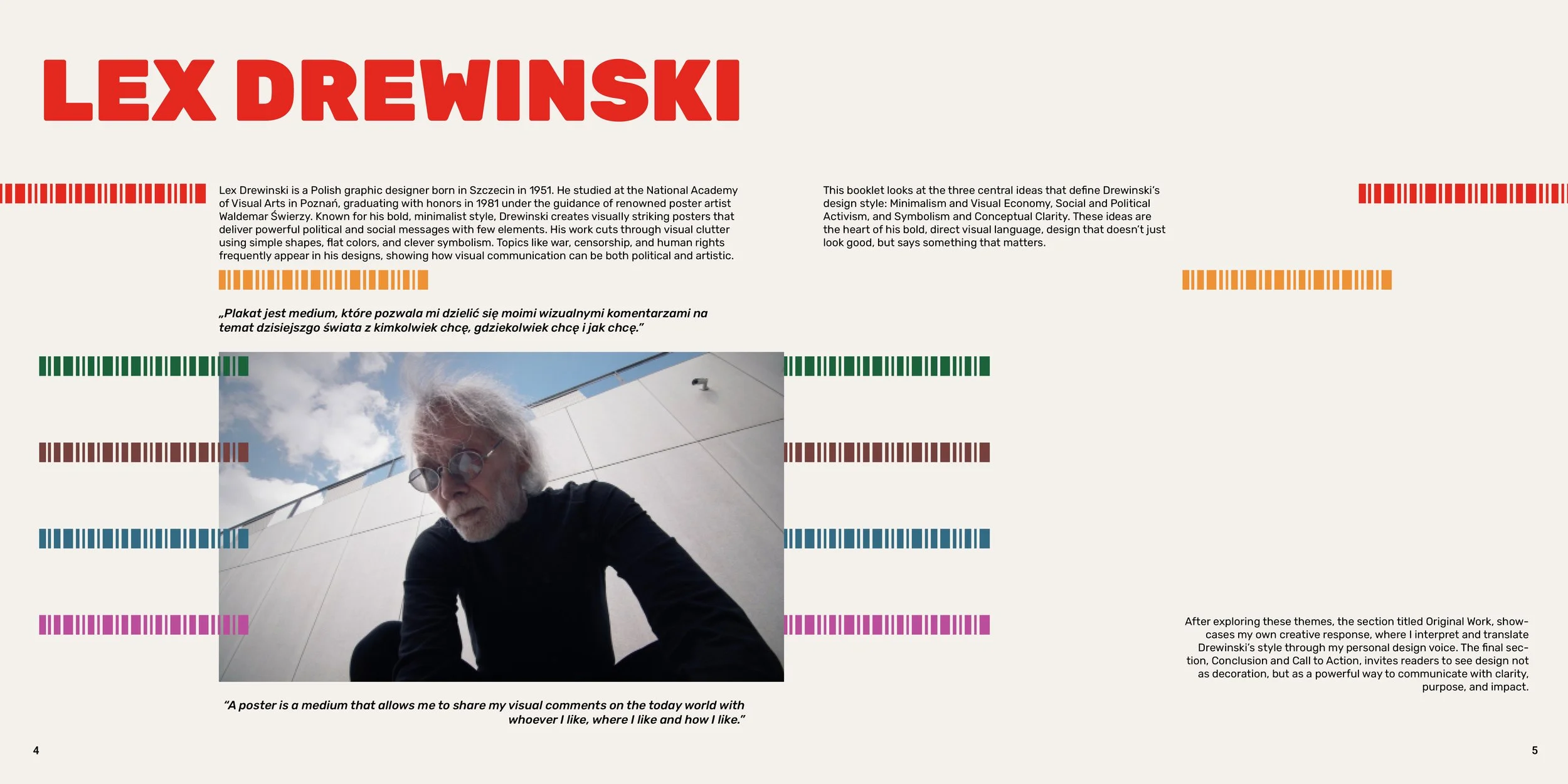
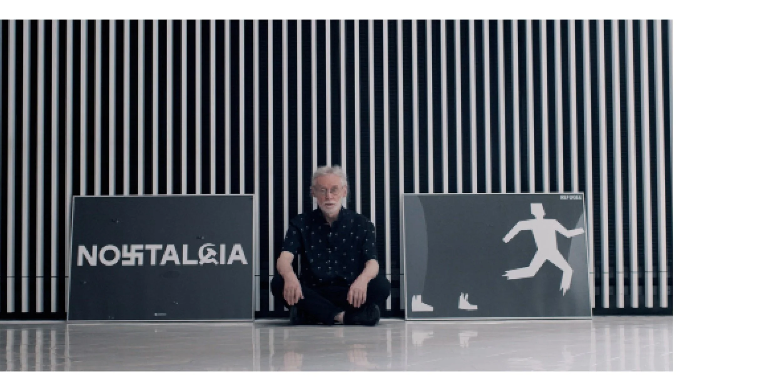
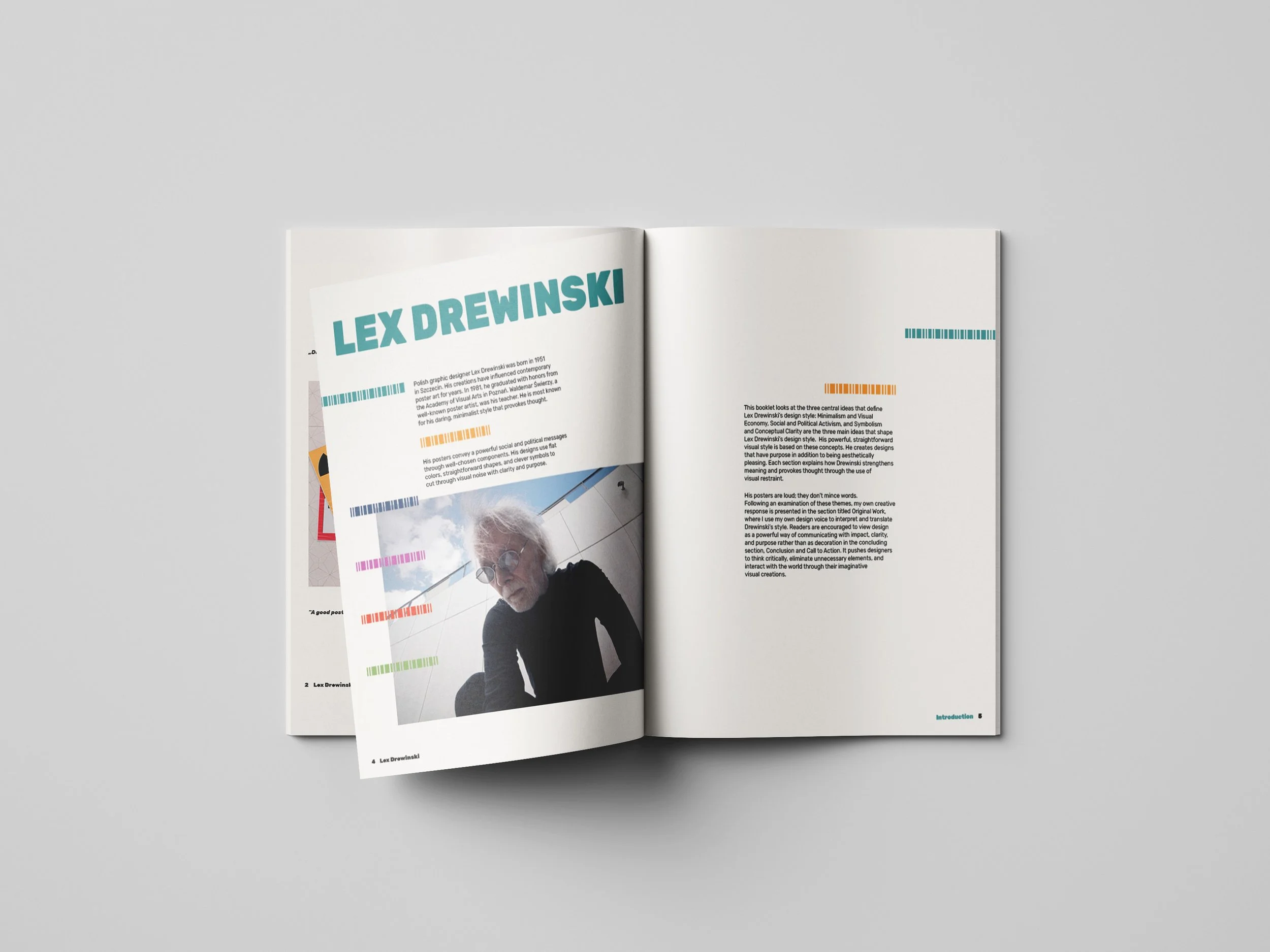
Lex Drewinski
Overview
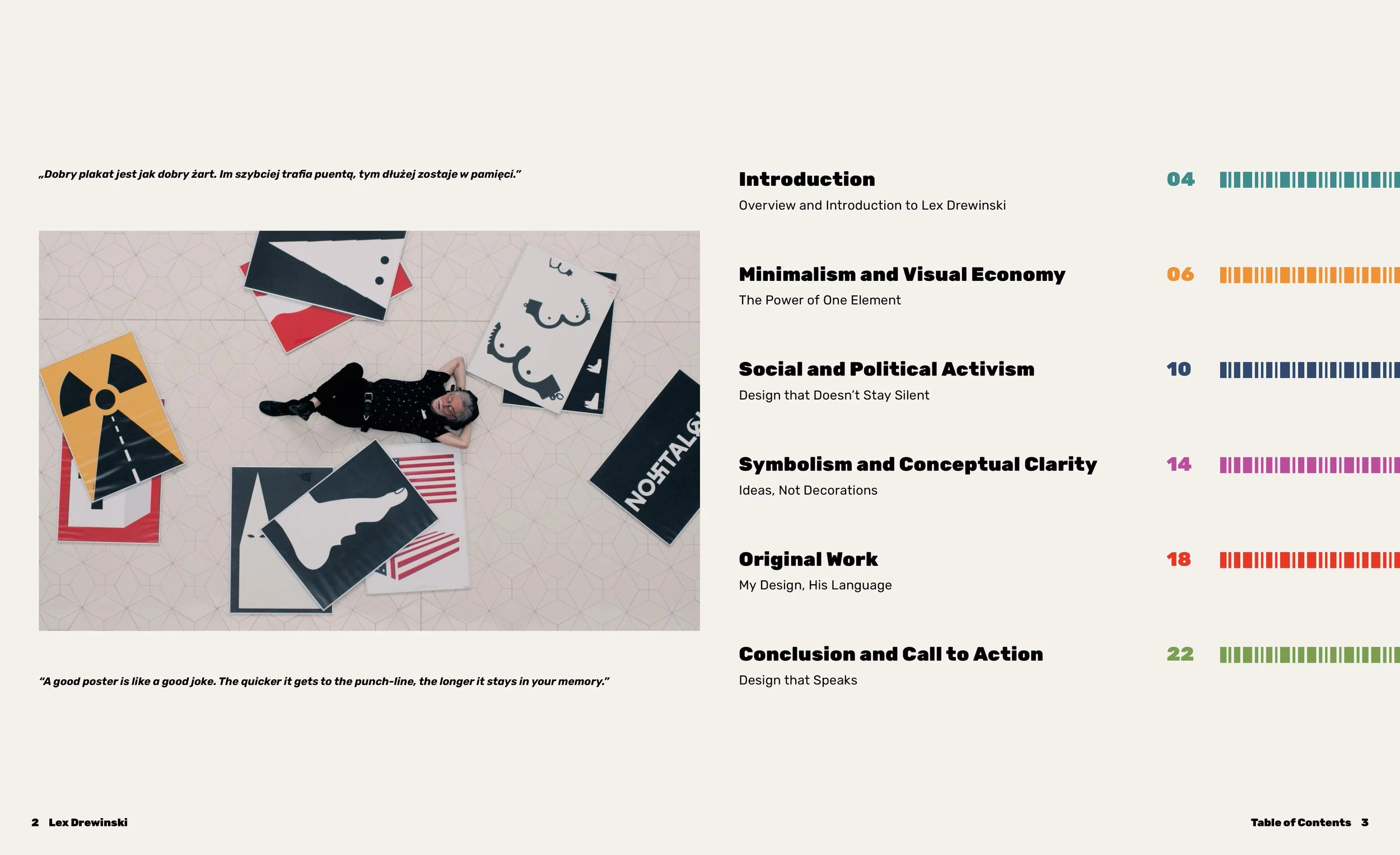
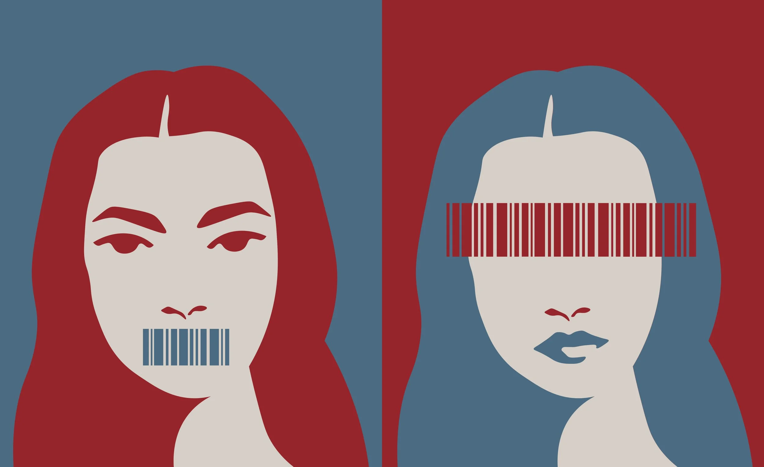
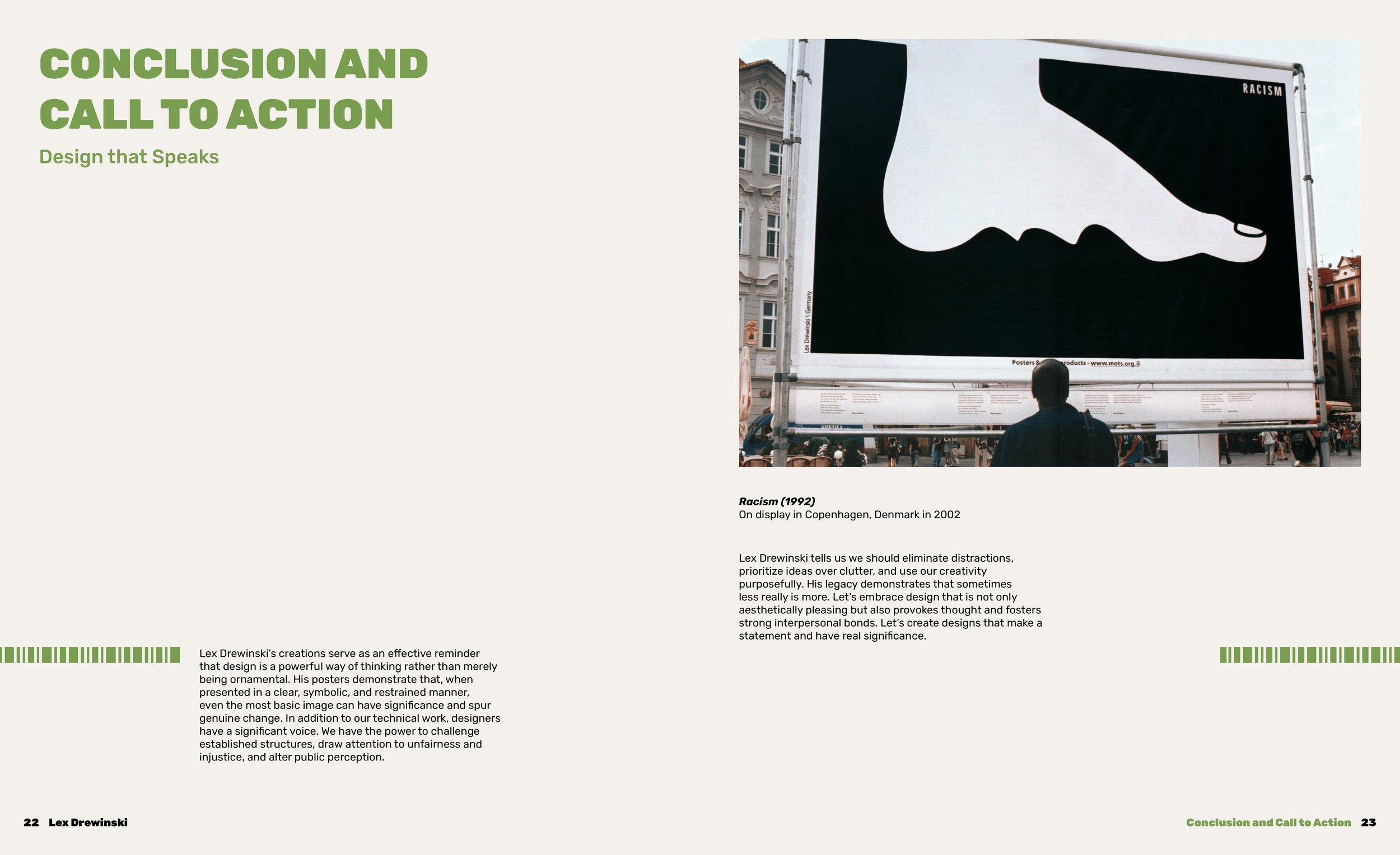
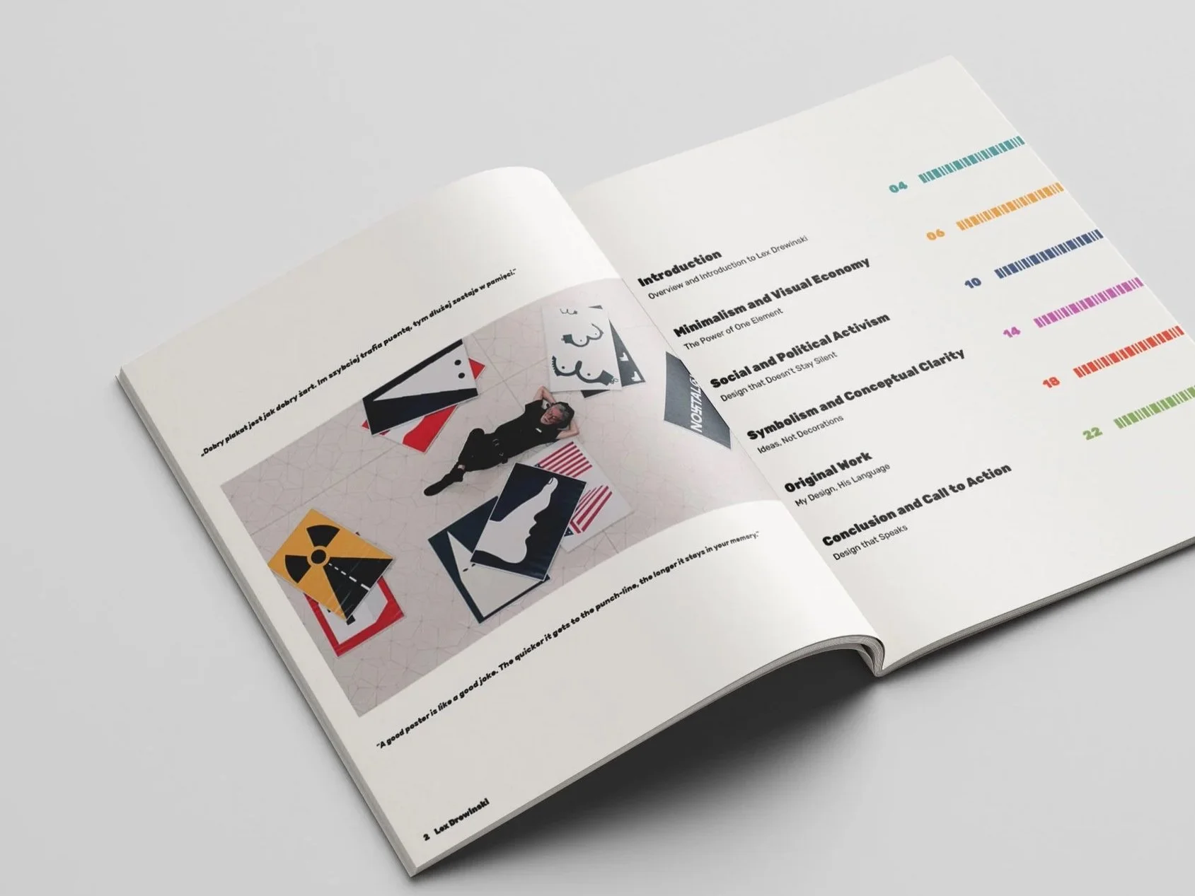
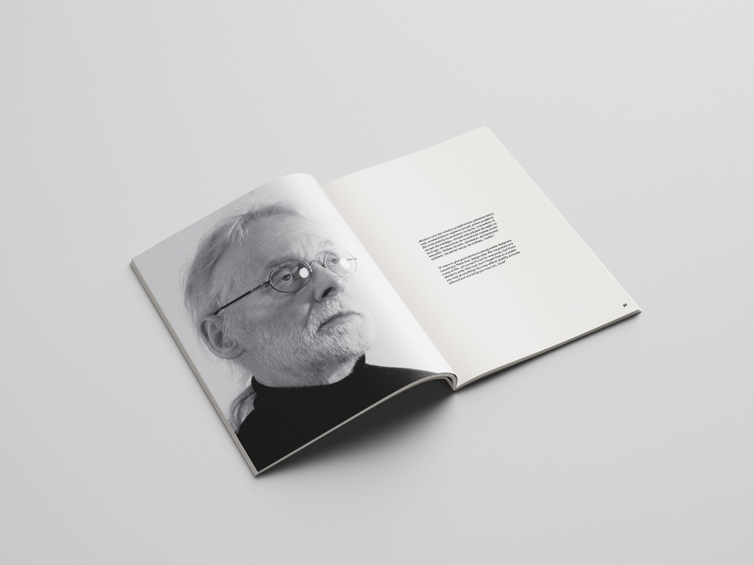
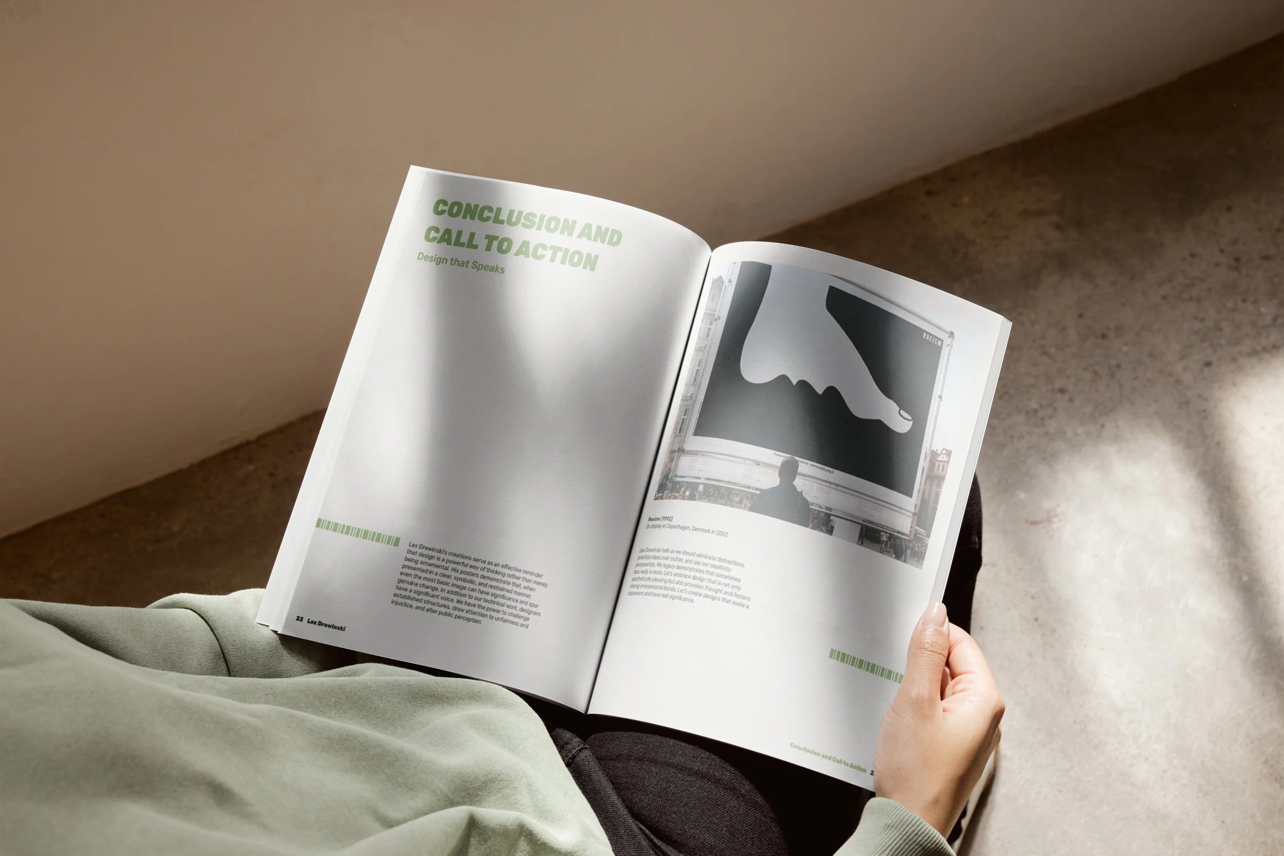
This conceptual publication explores the work of Lex Drewinski, a designer known for using minimalism to communicate powerful ideas with clarity and restraint. It focuses on three core themes in his work: visual economy, social and political activism, and symbolism through conceptual clarity.
The booklet also includes my original posters that reinterpret these principles through contemporary topics. Designed for design students and enthusiasts, it encourages emerging creatives to explore how strong ideas and intentional simplicity can convey complex messages with clarity and impact.
Research & Discovery
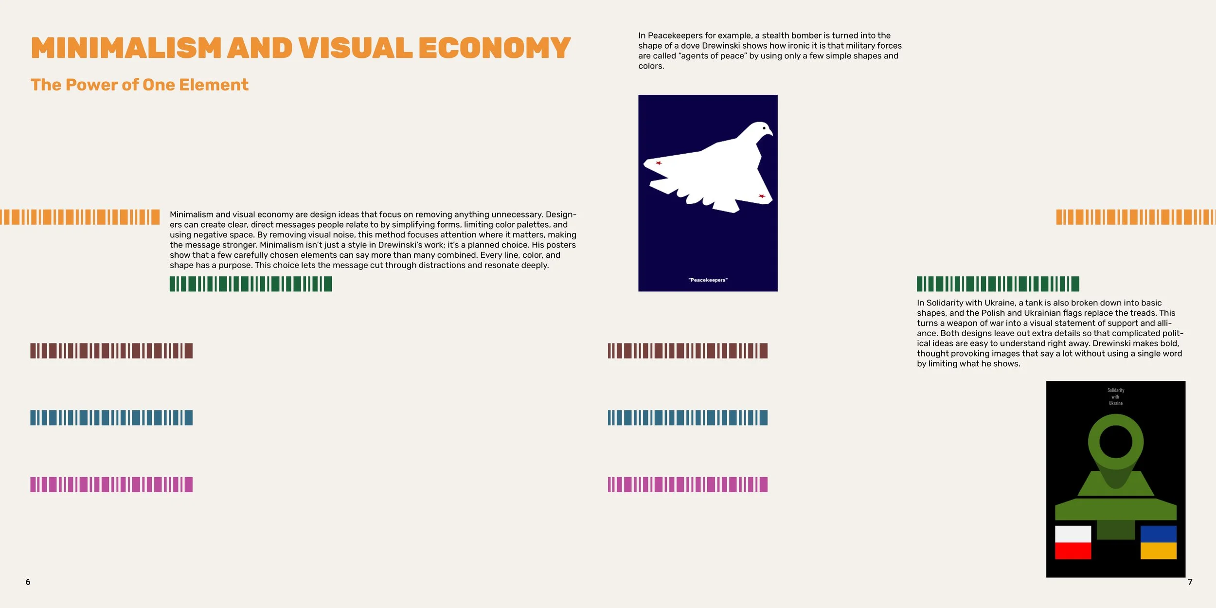
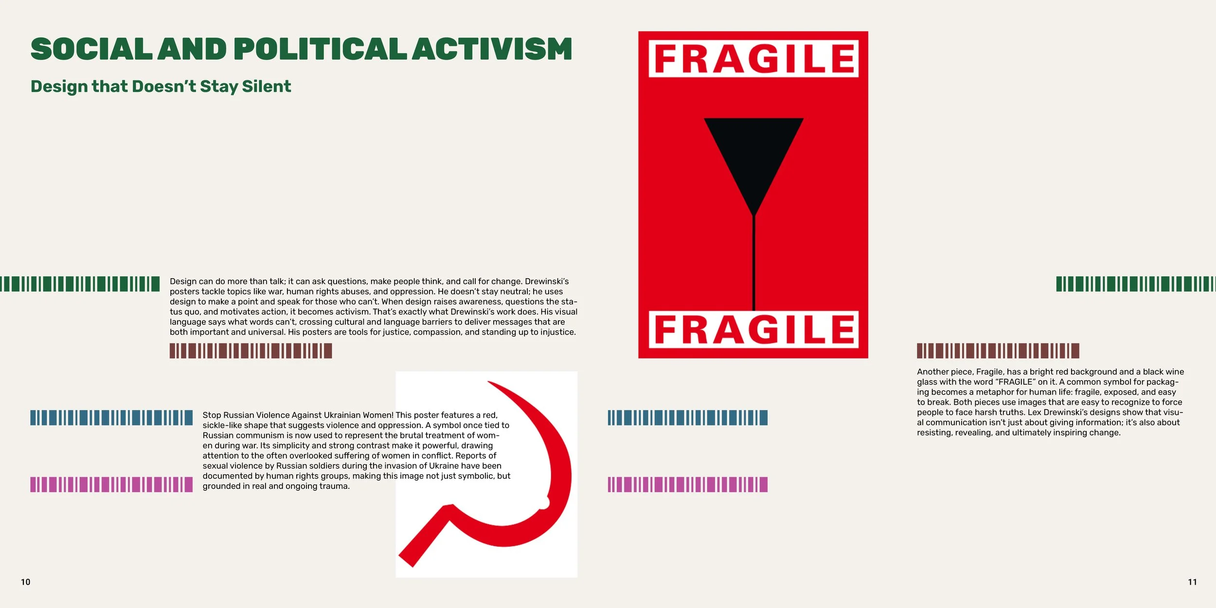
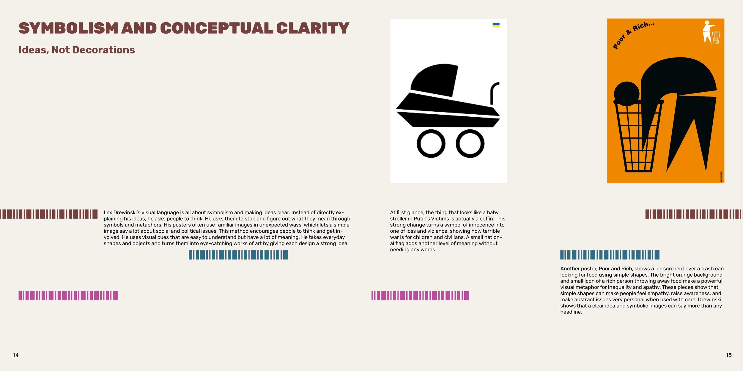
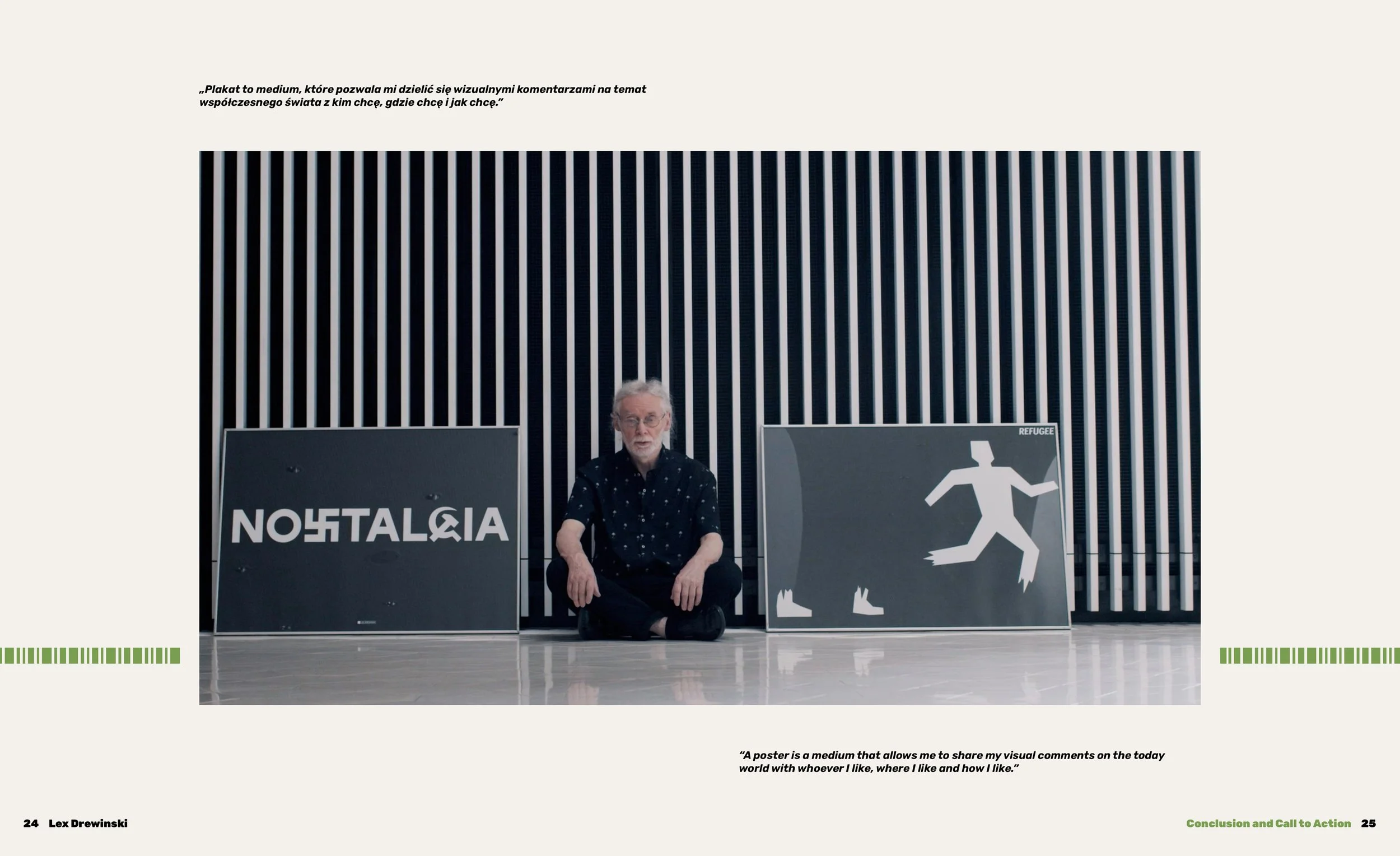
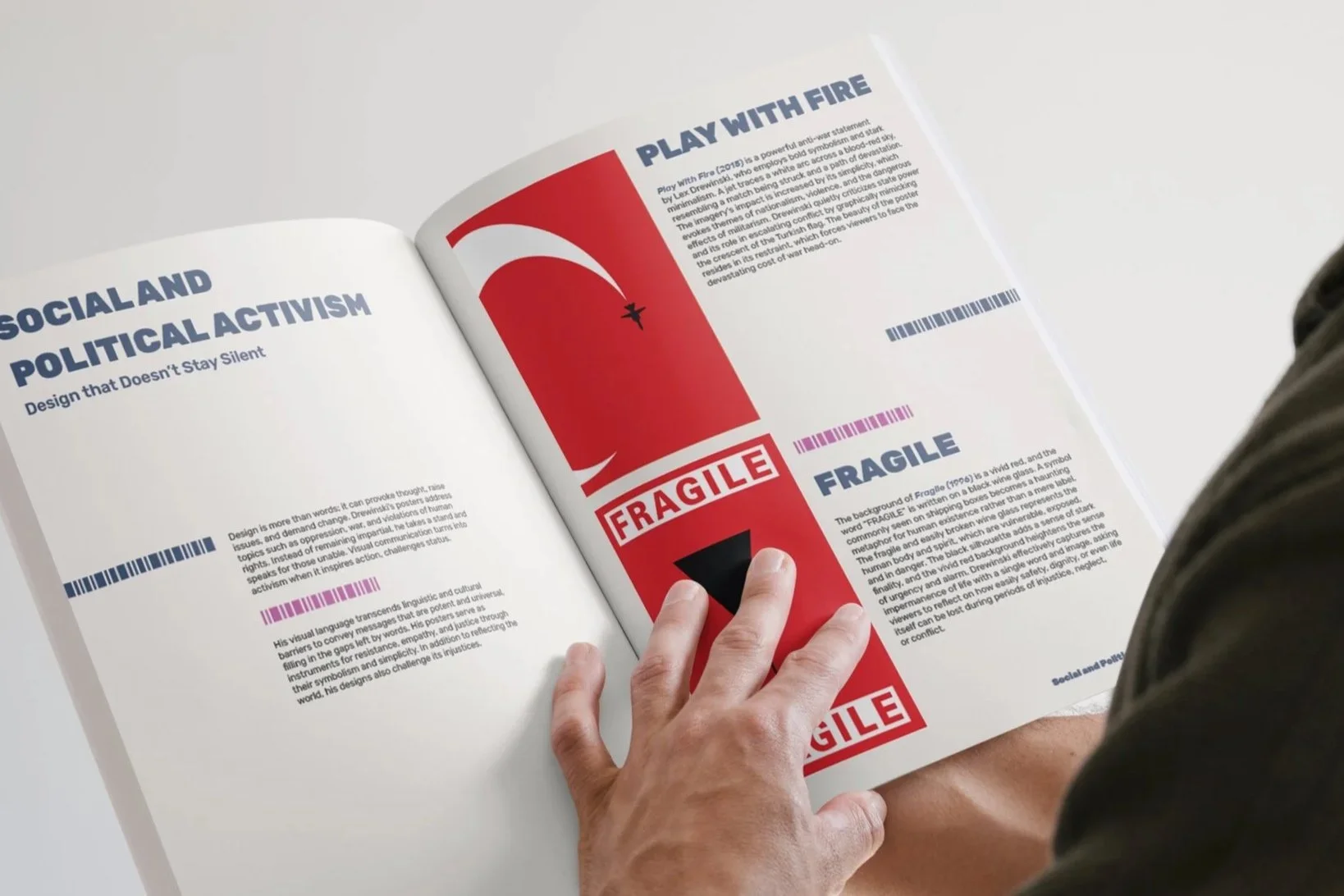
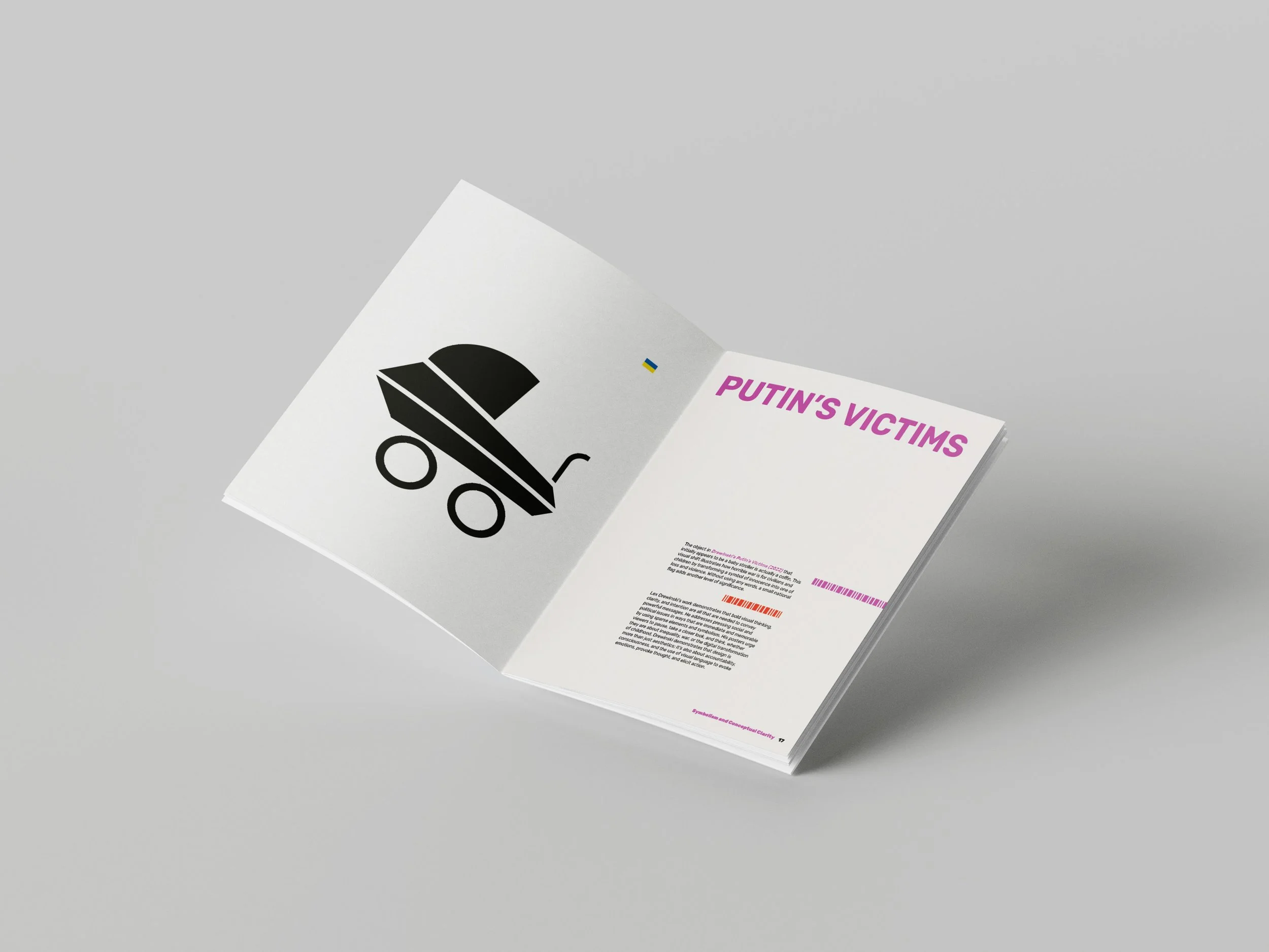
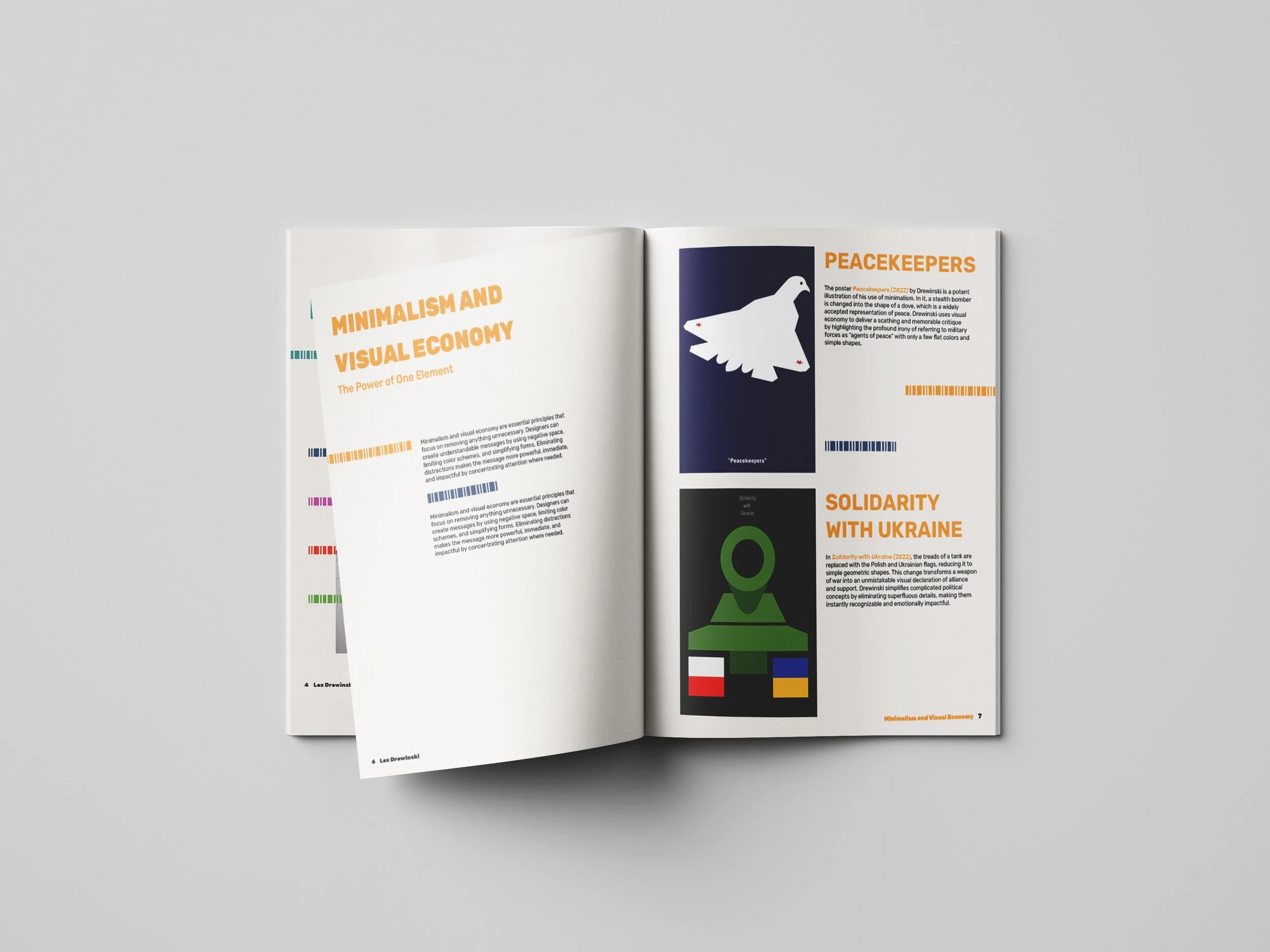
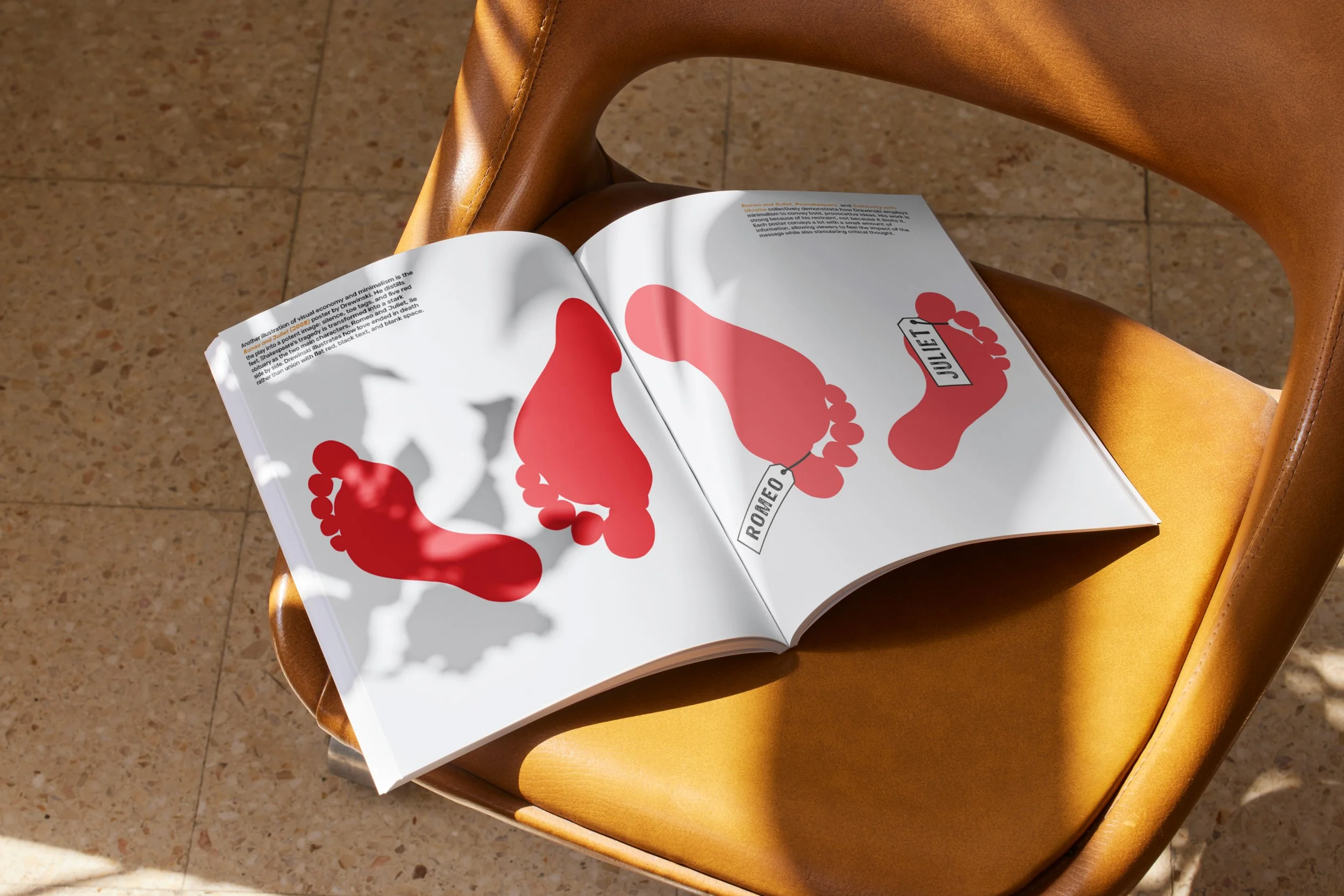
Research centered on Drewinski’s posters and design philosophy. His work often addresses themes such as human rights, censorship, war, and social justice through minimal visuals and bold symbolism.
I analyzed his use of contrast, space, composition, color, and typography to understand how reduced forms can carry meaning and evoke emotion. These insights informed the development of my own work, ensuring it reflects similar clarity and conceptual focus.
Inspiration & Ideation
Mood Board
This mood board explores visual ideas inspired by Lew Drewinski’s work. It focuses on bold, minimal forms, strong contrast, and a limited color palette to test how simple visuals can communicate clearly and quickly.
References from posters, editorial layouts, and gallery work help guide the direction, emphasizing concept over decoration. At this stage, the goal is to explore and define a visual language that feels direct, graphic, and intentional before moving into final design.
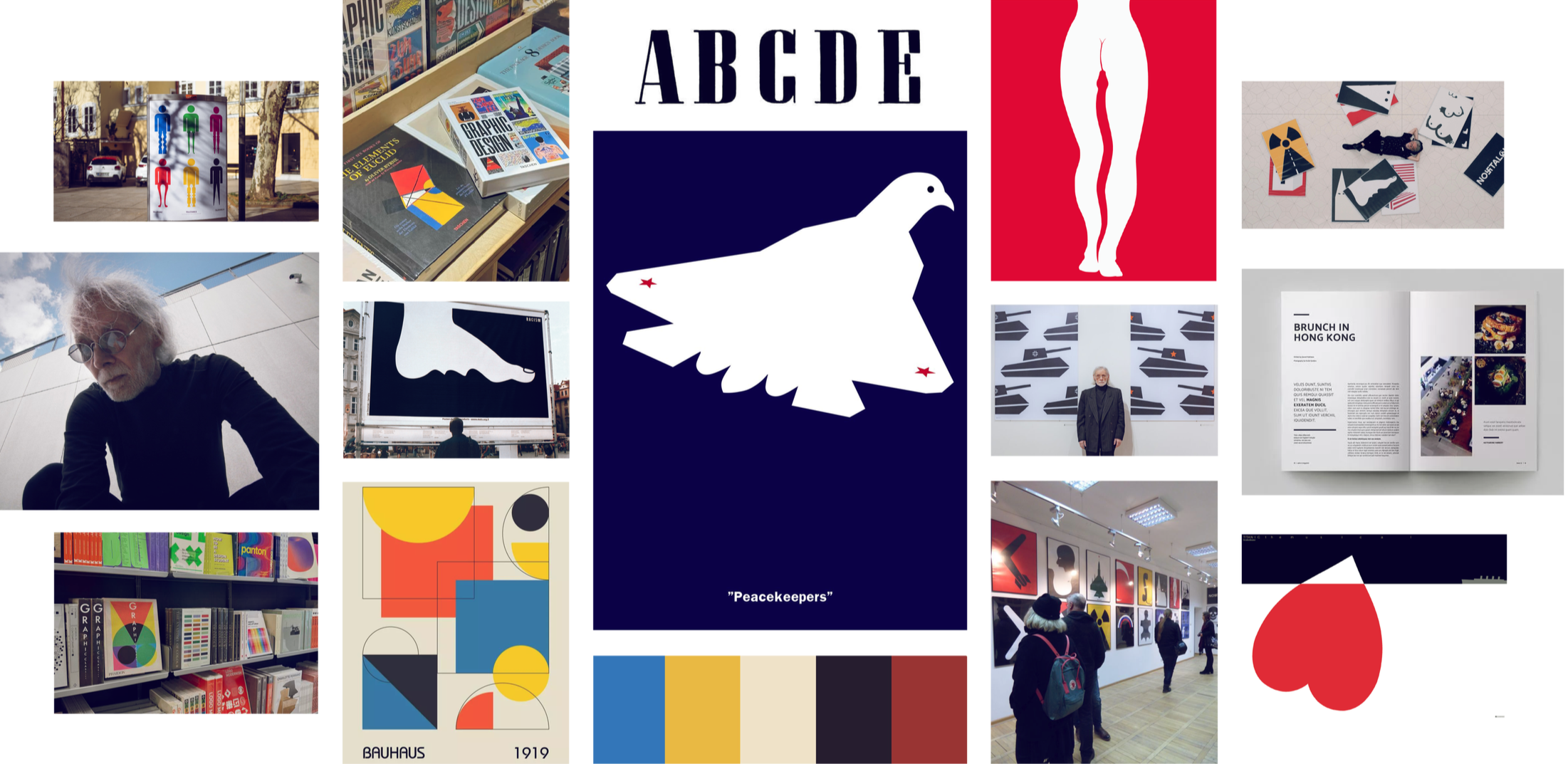
Click image to expand
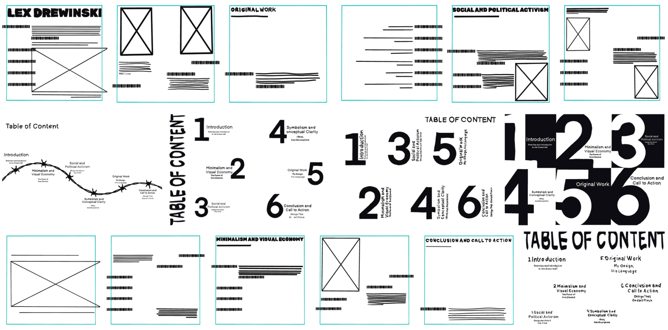
Sketches
Sketching focused on exploring layout ideas and reducing them to their most essential forms. Multiple concepts were tested to see how simple compositions could communicate clearly with minimal elements. This iterative process allowed for quick exploration and refinement, helping define a strong, concept-driven direction for the booklet.
Click image to expand
Digital Drafts
This stage focused on establishing grid systems, alignment, and spacing to create clear structure throughout the booklet. I explored scale, contrast, and placement to build a strong visual hierarchy while maintaining a minimalist approach.
Different iterations tested how well each concept communicated, with refinements made to simplify forms and strengthen symbolism. Typography and color were introduced to evaluate how they worked with imagery and overall balance. These drafts bridged concept and final design, allowing for refinement while staying grounded in clarity and minimalism.
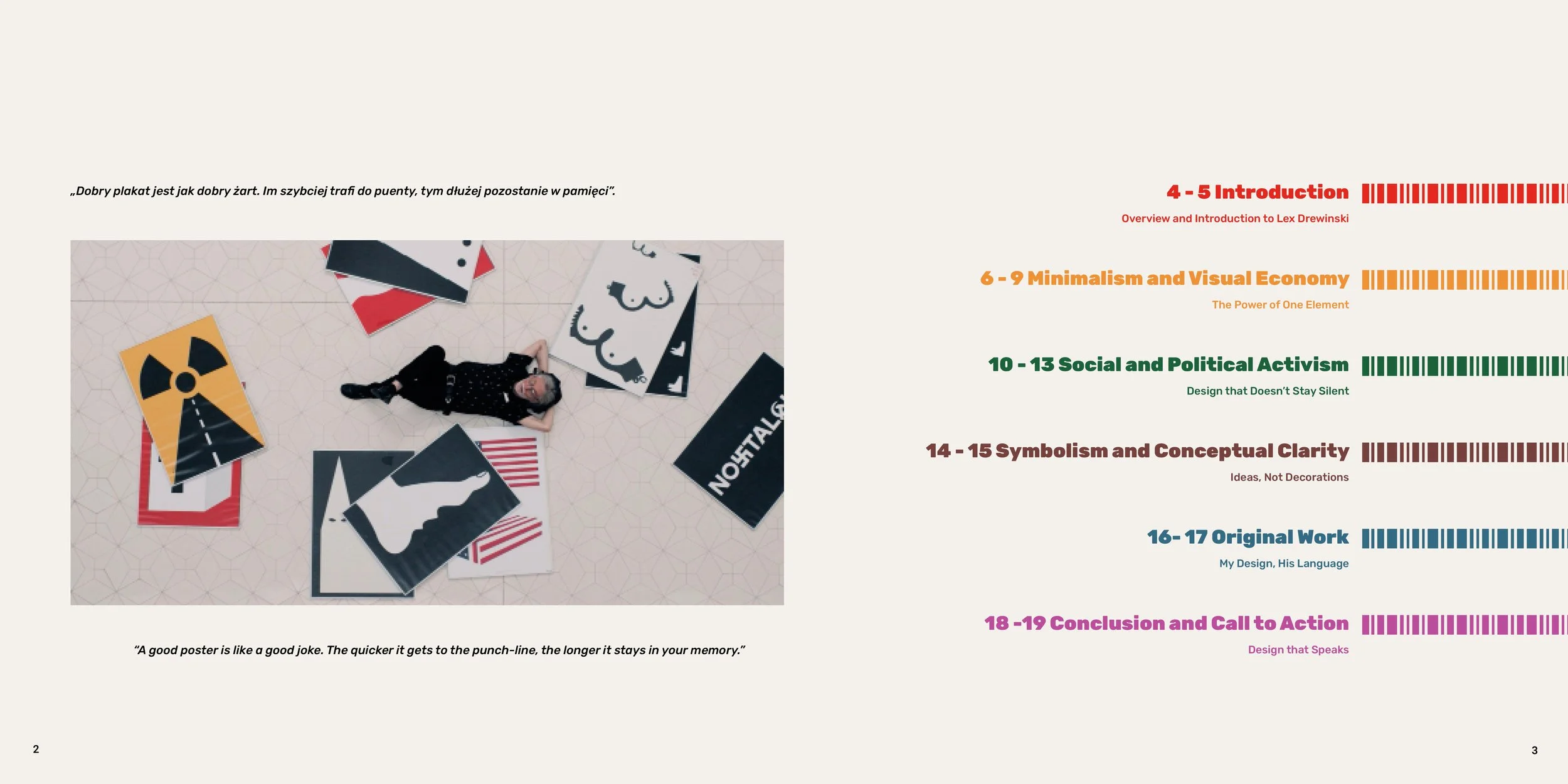
Final Design
The final booklet presents a cohesive and intentional system that reflects Drewinski’s principles while incorporating my own perspective. Layout, typography, and color work together to communicate complex ideas with clarity, demonstrating how minimal design can achieve strong visual impact and conceptual depth.
The palette balances neutral tones with selective accents, using color sparingly to create hierarchy and guide attention while maintaining a clean, focused aesthetic. This restrained approach supports clarity without overwhelming the composition.
Rubik is used as the primary typeface, with variations in weight and style establishing hierarchy. Bold weights emphasize key statements, regular text ensures readability, and italics introduce subtle contrast, reinforcing the overall minimalist system.
Reflection
This project emphasized the value of restraint in design. Studying Drewinski’s work reinforced that clarity often comes from removing rather than adding.
Developing both the booklet and original posters strengthened my approach to symbolism, hierarchy, and visual storytelling. It also built confidence in using minimal elements to create work that is both impactful and meaningful.