Creatures of the Cask
Rum Branding
Overview
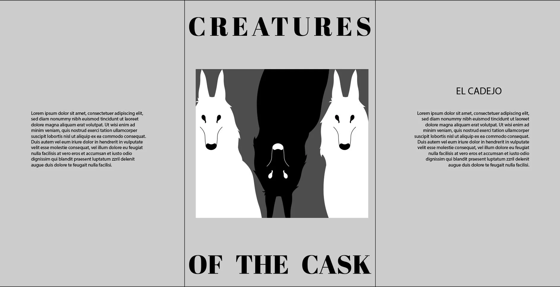
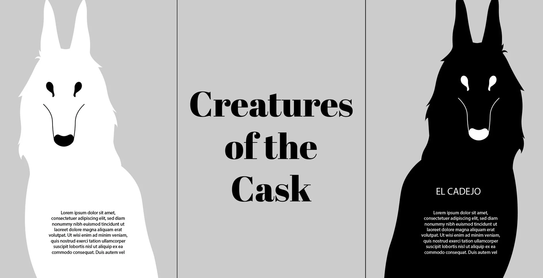
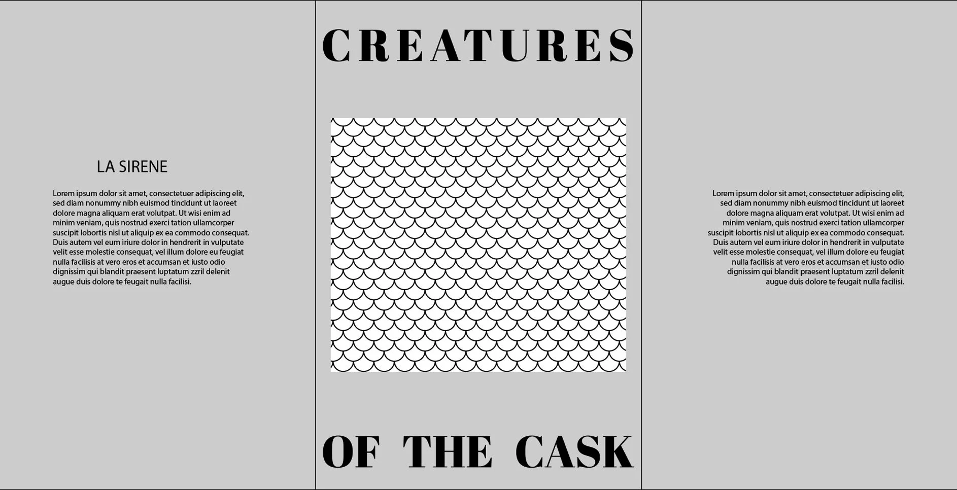
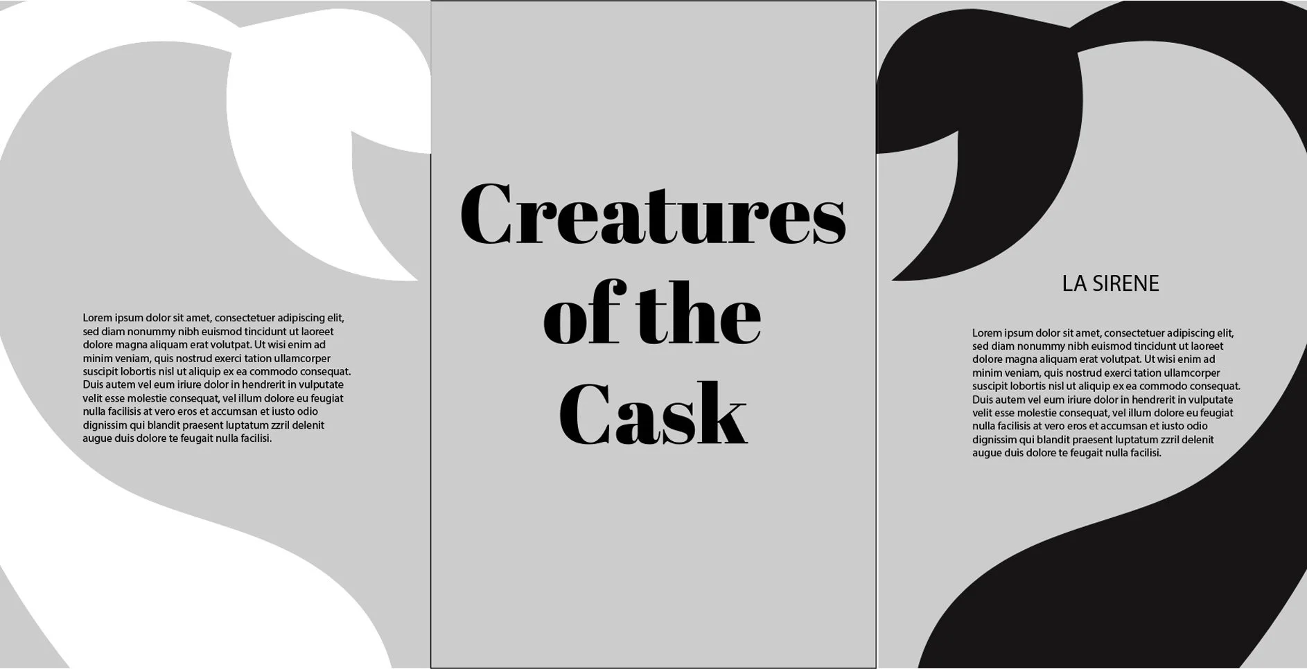
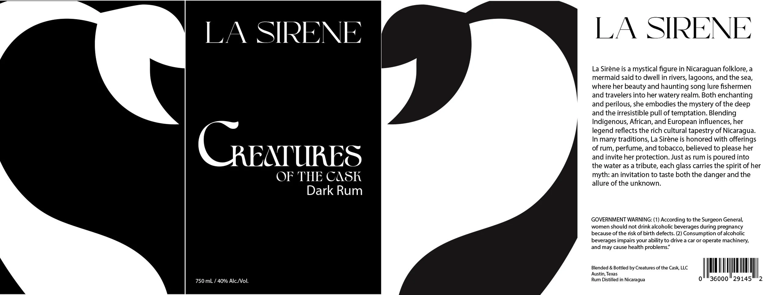
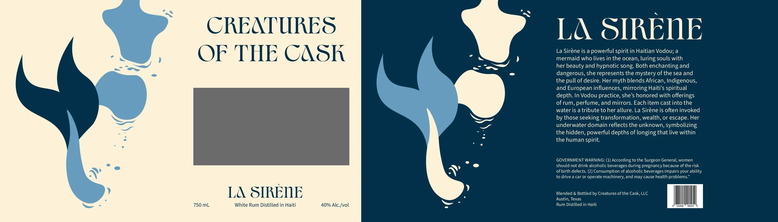
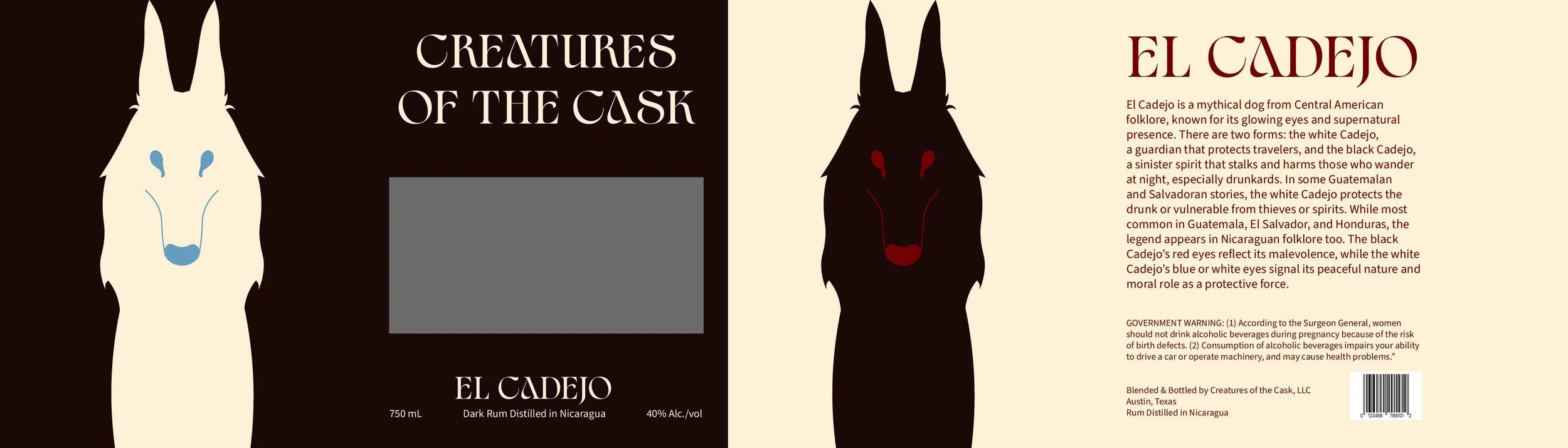
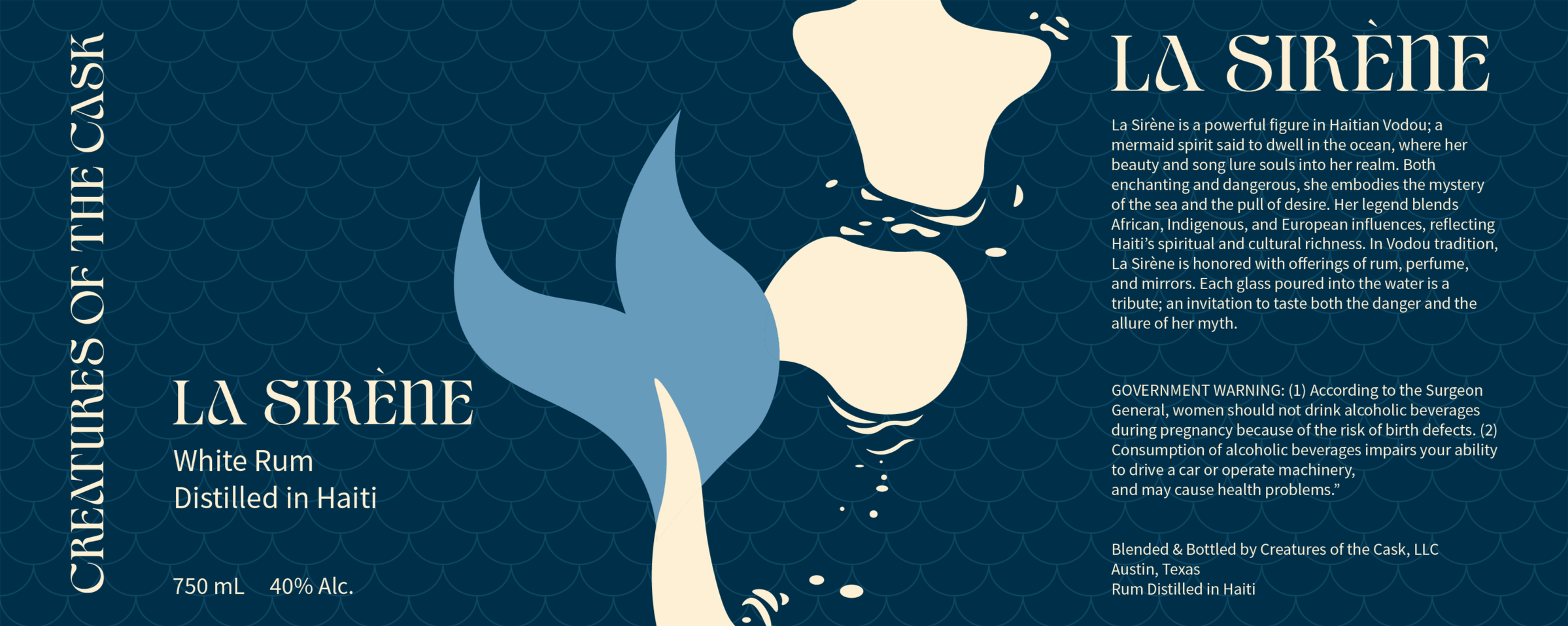
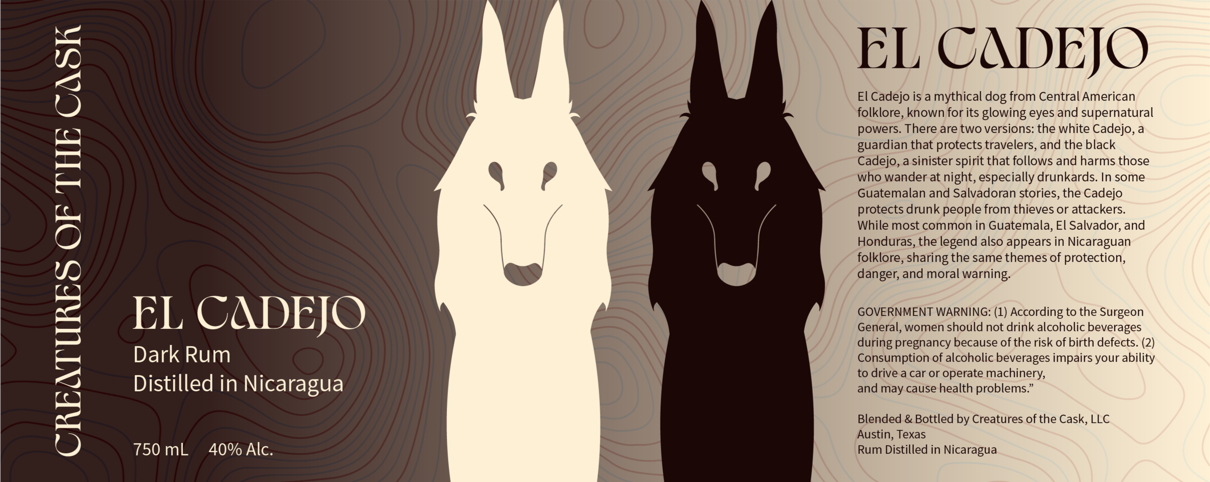
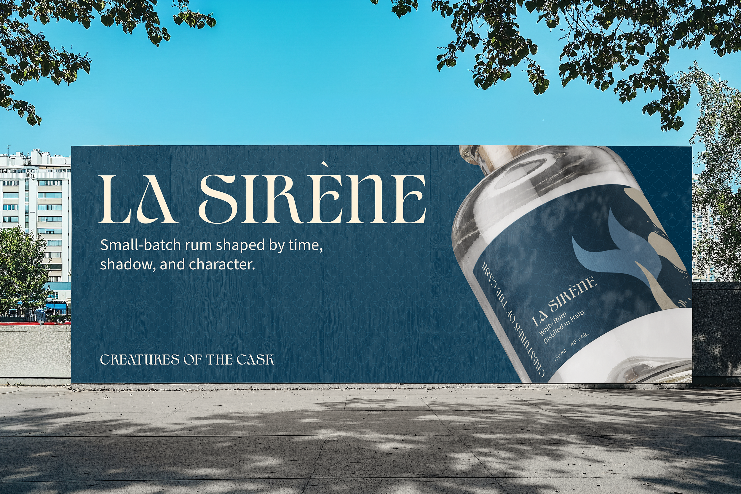
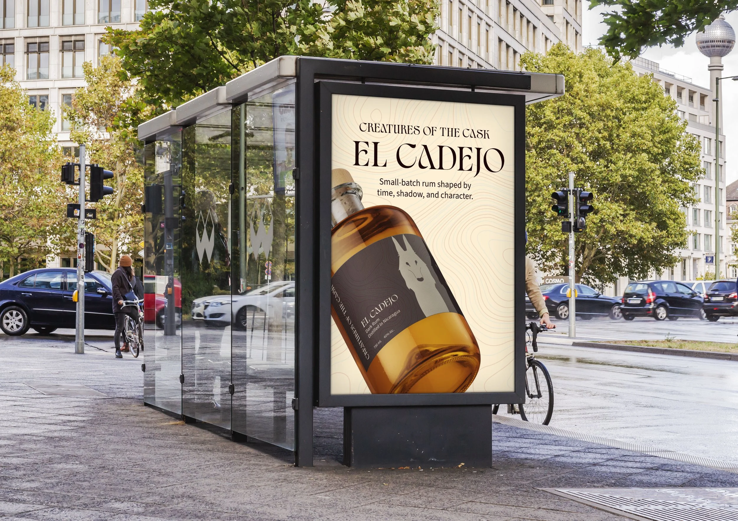
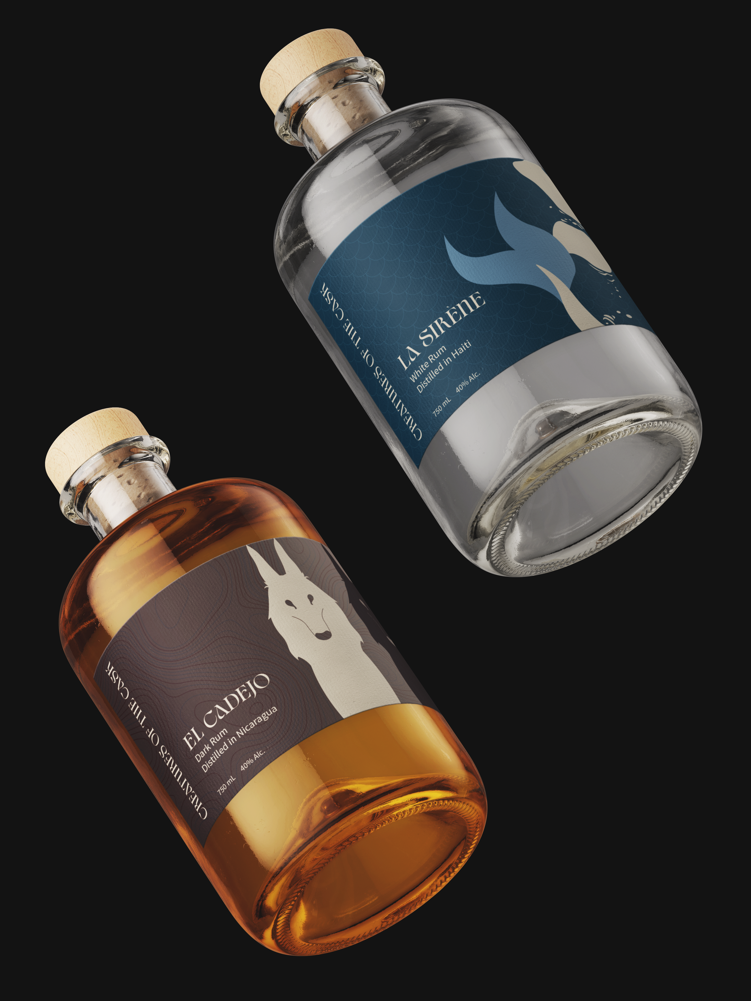
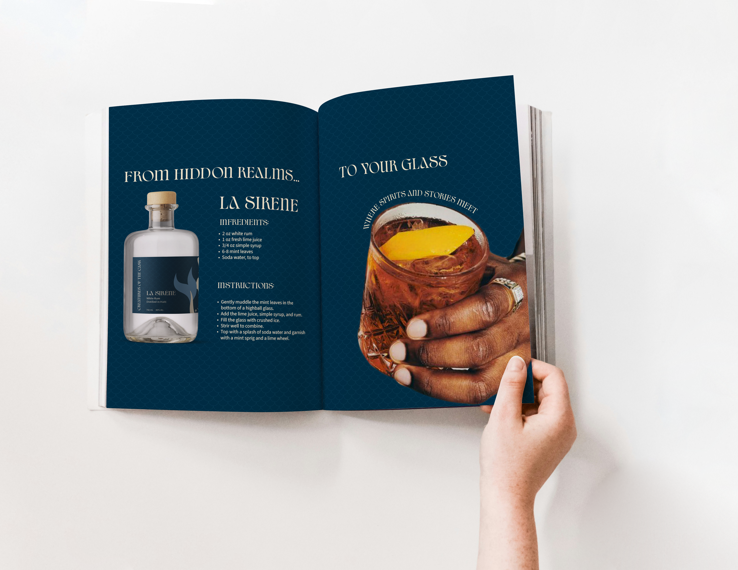
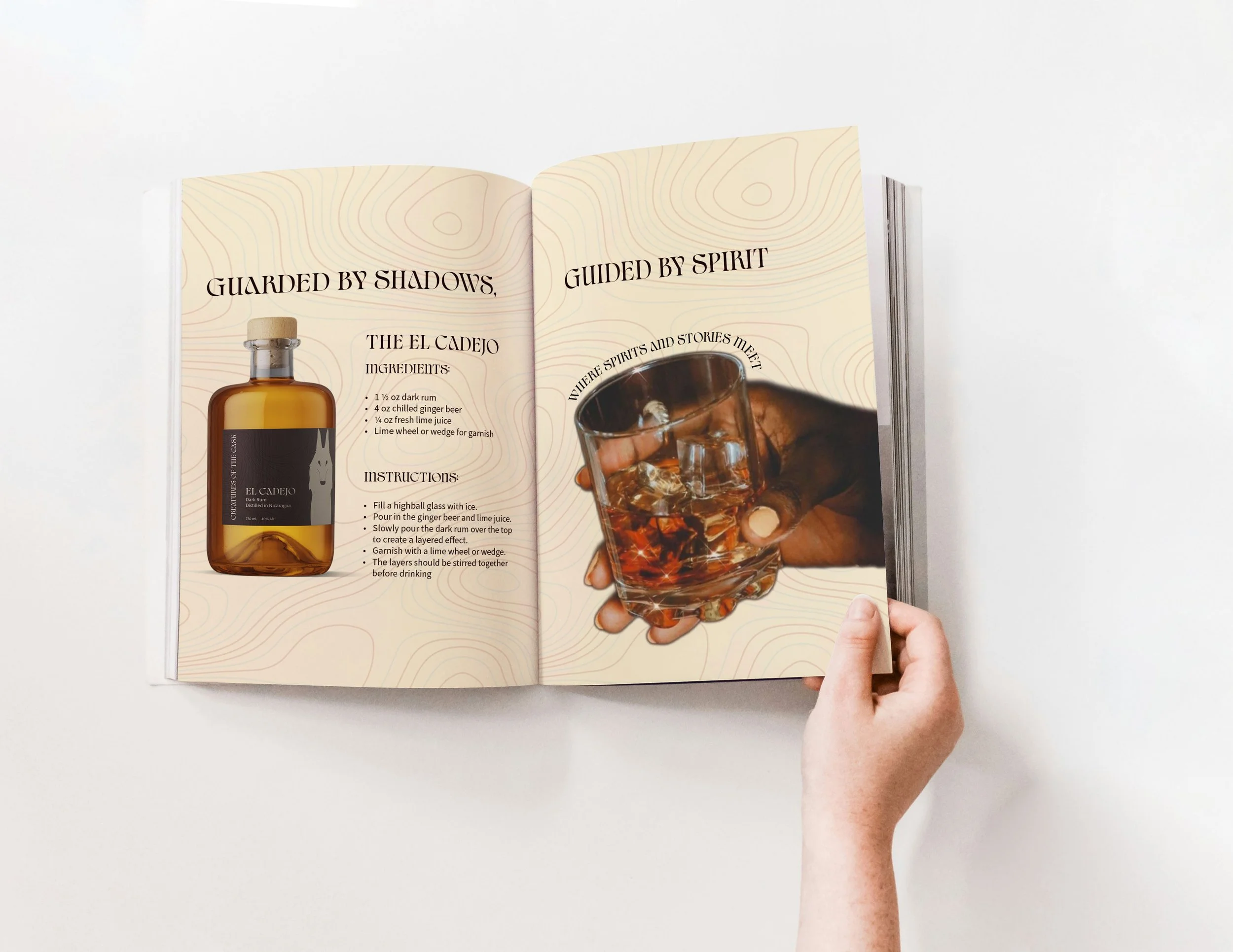
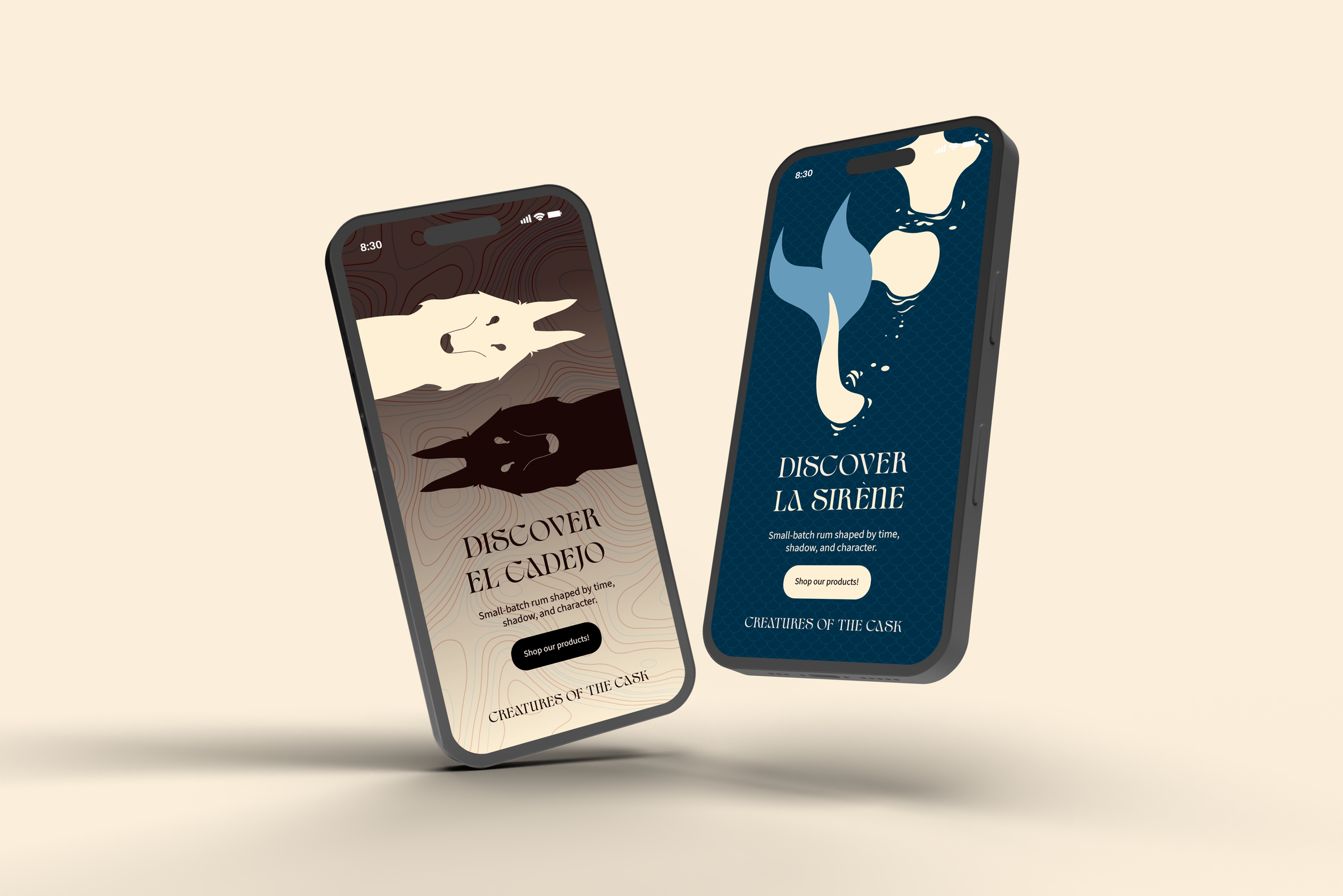
Creatures of the Cask is a premium rum brand that transforms a traditional spirit into an immersive storytelling experience. By pairing high quality rum with folklore from its country of origin, the brand offers more than a drink, it invites consumers into a world of myth and legend. Each rum is tied to a local legend, including La Sirène for the white rum from Haiti and El Cadejo from Nicaragua, grounding the narrative in cultural context.
The project explores how fantasy driven narratives can coexist with a refined luxury aesthetic to stand out in a saturated market. It targets discerning consumers aged 30 and up with disposable income and a taste for elevated experiences. Socially and design conscious, they value thoughtful design, strong packaging, and visual storytelling, often using the bottle as a conversation piece. Culturally curious, they follow gourmet trends, appreciate nuanced flavors, and are drawn to products that offer narrative depth and a sense of discovery.
Research & Discovery
Research revealed a gap in the rum market. While Bacardi and Captain Morgan lean on scale and party culture, and Diplomático focuses on heritage craftsmanship, few brands combine premium quality with immersive storytelling rooted in place.
To build that connection, each rum is tied to a local legend from its country of origin. La Sirène from Haiti represents beauty and mystery as a powerful water spirit, while El Cadejo from Nicaragua appears as a dual natured supernatural dog. These stories shaped the tone and visual direction of the brand.
The key insight was to balance fantasy with restraint, avoiding anything overly literal or juvenile while keeping the designs refined and culturally grounded.
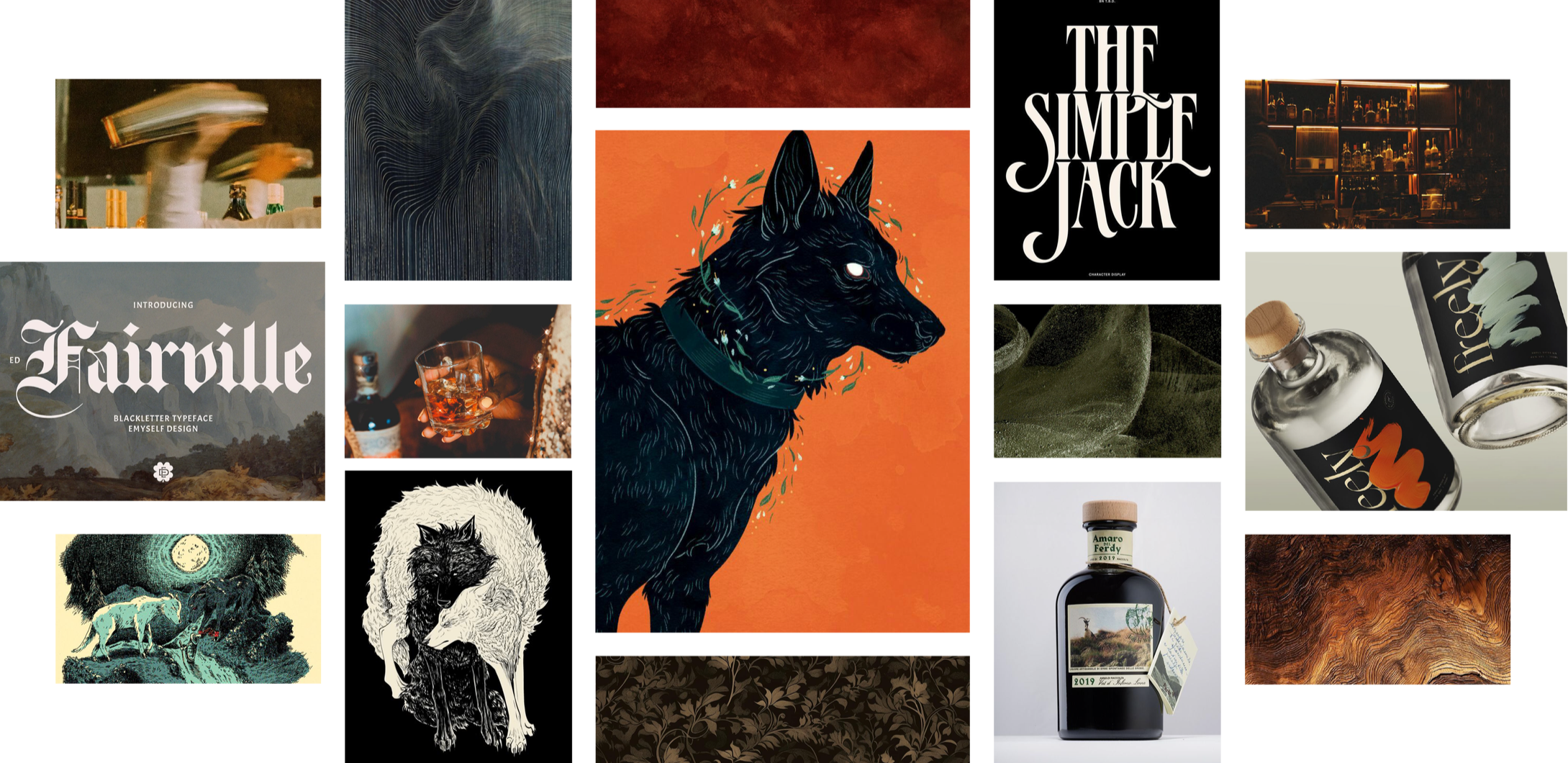
Inspiration & Ideation
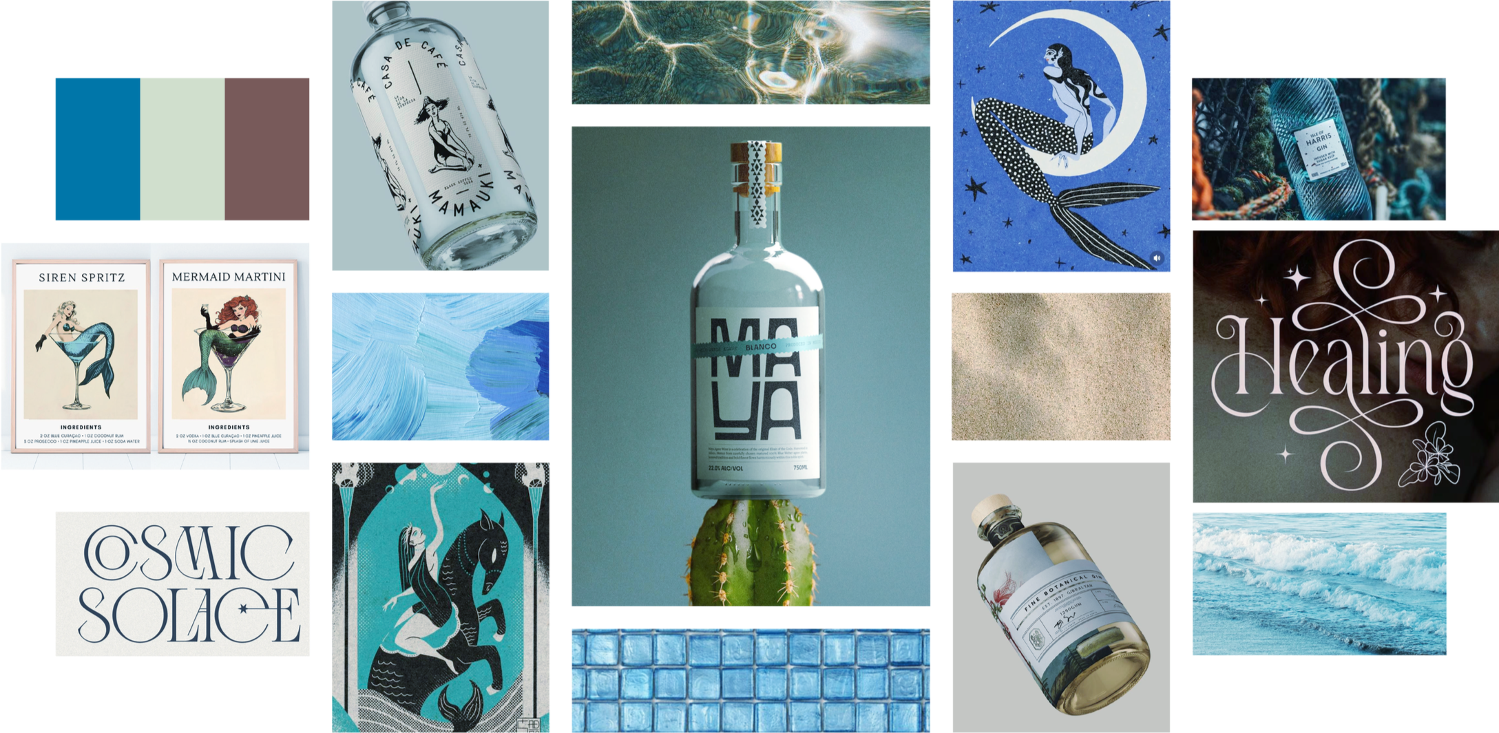
Mood Board
This mood board explores a light, fluid direction inspired by La Sirène. Oceanic blues and shimmering textures create a fresh, airy feel, while subtle mythical elements add a sense of storytelling.
In contrast, El Cadejo, a Nicaraguan rum, takes a darker, more grounded approach. Deep browns, maroons, and rich textures evoke earth, wood, and mystery, with the Cadejo figure introducing duality.
Together, they balance light and dark, creating a cohesive system rooted in storytelling and regional identity.
Click image to expand
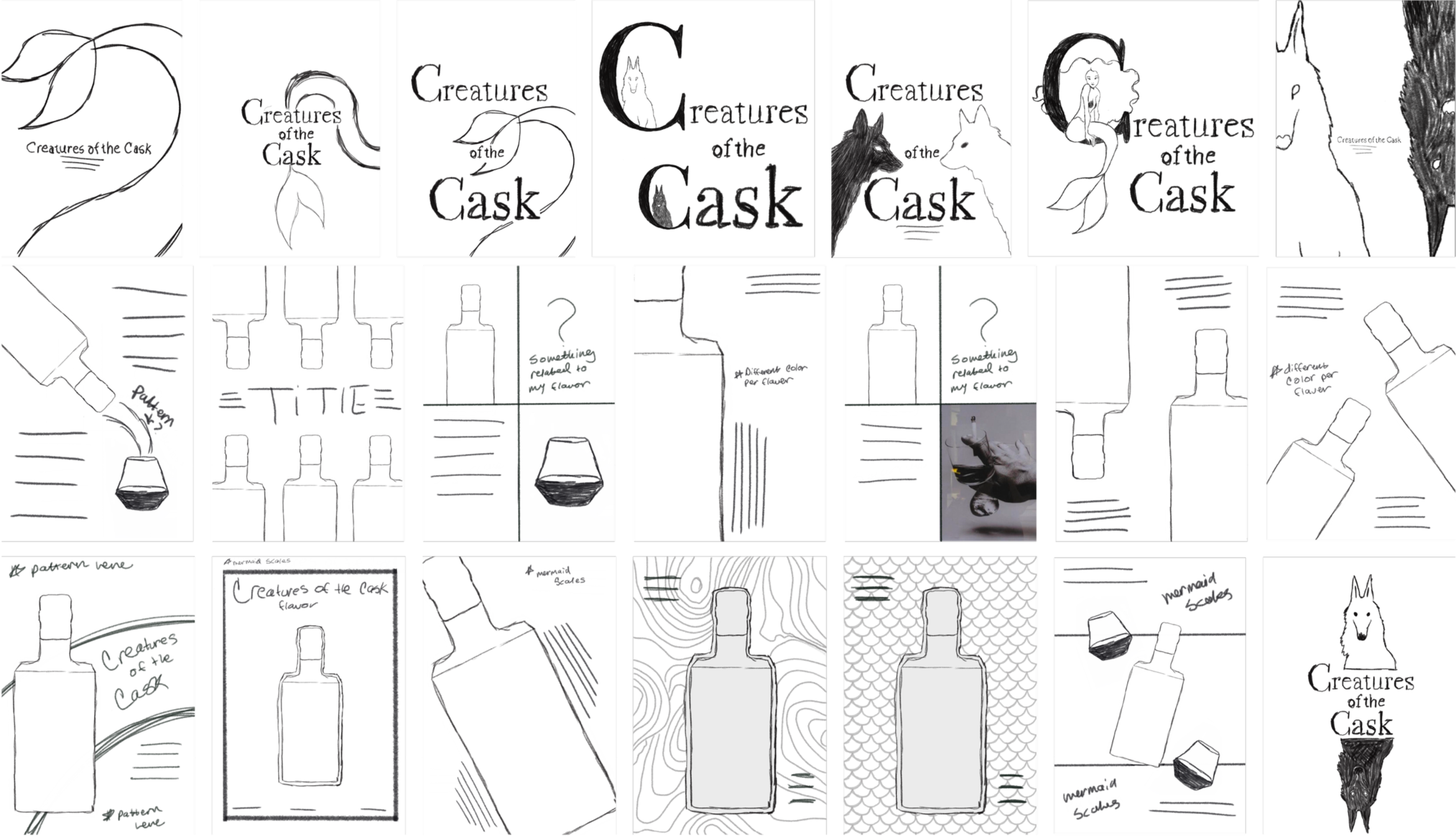
Sketches
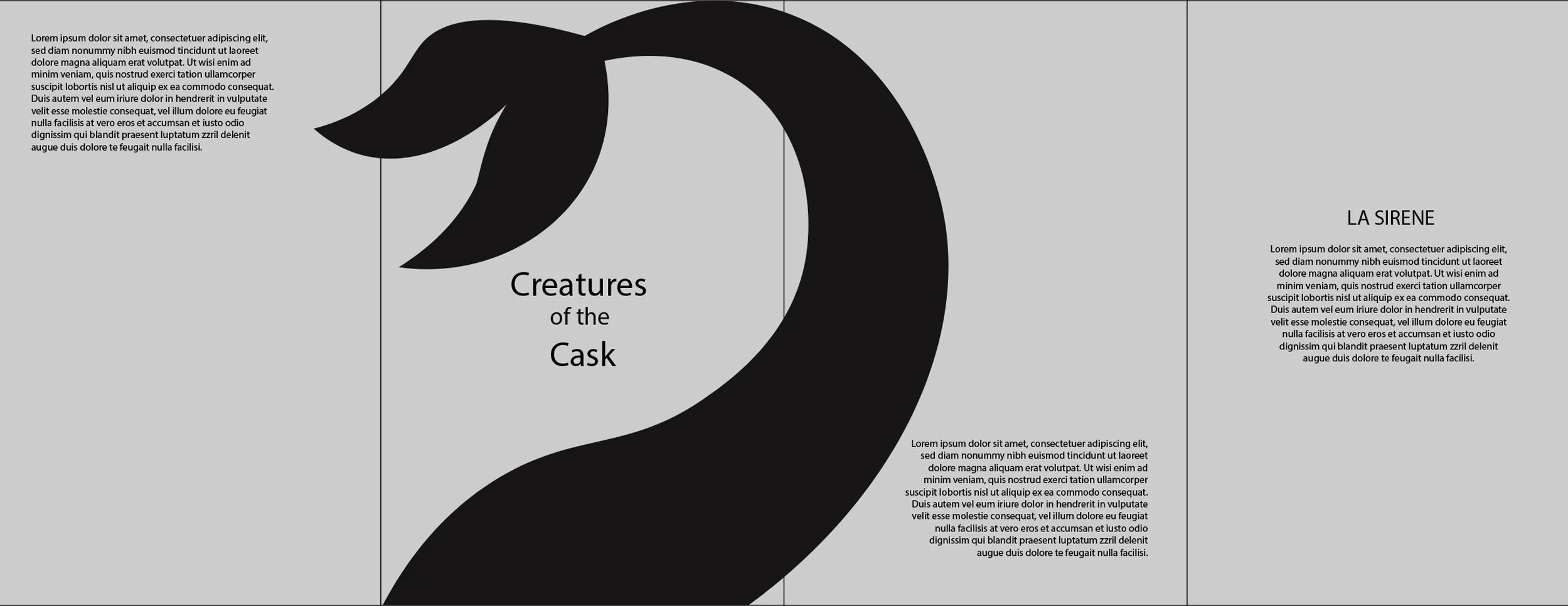
Early sketches explored integrating creature forms with typography. Illustrations wrap around the bottle and interact with negative space, especially within the “C” of “Creatures.” Advertising concepts focus on the pour, using patterns like scales and topographic lines to suggest motion and act as portals into each story. Iterations refined composition, hierarchy, and scale while maintaining a refined tone.
Click image to expand
Digital Drafts
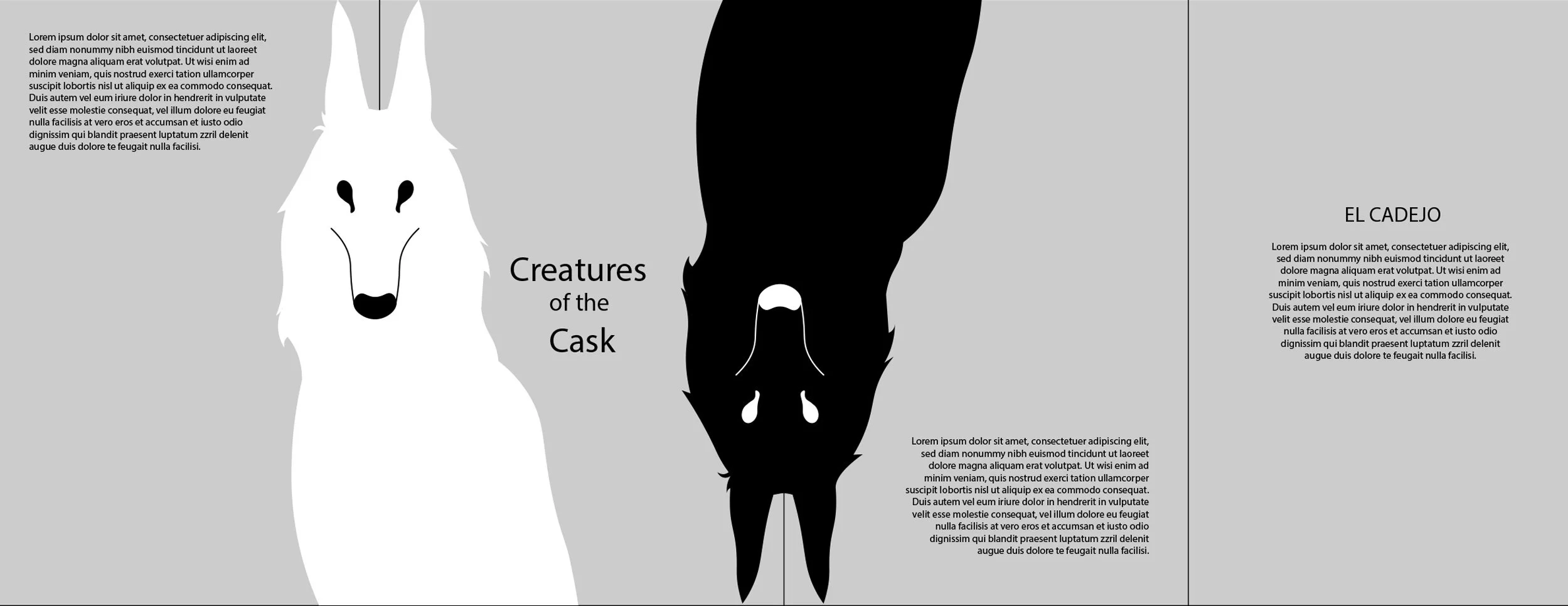
Round One
This phase focused on layout and hierarchy. The goal was to establish structure before adding color. While the illustrations were strong, the layouts felt inconsistent and the narrative elements competed with key product information. This made the labels harder to read and less cohesive across the full wrap.
Round 02
Color, pattern, and layout were refined to improve clarity and flow. A controlled palette was introduced to differentiate each rum while keeping the brand consistent. Supporting patterns, like scales and topographic lines, add depth and reinforce each story without distracting from the product. Typography and spacing were simplified to improve readability. The final direction feels more cohesive, balanced, and premium, but it still needed improvement, as the imagery was not yet strong enough as a focal point and tended to recede instead of leading the design.


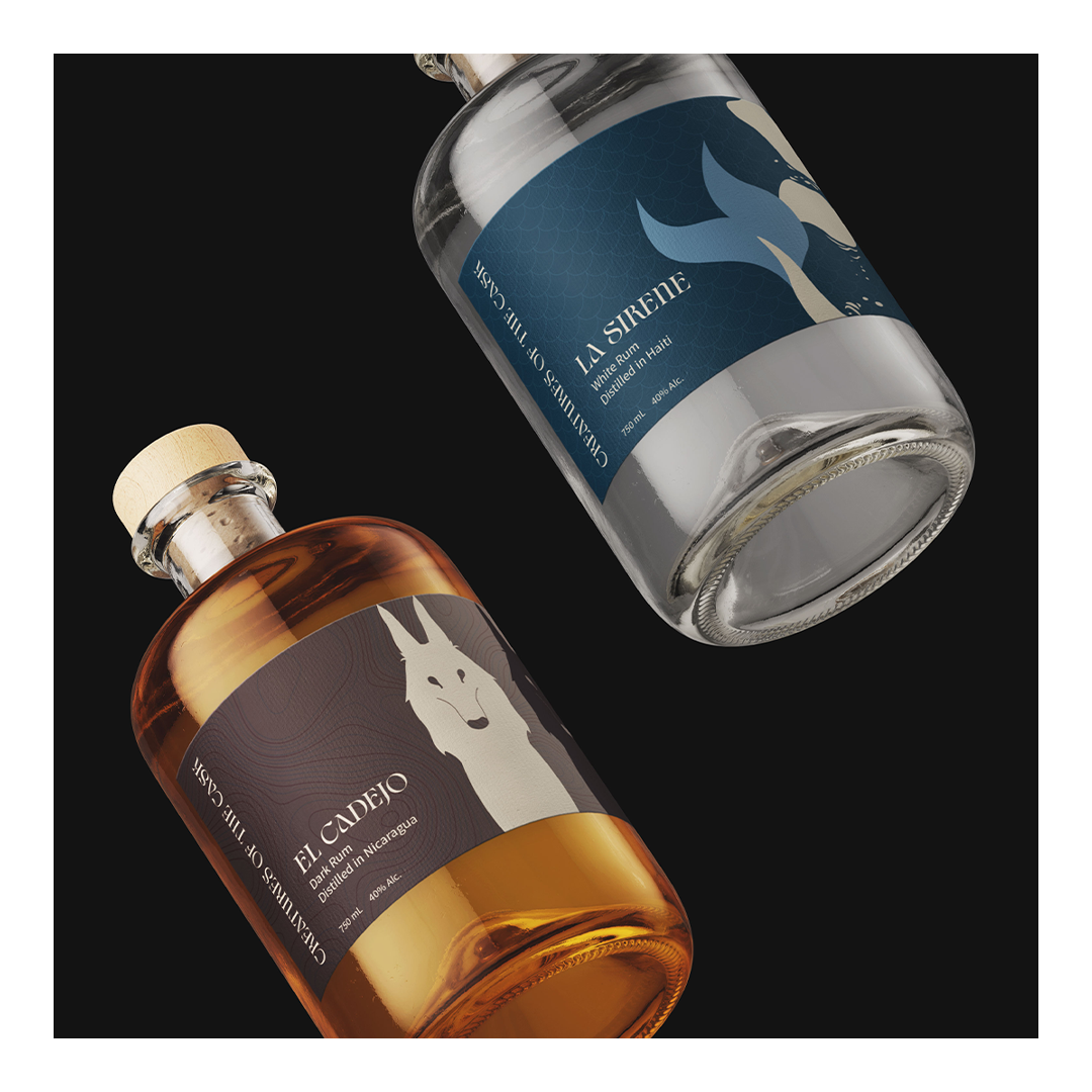
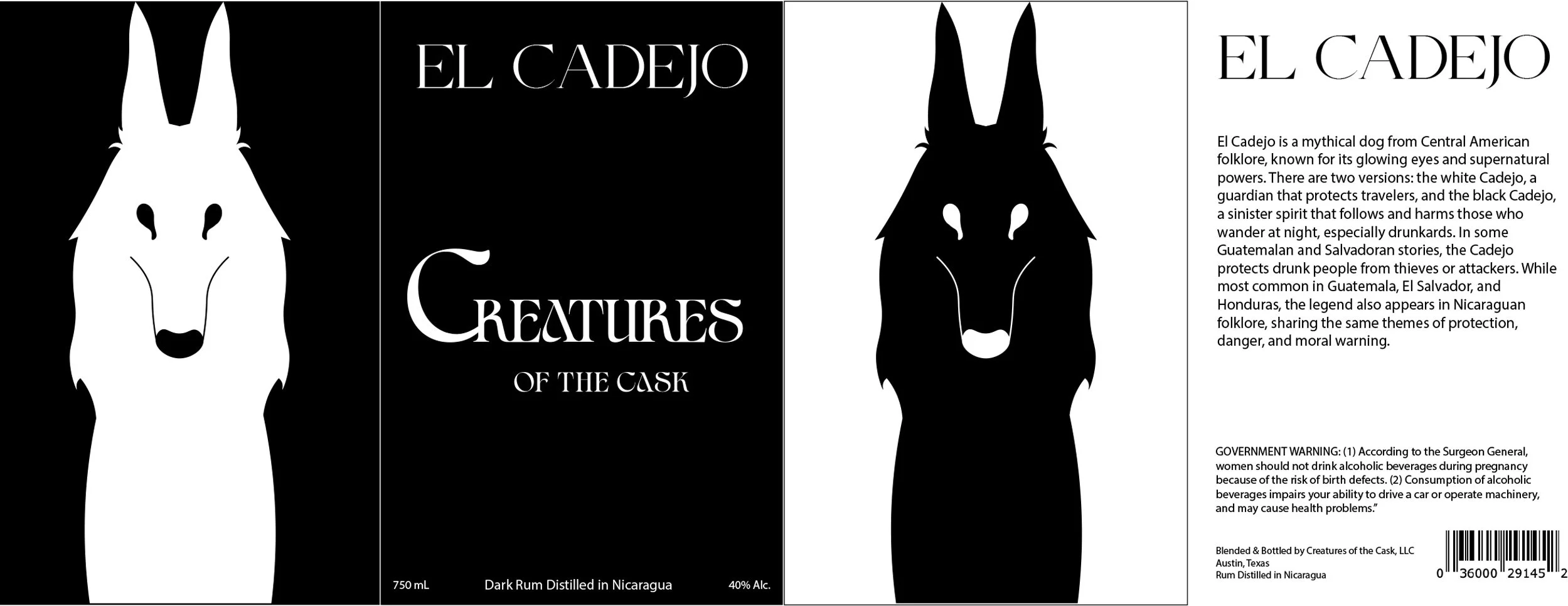
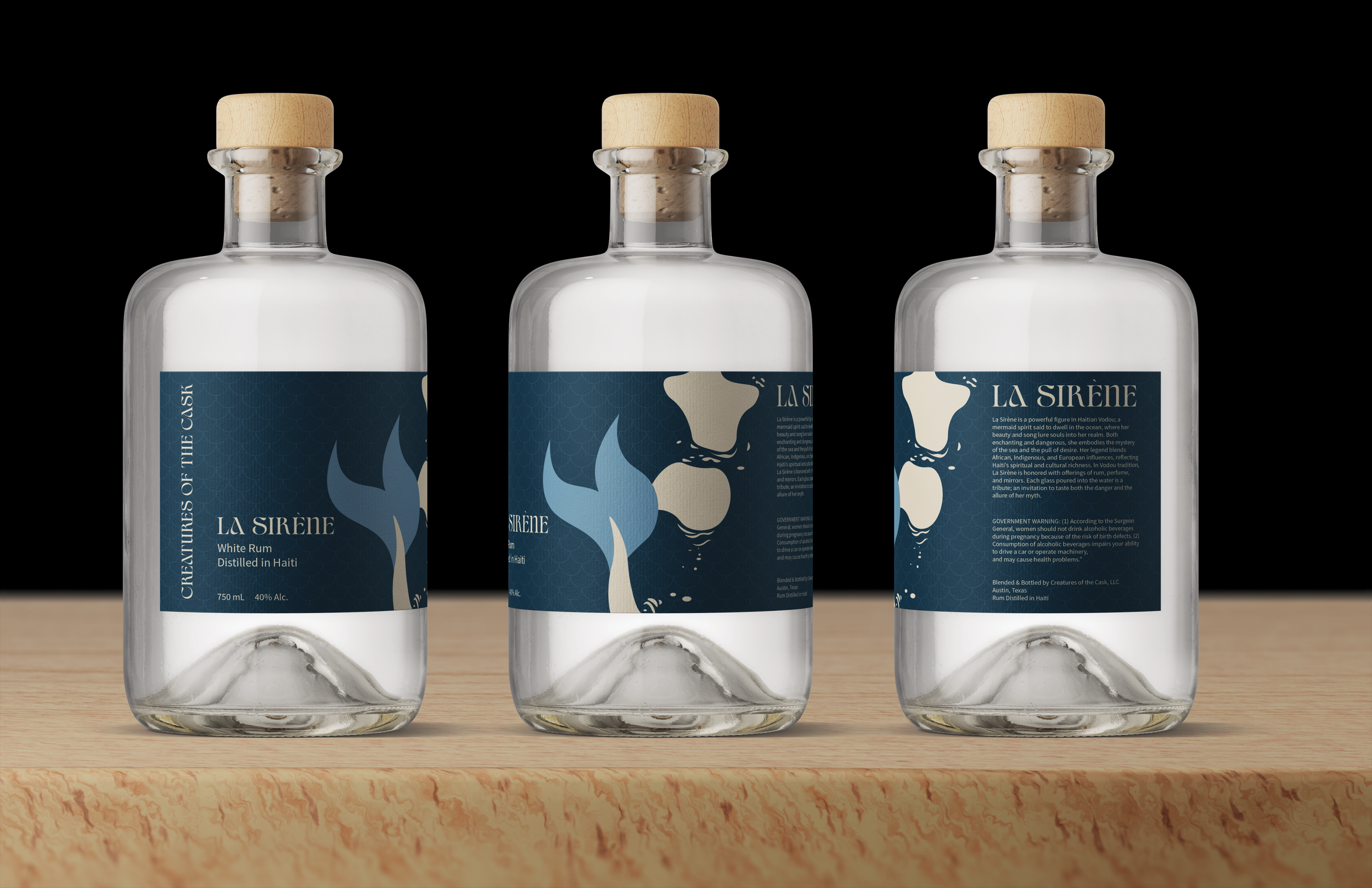
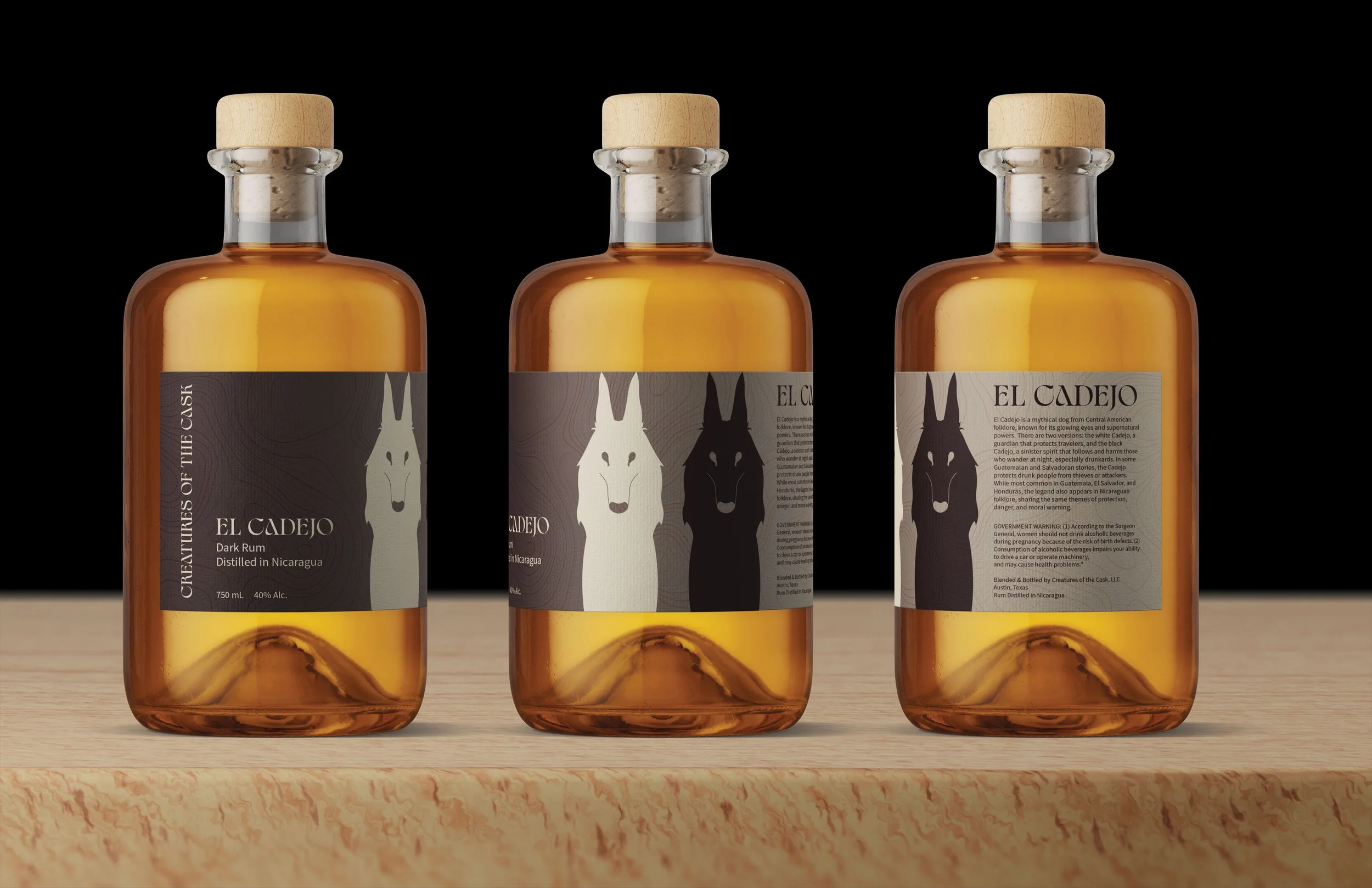
Final Design
A cohesive palette connects origin and luxury. Midnight navy adds depth, while soft cream brings warmth and a vintage feel. La Sirène uses sky blue to reflect Haitian waters. El Cadejo uses coffee and maroon tones to reflect Nicaragua’s landscape and the creature’s dual nature. The colors separate each product while keeping the brand consistent.
Typography balances style and clarity. Civons, a serif with flowing ligatures, reflects myth and tradition. Source Sans Pro keeps information clean and easy to read. Together, they support both storytelling and usability.
The final labels use bold, simplified forms that wrap across the bottle. La Sirène features a minimal mermaid tail in blue tones on a cream base. El Cadejo uses a cream and coffee palette to show contrast, paired with a topographic pattern inspired by Nicaragua. The result is a clear, cohesive design that blends premium packaging with storytelling.
Reflection
This project explores how to execute fantasy with restraint. The challenge was maintaining sophistication while incorporating mythological elements. Through controlled color, minimal illustration, and refined typography, the final system avoids cliché and supports a luxury position. Future iterations could expand into interactive packaging and digital storytelling. The project strengthened my ability to build cohesive brand systems where narrative and design work seamlessly together.