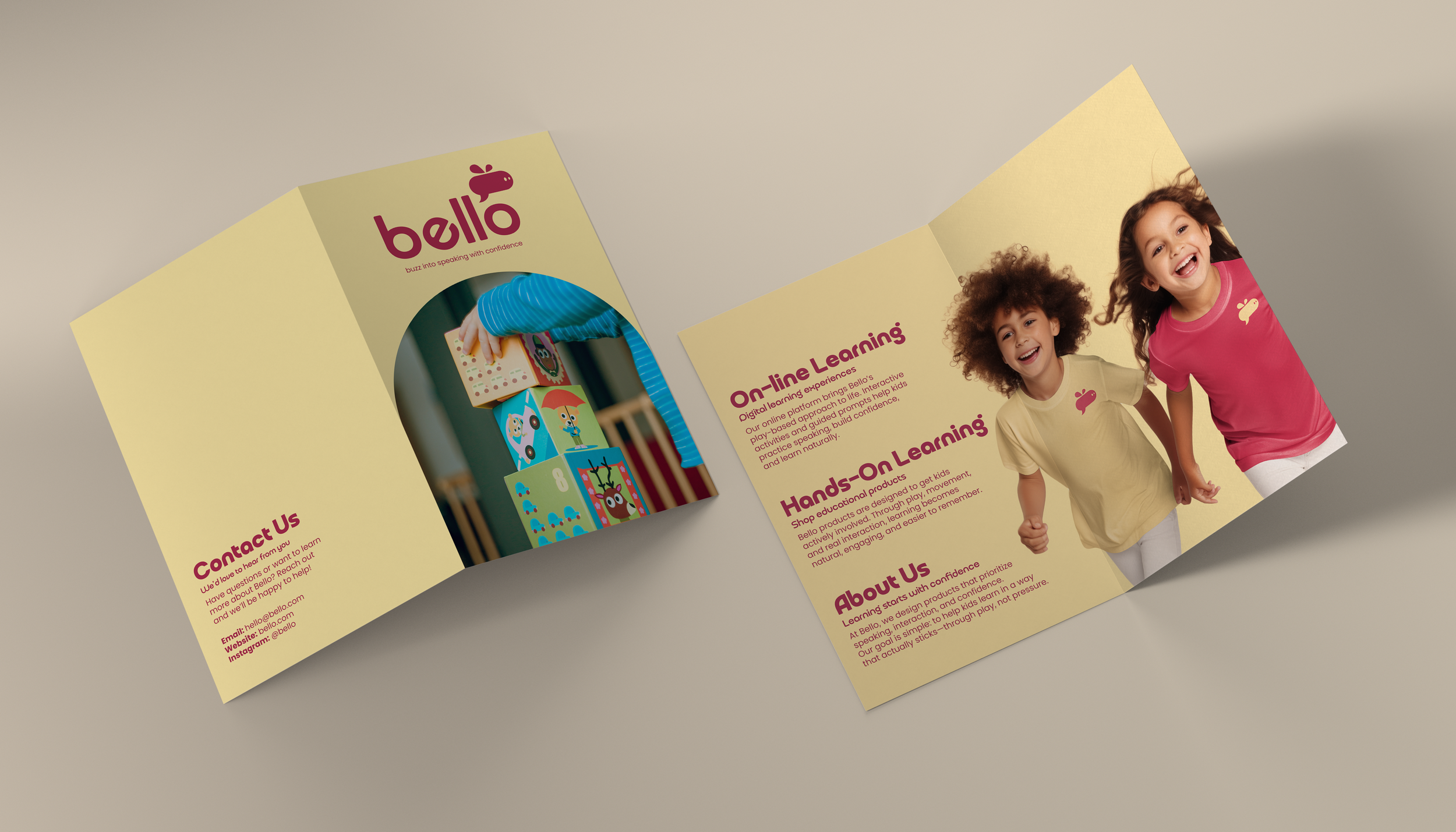
Bello
Education Branding
Overview
Bello is a creative education brand focused on helping children build confidence in speaking new languages. The system moves away from reading and writing heavy methods, prioritizing verbal communication and listening through image driven, imaginative learning experiences.
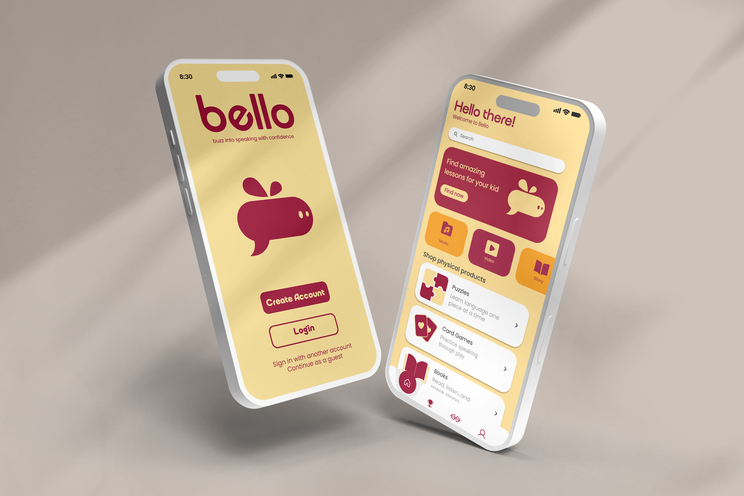
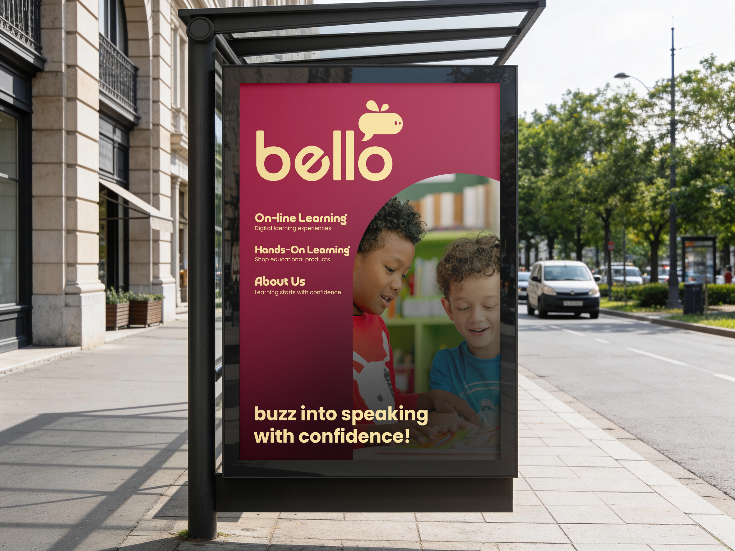
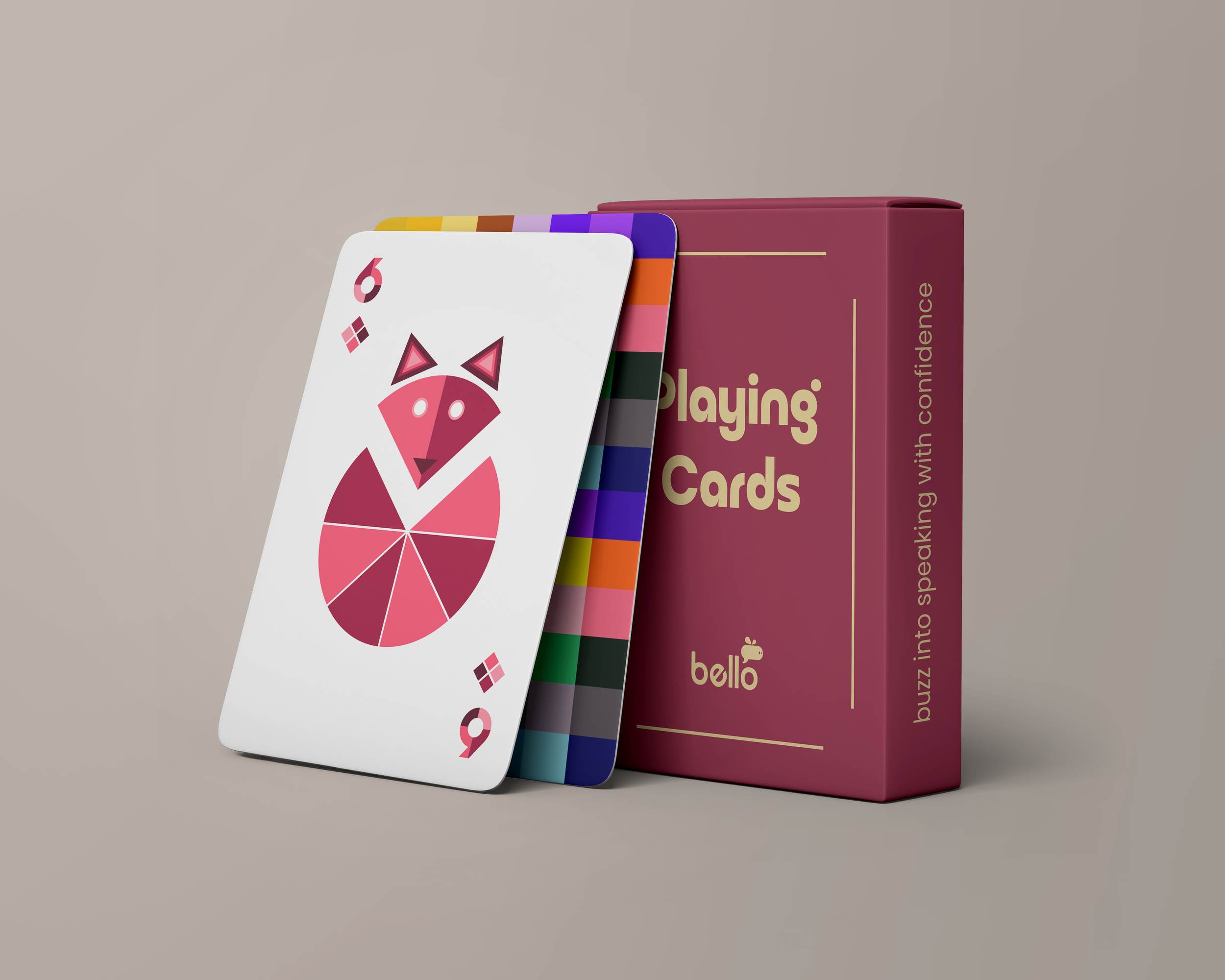
Bello operates as both a digital and physical learning platform, offering interactive online games alongside thoughtfully designed products available in stores and through its website.
By combining playful design with interactive learning, Bello transforms language acquisition into an engaging, confidence building process. It is designed primarily for children aged 4 to 10 who are visual learners and benefit from a safe, supportive environment to practice speaking without fear of mistakes. The brand also supports parents, caregivers, and educators seeking high quality learning tools, while inviting designers and creatives to collaborate in developing visually rich educational materials.
Research & Discovery
Research identified a clear gap in early language education. Many platforms emphasize literacy and vocabulary recognition, but few focus on building confidence in spoken language.
Competitor analysis included Lingokids and Duolingo, revealing an opportunity to bridge digital interactivity with strong physical design. This led to a hybrid approach that combines tactile experiences with simple, expressive visuals to encourage speech.
Inspiration & Ideation
Mood Board
This mood board explores a playful, visual approach to language learning. Bright colors, simple shapes, and friendly illustrations make the experience feel fun and easy for kids to understand.
It also focuses on hands-on learning through puzzles, cards, and interactive tools, along with digital games that encourage speaking and listening.
Overall, the direction is imaginative, approachable, and designed to help kids build confidence while learning through play.
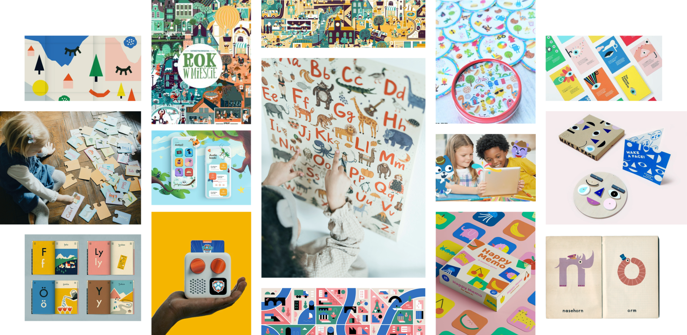
Click image to expand
Sketches
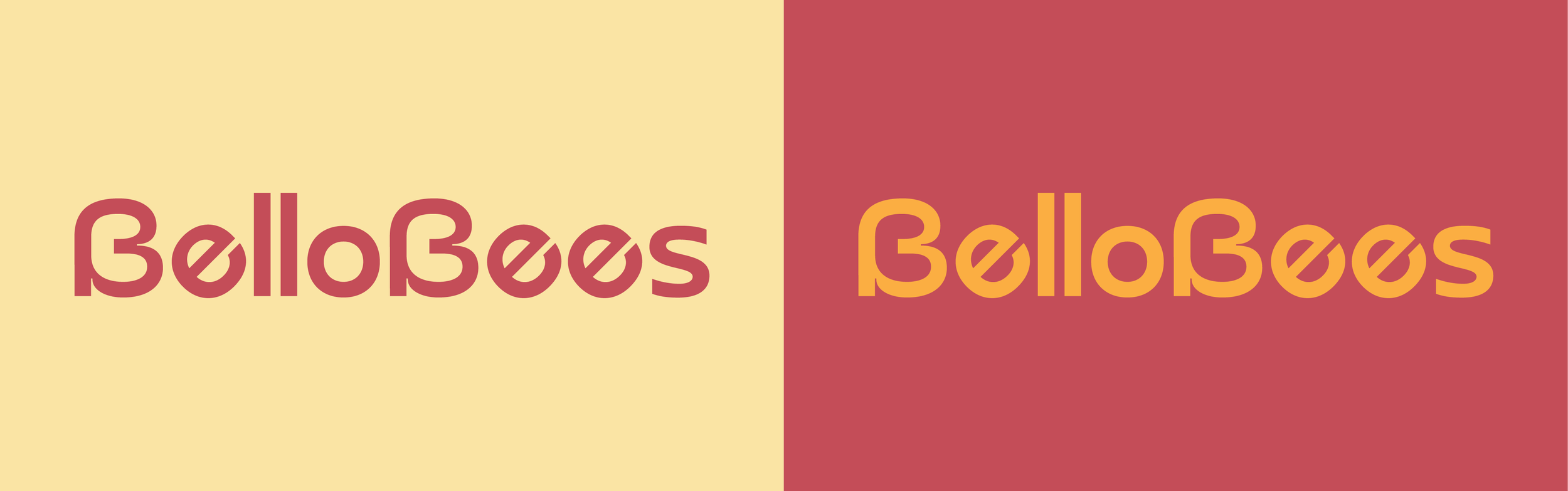
Sketch exploration focused on three directions: abstract symbols, mascot driven concepts, and wordmarks. At this stage, the project was named BelloBees, though it was later changed after discovering another company already used the name and to simplify the overall identity.
Abstract concepts used honeycomb forms and sound inspired shapes to represent structure and communication. Mascot exploration developed a bee character that integrates speech elements. Wordmark studies focused on soft, rounded forms inspired by handwriting and organic shapes. These explorations helped define a direction that balances clarity, personality, and meaning.
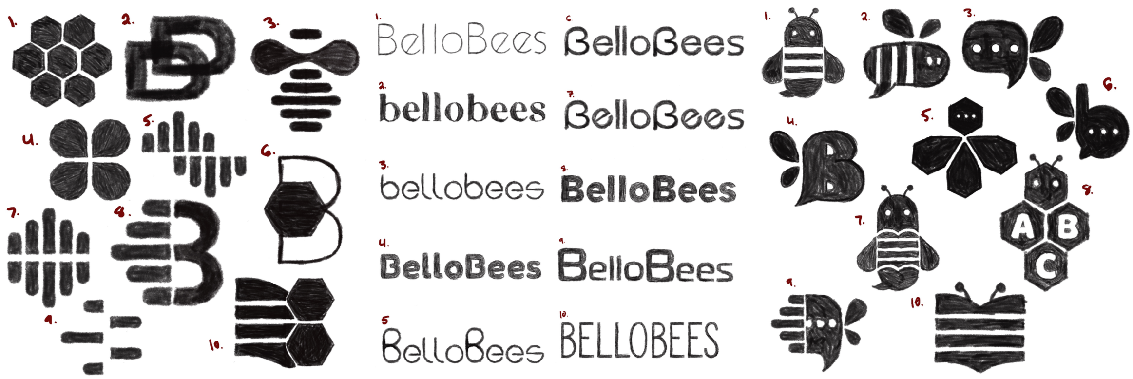
Click image to expand
Digital Drafts
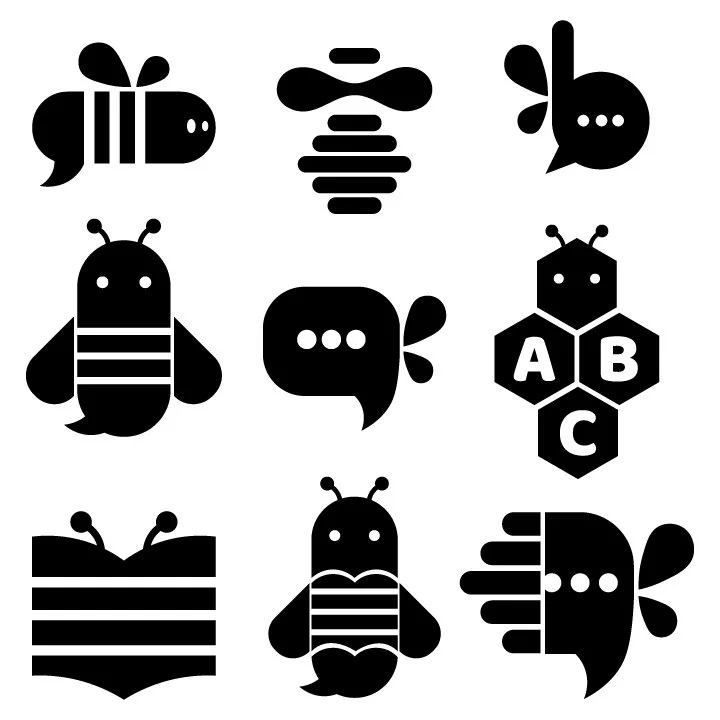
Round One
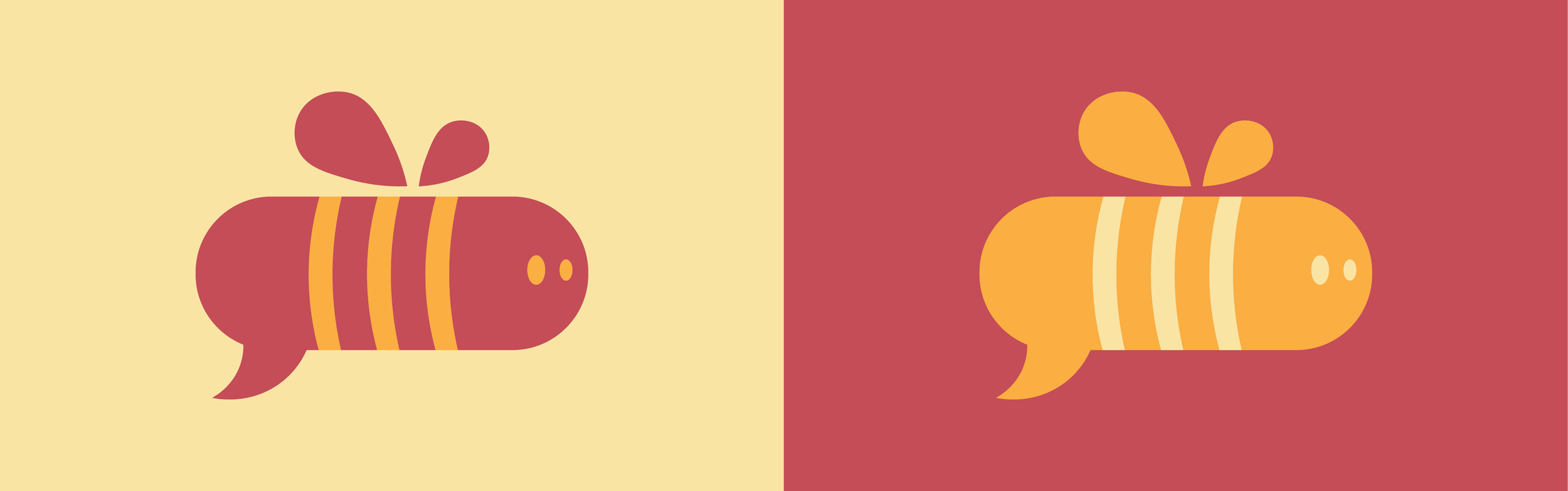
The first round of digital exploration focused on developing a visual language through iconography and typography. A series of bee-inspired icons were created, experimenting with simplified forms, speech bubble elements, and character-like features to convey communication and friendliness.
Typography testing explored a range of rounded typefaces to find a balance between playfulness and legibility. These early studies helped identify key directions, including the use of soft curves and bold, approachable letterforms that align with a child-focused learning brand.
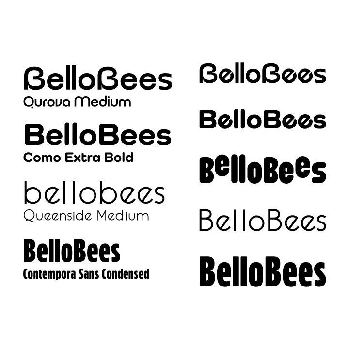
Round 02
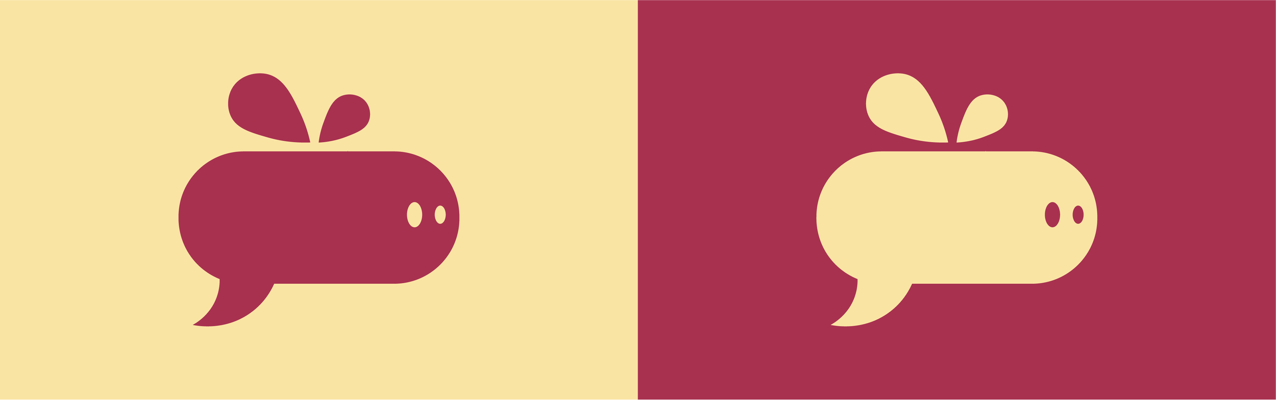
Digital refinement brought the strongest ideas together into a more unified system. The bee icon was shaped to resemble a speech bubble, reinforcing the connection to spoken language.
Color and typography were refined to feel cohesive and inviting, using a warm palette that supports the brand’s playful tone.
While the direction is stronger, it still needed improvement, particularly in simplifying elements and better balancing the icon and typography to create a clearer, more distinctive mark.
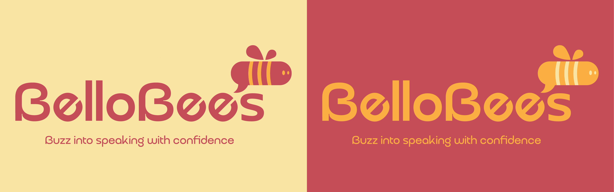
Final Design
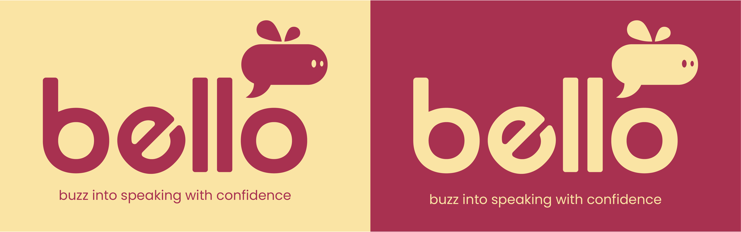
Refining the bee icon improved its legibility and made it easier to recognize at different sizes. Simplifying the form removed unnecessary detail while preserving its core idea. At the same time, the name shifted from BelloBees to Bello—avoiding conflicts with existing brands and creating a more concise, adaptable identity. The name also subtly connects “bee” and “hello,” reinforcing the brand’s focus on communication.
The color palette feels inviting without becoming overwhelming, creating a more comfortable and approachable visual tone. Together, these colors strike a balance between playfulness and intention.
Typography supports this sense of clarity and ease. The rounded sans serif used in the logo feels friendly and approachable, while a clean, modern sans serif ensures readability across both digital and physical applications. This combination keeps the system consistent while allowing for flexibility.
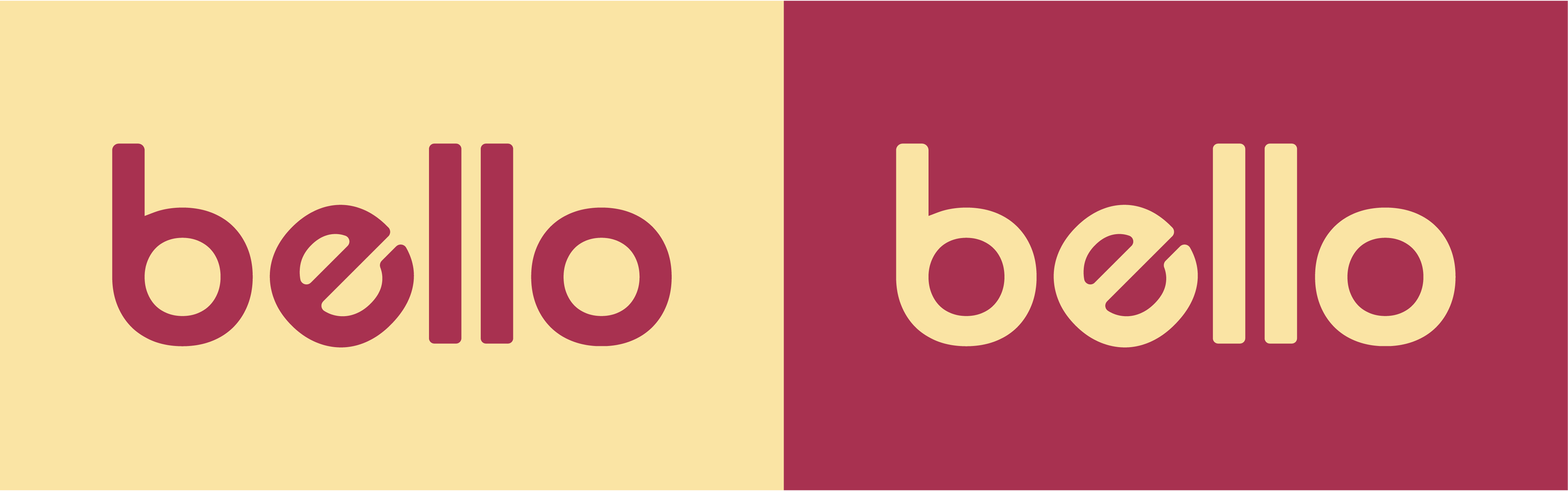
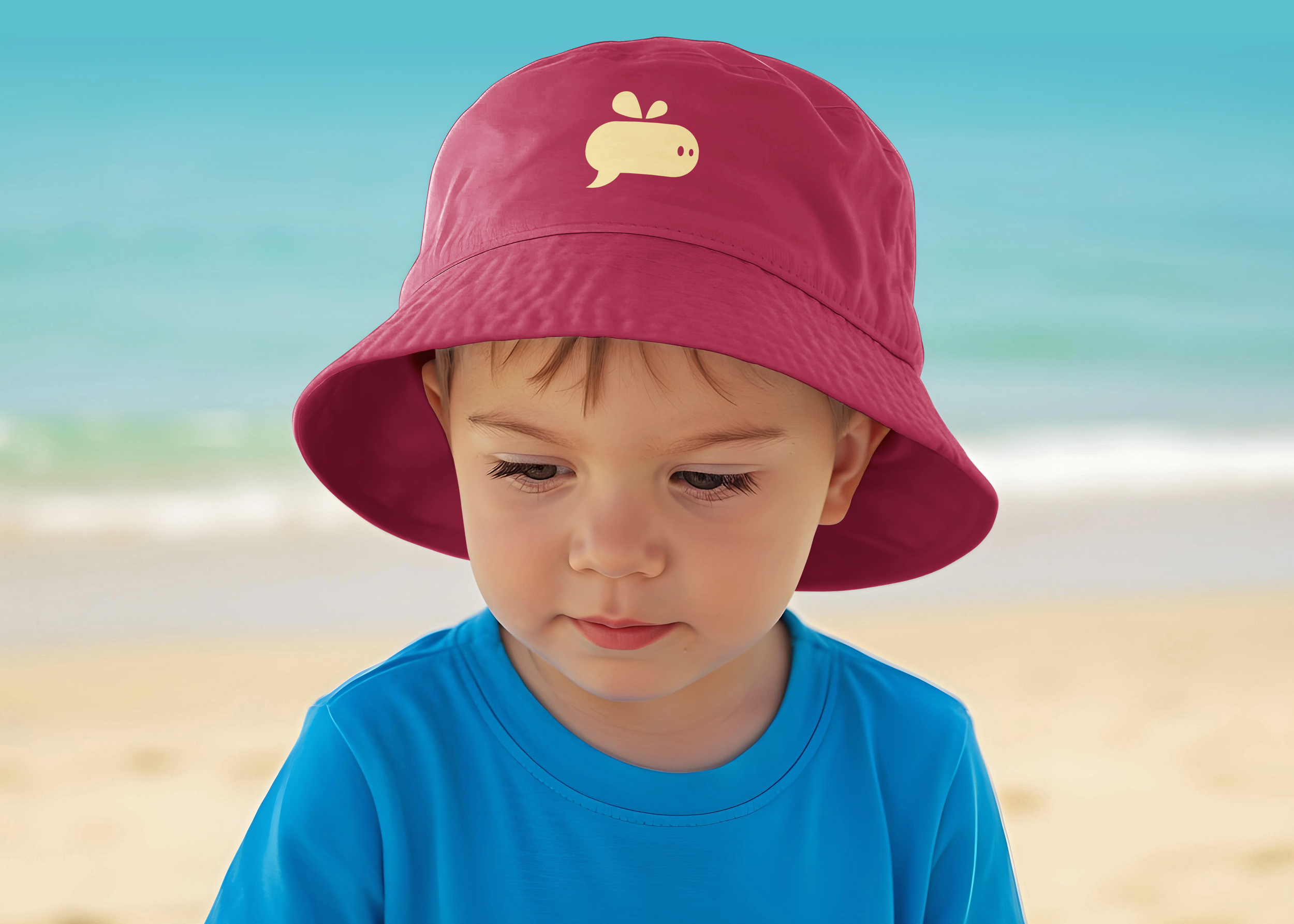
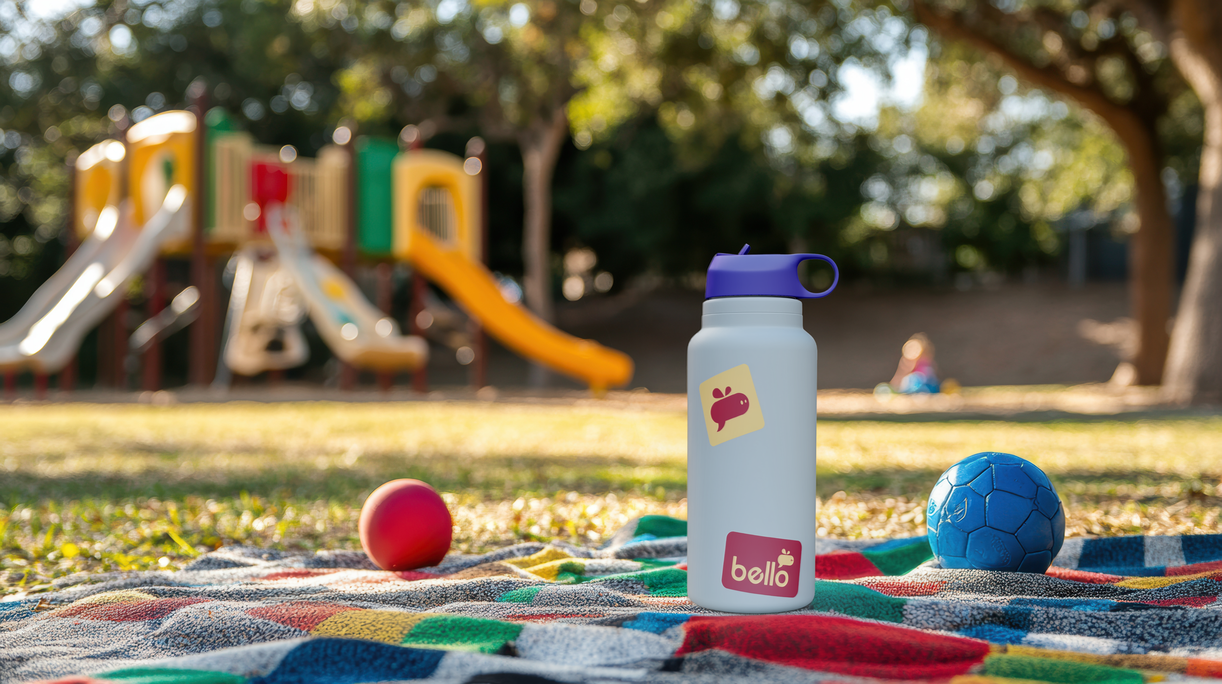
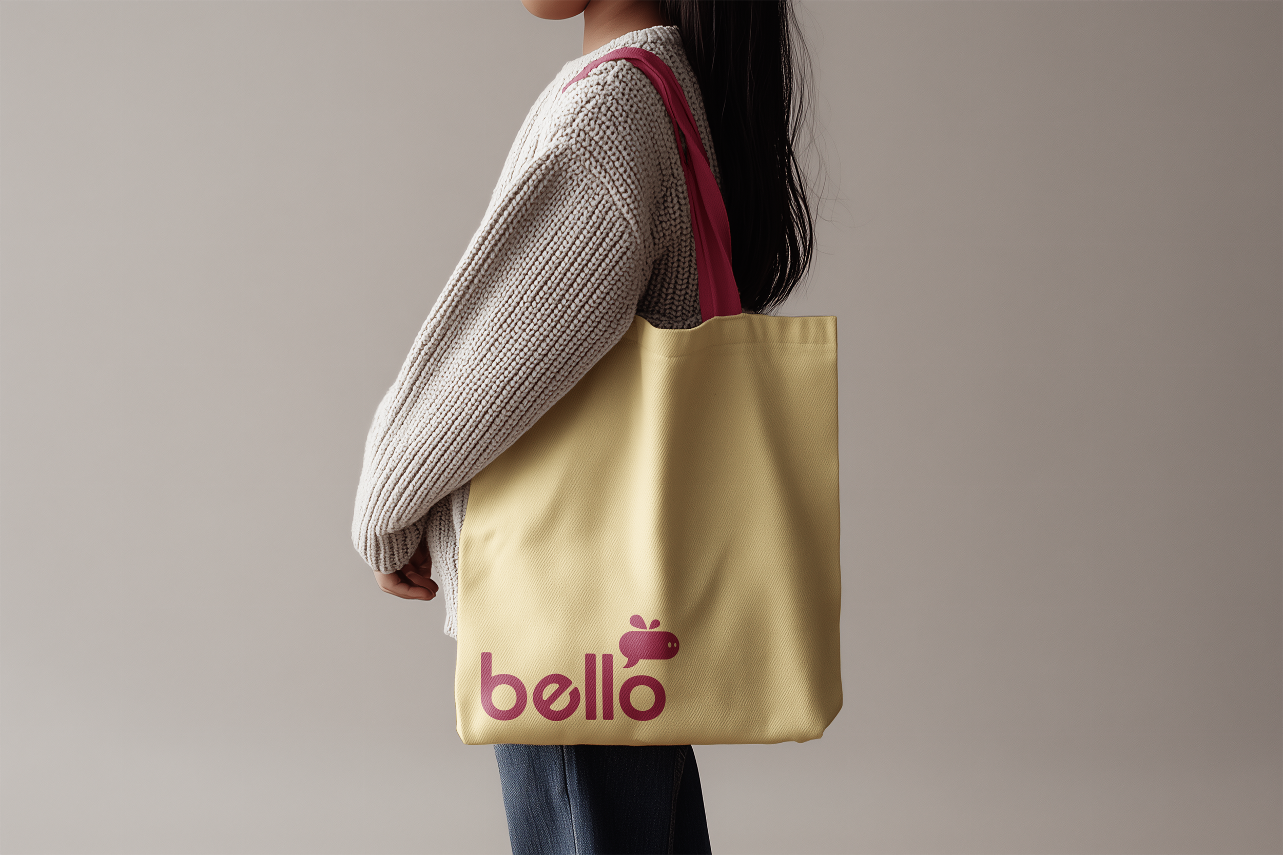
The final identity brings the wordmark and icon together into a unified system. It scales effectively across uses, from small digital touchpoints to larger physical formats, maintaining clarity and character at every size.

Reflection
This project explores how branding can support emotional confidence in learning. By shifting away from rigid, correctness driven systems toward exploration and play, Bello creates a more inviting experience for children.
The process emphasized the importance of aligning visual identity with educational strategy. It also strengthened my ability to build systems that extend across physical and digital touchpoints. The result is a brand that is playful, purposeful, and designed to grow alongside its users.
This is a project I would love to bring to life one day. I believe language is the first step toward understanding each other’s cultures, and Bello is rooted in that idea—making communication feel accessible, engaging, and meaningful from the very beginning.